Note: If you haven’t downloaded and installed the program, you can find the instructions here. You can also find QGIS’s documentation here.
Datasets
To create these maps we will be using the following three datasets:
-
US Counties 1:20,000,000 (clipped to shoreline). Download from US Census Bureau.
-
US States 1:20,000,000 (clipped to shoreline). Download from US Census Bureau
-
Covid-19 cases. Download from John Hopkins University - CSSE Covid-19 Daily Reports. Download the most recent file.
A packaged file of the above data can be found here. Note that this package may contain partial datasets meant for this tutorial. To get the full datasets please refer to the links above.
Adding Layers
The first step in creating a basic map is to open QGIS and add the counties and state layers you downloaded:
-
To add shapefiles click on the
Add Vector Layerbutton. Other types of data, including rasters, csv (comma separated values) and postGIS, will be added using the other buttons.
-
Start by adding the
US Counties (20m)file. -
Under
Soruce, click on the three dots and make sure you select the file with the extension.shp. Remember that a shapefile is actually made up of 5 or 6 individual files with different extensions. Normally, these individual files are the following:-
.shp- The main file that stores the feature geometry (required). -
.shx- The index file that stores the index of the feature geometry (required). -
.dbf- The dBASE table that stores the attribute information of features (required). -
.sbnand.sbx- The files that store the spatial index of features (these might get corrupted, see note at the end of this tutorial). -
.prj- The file that stores the coordinate system information. -
For more information on these extensions and others see this explanation by ESRI.
-
-
Depending on the settings of your QGIS, the program will either load the file automatically and change your project’s
CRS(coordinate reference system) based on theCRSof the file you just added, or ask you toSelect a Transformationfor your file. If you do get the prompt to select the transformation, we suggest you choose the default transformation. Unless you know exactly what transformation you want to use, your best bet is probably to go with the one QGIS is suggesting. In any case, at any point you can change the project’sCRSto fit your needs. -
Once you’ve chosen the transformation (if prompted) close the window where you selected the vector file to add.
-
Next, let’s change the project’s
CRSto the standard US projection:-
Click on the button that says
EPSGat the bottom-right corner of the map. This will bring up theProject Propertiespanel with theCRStab open. -
In the
Filterprompt, typeUSA Albers Equal Area. This will bring up a couple of options in thePredefined Coordinate Reference Systemssection. Choose theUSA_Contiguous_Albers_Equal_Area_Conic_USGS_versionand clickOK. This will change the way the map looks, but it won’t alter the data itself or what you can do with it.
-
-
Before:
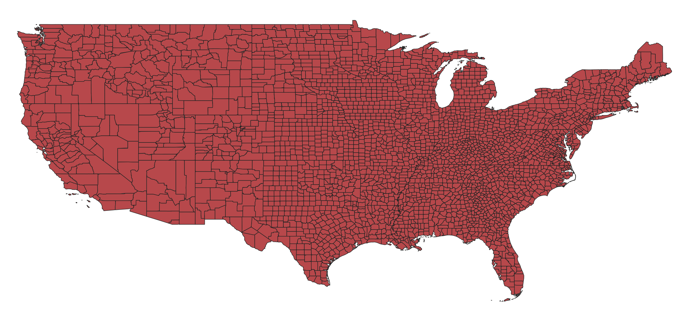
-
After:
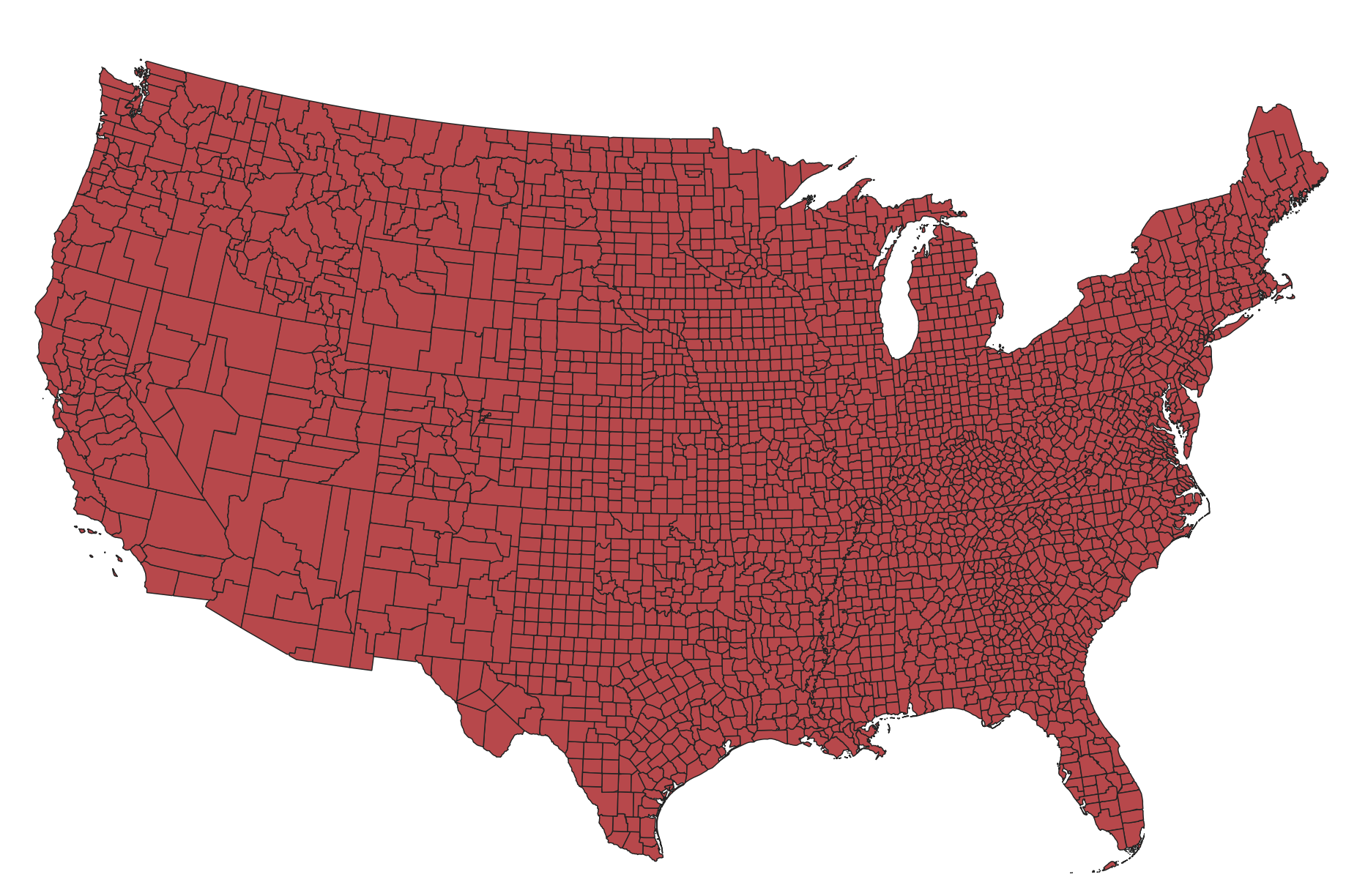
-
Now add the US states layer.
-
After you’ve added the US states layer you can re-arrange your layers. In the layer panel drag the US states layer above the US counties layer.
-
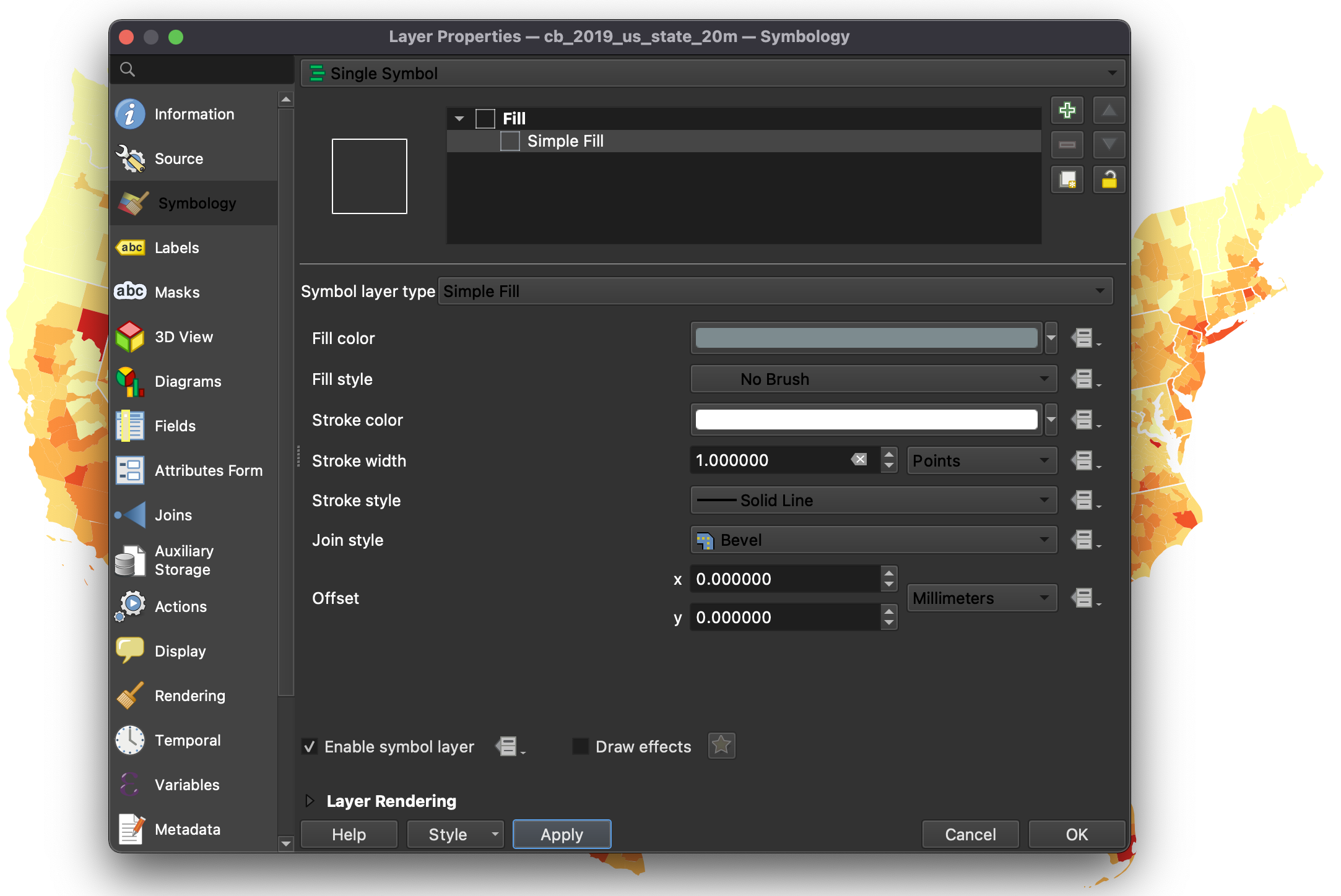
Finally, so that you can actually see both layers at the same time let’s quickly change the symbology of the US states layer:
-
Double-click on the US states layer and go to the
Symbologytab. -
There, highlight the
Simple Fillsymbol, under theFillsymbol. -
As
Fill stylechooseNo brush. -
For
Stroke colorchoose white (#ffffffin `HTML notation). -
And for
Stroke widthchoose0.5(withpointsas the unit).
-
-
You should now see the states as a white outline and the counties underneath.
Adding a CSV File
Next, let’s add the Covid-19 dataset. This is a csv (comma separated values) file, with no geographic information: it doesn’t contain coordinates or geometry. Instead, every row represents a county and is identified with a FIPS (Federal Information Processing Standards) code. We will join the Covid-19 data to the US counties, by matching the FIPS code to the GEOID code that’s already in the counties file.
-
First, we need to create a “metadata” file that will tell QGIS exactly how to read the
csvfile. In QGIS this file is called acsvtand it contains the type of data for each column in thecsvfile. The different types of data your fields can take are:-
String - Represents text
-
Integer - Represents whole numbers
-
Real - Represents both negative and positive numbers, with decimal points
-
Date - Date in the format YYYY-MM-DD
-
Time - Time in the format HH:MM:SS+nn
-
DateTime - Date and time in the format YYYY-MM-DD HH:MM:SS+nn
-
-
For every column in our
csvfile we need to specify what type the data is in:-
In your text editor (Sublime, Atom, or VS Code), open a new file.
-
On the new file write (all in one line):
"Date","String","String","String","Integer","Integer","Integer","Integer","Integer","Integer" -
Note that every item is in double quotes and separated by a comma. Also, even though some columns look like numbers in the original
csvfile (like theFIPScode), they should actually be treated as text (and maintain their leading zeros). Since we are using this field to join the Covid-19 data to the US counties, it is very important that it comes in in the right format. If we have one file with text and another with integers or real numbers, the QGIS won’t be able to match them.
-
-
If you are working on Mac’s TextEdit you need to format your file as ‘Plain Text’. To do this click on Format and then Make Plain Text. This will change your file from an .rtf to a simple .txt.
-
Save your file with the same name as the
csvfile it is “annotating” but with a different extension. It is important to do this so that QGIS understands that thiscsvtfile corresponds to the othercsvfile. In both Windows Notepad and in Mac TextEdit you need to manually type the extension (.csvt) and in TextEdit you need to un-check the option that says ‘If no extension is provided, use .txt’. -
This file should be saved as
us-counties.csvt. -
Once you have created the
csvtfile you are ready to import thecsvfile:-
Click on the
Add Delimited Text Layerbutton (the comma with the + sign) and select thecsvfile. Remember, thecsvtfile should be located in the same folder where hecsvfile is and should have the same name (the only difference being the extension). -
Make sure the file format is
CSVand that underGeometry Definitionyou selectNo geometry (attribute only table). If we were importing acsvfile with coordinates or geometry we would select one of the other two options.
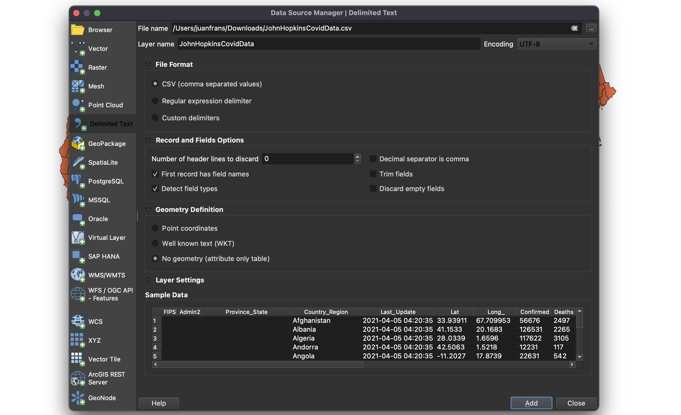
- Hit
Addand thenClose. You should now see thecsvfile in the layers menu.
-
-
To verify that the data was correctly read, right-click on the Covid-19 data table and choose
Properties. Then navigate to theFieldstab. There you should see the different fields with the rightTypeassociated with them:QStringforFIPSanddoubleforIncident_Rate.
Joining the Two Datasets
The most important thing to do before we can join the two datasets is to verify that the two columns we will use to create the join (GEOID and FIPS) match each other. However, if you open the attribute table of the US counties dataset (by right-clicking on the layer and selecting Open Attribute Table) you will see that the GEOID column always have 5 digits (sometimes the first digit is a leading zero), whereas the FIPS column sometimes has 4 and sometimes 5 digits.
Therefore, the first thing we need to do is to add a leading zero to the FIPS column in the Covid-19 dataset:
-
First, open the Covid-19 dataset
Attribute Table. -
At the top, click on the
Open field calculatorbutton (the small abacus). -
Next, in the
Output field nameoption, typeGEOID. -
Change the
Output field typetoText (string). -
And then in the
Expressionbox typelpad("FIPS",5,'0'). This invokes theleft padfunction, taking the values from theFIPScolumn, and making sure they always have5digits, adding a0at the left if necessary.
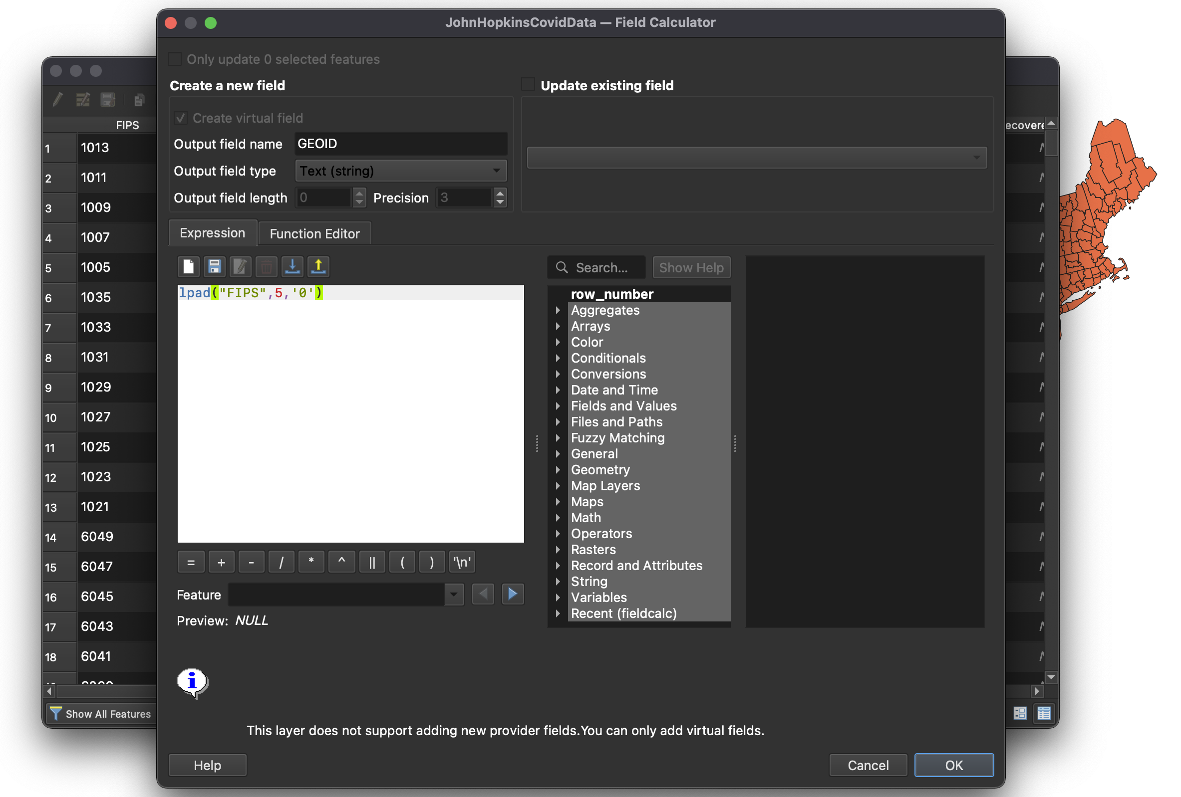
- Click
OK. If you now move to the left hand side of the Covid-19Attribute Tableyou should see the new column (calledGEOID) and it should always have 5 digits (sometimes with a leading zero). Note that many rows won’t have eitherGEOIDor aFIPScode. This is because in addition to data for US counties that dataset also contains data for the rest of the world.
Now that the two fields are in the same format, we can actually create the join:
-
Right-click on the US counties layer and choose
Properties. Then navigate to theJoinstab. -
There, click on the green plus (+) sign at the bottom of the window.
-
Select the Covid-19 data as the
Join layerandGEOIDas theJoin field. And selectGEOIDas theTarget field. -
To make field names shorter check the
Custom field name prefixand typeCovid_in the field below. -
Your join menu should look something like this:
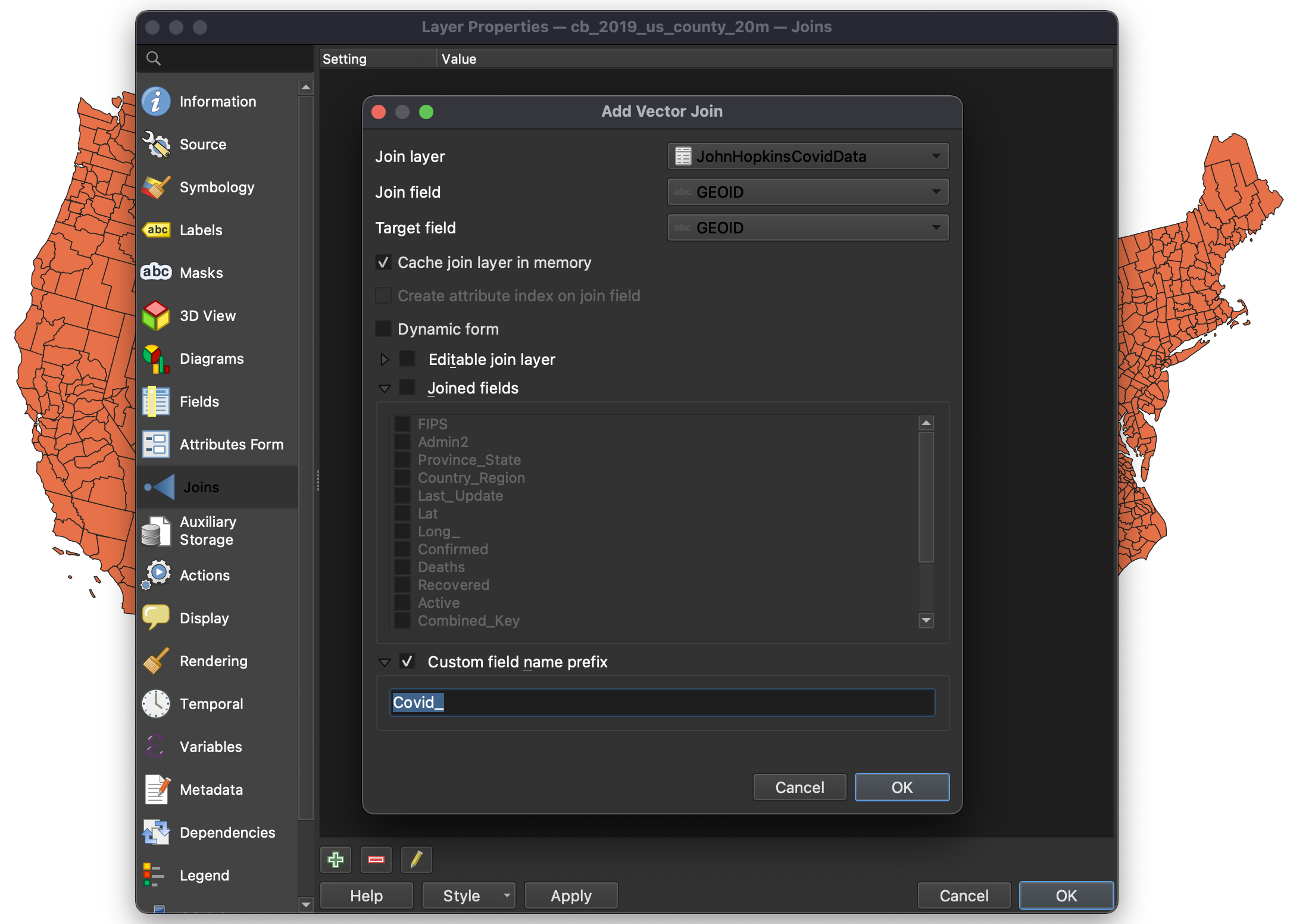
-
Click
OKandOKagain to close thePropertiespanel. -
To verify that the join happened correctly, open the attribute table of the US county layer and scroll to the left. There you should see the new fields (labeled
Covid_...) with data in them.
Basic Symbology
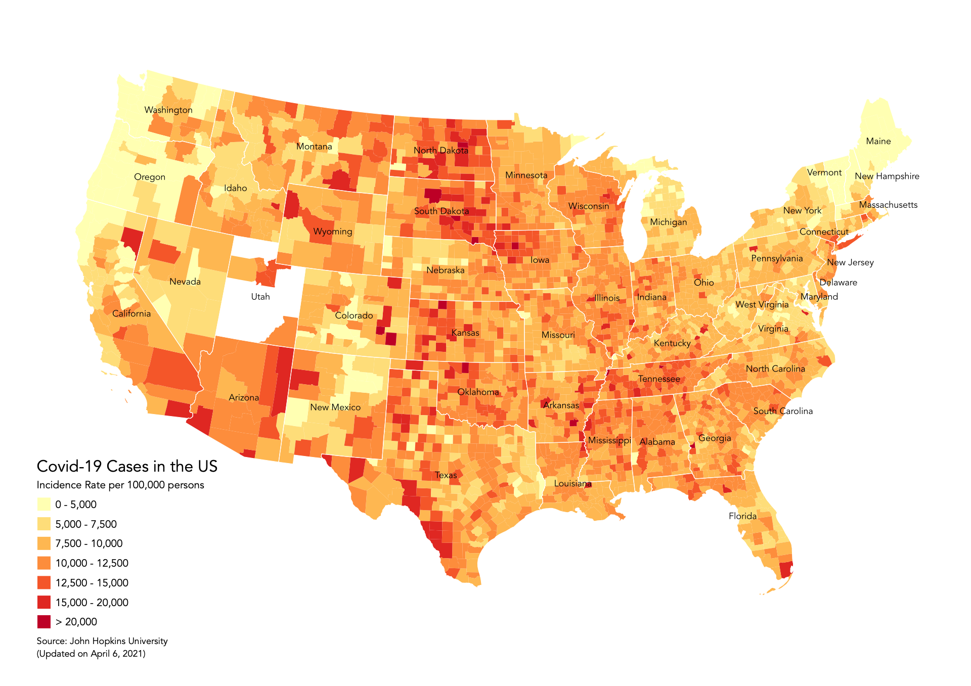
Symbology is one of the most important concepts in mapping. At its most basic level, symbology stands for changing the color, line weight, size or outline of a layer. However, and more importantly, it also means changing the appearance of a layer based on one or multiple of its attributes. In this tutorial we will classify and symbolize the data based on the values found in the Covid_Incidence_Rate field.
-
Double-click on the US counties layer and go to the
Symbologytab. -
Since the value we are using for the symbology is a continuous one, instead of a categorical one, click on the dropdown menu at the top and select
Graduated. -
Next, click on the dropdown menu for the
Valuefield and select the one we wish to symbolize:Covid_Incident_Rate. -
Select the color ramp you will use by clicking on the dropdown menu next to the
Color rampfield. We have chosen theYlOrRd(yellow - orange - red), found in theAll Color Rampssub-menu inside theColor Rampdropdown menu. -
Now click on the
Classifybutton at the bottom of the page. -
You will notice that QGIS creates 5 classes. This default classification method is called
Equal Interval. Before you hitOKclick on theSymbolbutton, highlight theSimple Fillsymbol (underneath theFillsymbol) and set theStroke styletoNo Pen. This way you’ll be able to see the results of the classification method much better.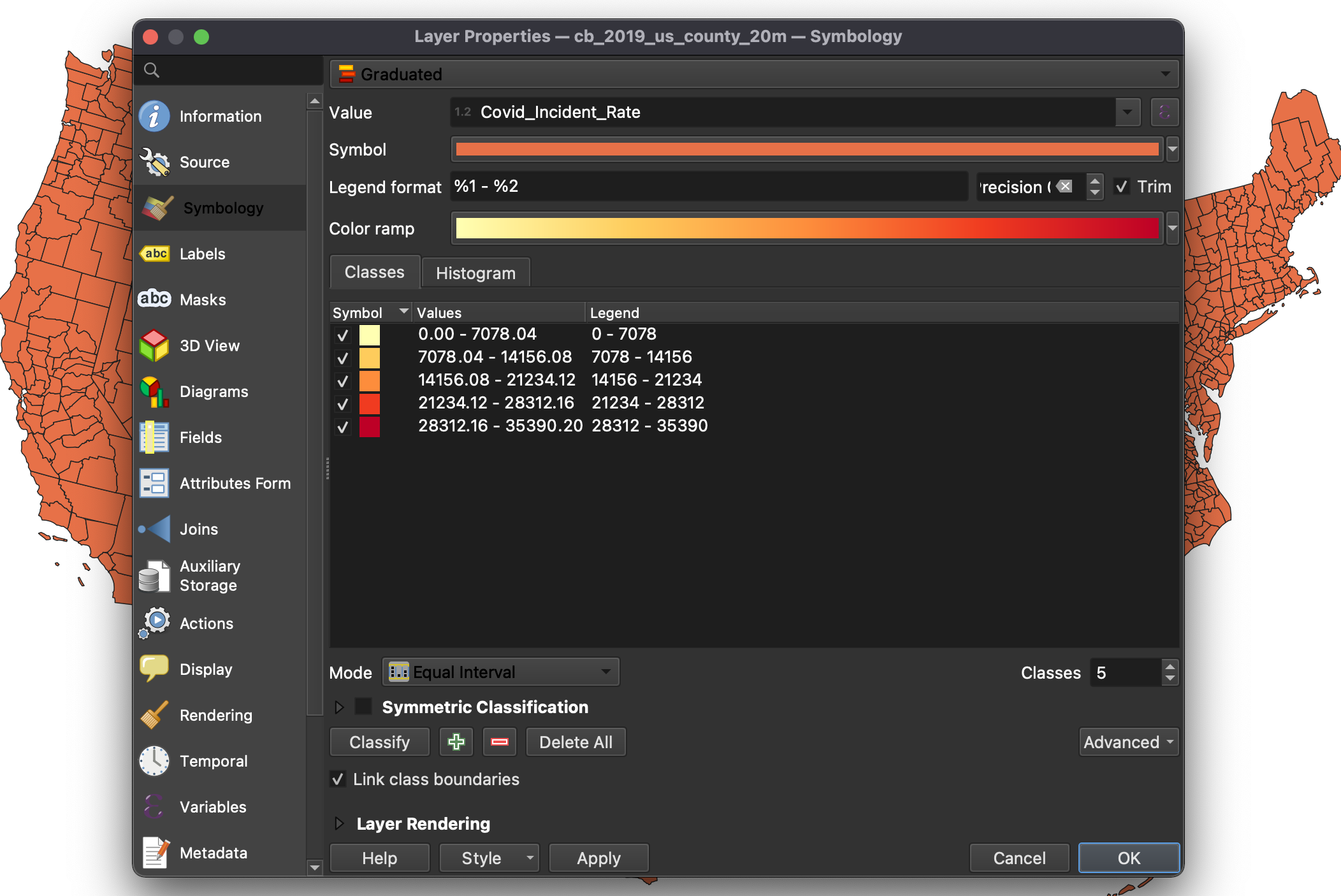
-
Once you hit
OKyou will notice that with this classification method the counties with the highest Covid-19 incidence rates appear red, but that the majority of other counties are all grouped into the two lowest groups. -
Open the
Symbologypanel again and click on theHistogramtab. Click onLoad Values. Here, you can clearly see how this classification method is creating the buckets for your data. As you can see, most of the values are somewhere below 14,000, and they are all grouped into just two buckets, whereas the top three buckets contain very few counties.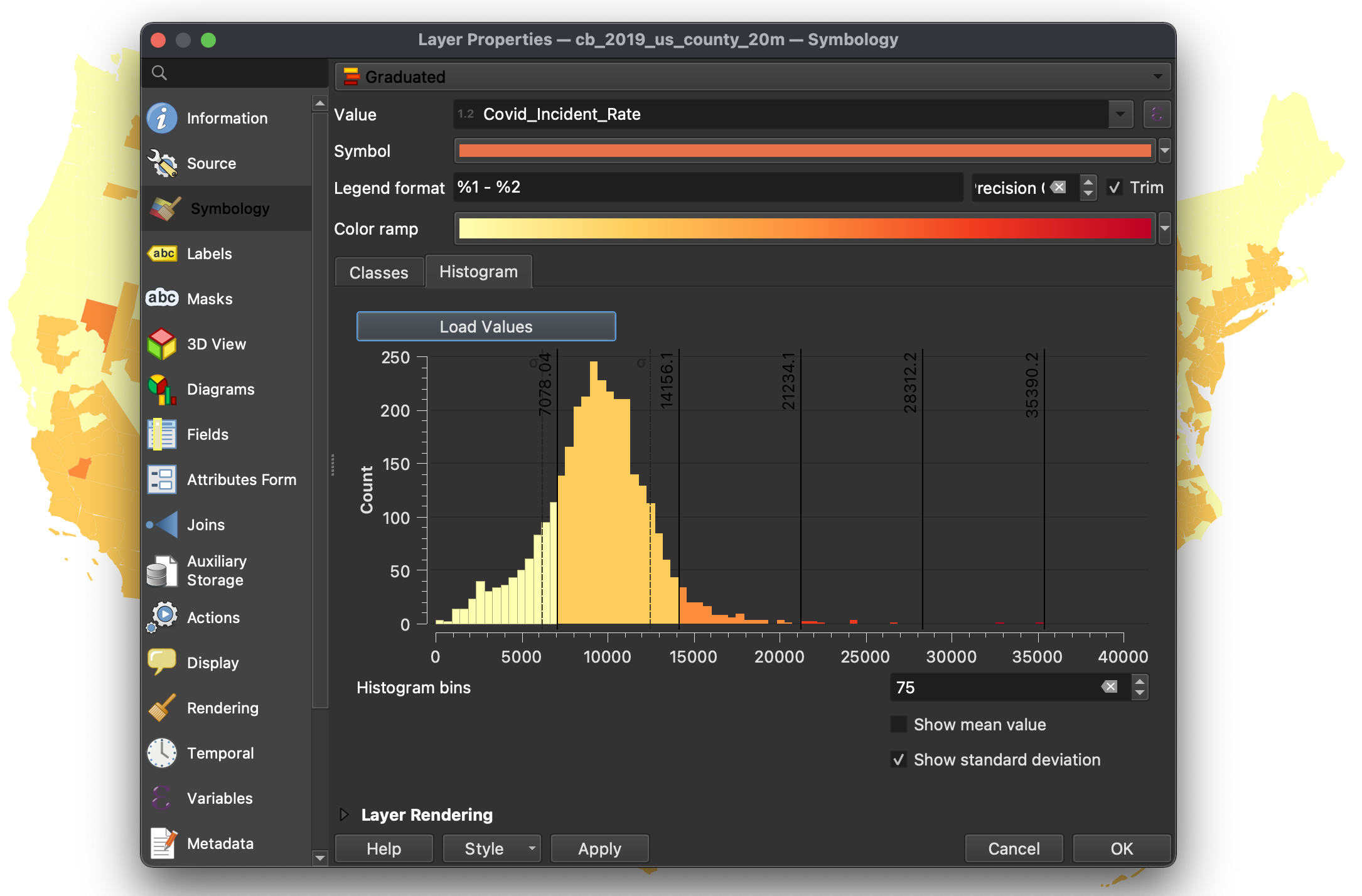
-
Go back to the
Classestab and change the classification method toNatural Breaks (Jenks). You might get a warning saying that this method could take a long time. If you have a large dataset you should be careful. However, the dataset that we are using is small enough. Once the classification is done, go to theHistogramtab. You can see how QGIS has now changed how it separated the data and most of the counties with lower incident rates are spread between the first three buckets. The Natural Breaks (Jenks) methods attempts to minimize the difference within groups while maximizing the difference between groups. Many datasets will be best classified using this method.
-
Click
OKso you see how the map is now much more nuanced and rich. You still see the counties with the highest rates but there is differentiation among the ones with lower rates too. -
Other methods of classification include Quantiles and Standard Deviations. Go ahead and explore them and see how they change our perception of the data on the map.
-
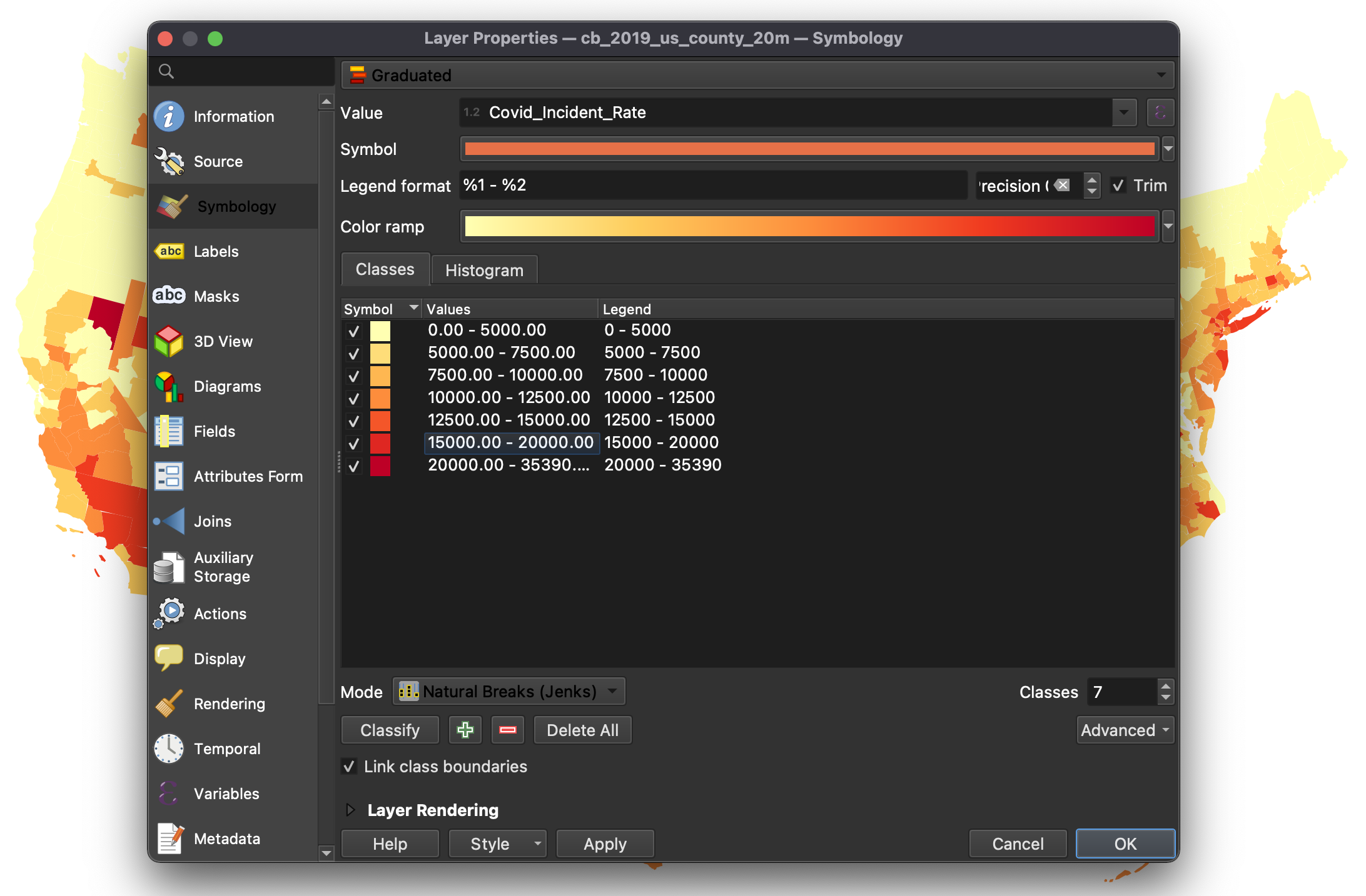
Finally, choose the Natural Breaks (Jenks) method. To add a bit more detail to the map, increase the number of classes to
7. This will add a few more buckets. However, note that increasing the number of classes by more than 8 doesn’t yield that much benefit as our eyes can’t really differentiate that well between too many shades of similar colors. -
The last step is to adjust a bit the values to make them easier to understand. Double-click on each row and change the value to the following:
-
0 - 5000
-
5000 - 7500
-
7500 - 10000
-
10000 - 12500
-
12500 - 15000
-
15000 - 20000
-
20000 - 35390 (or whatever the maximum value is)
-
-
Click
OKto close the properties panel.
Adding Labels
We will use the US states layer to add some labels to our map.
-
First, double-click on it to open its properties.
-
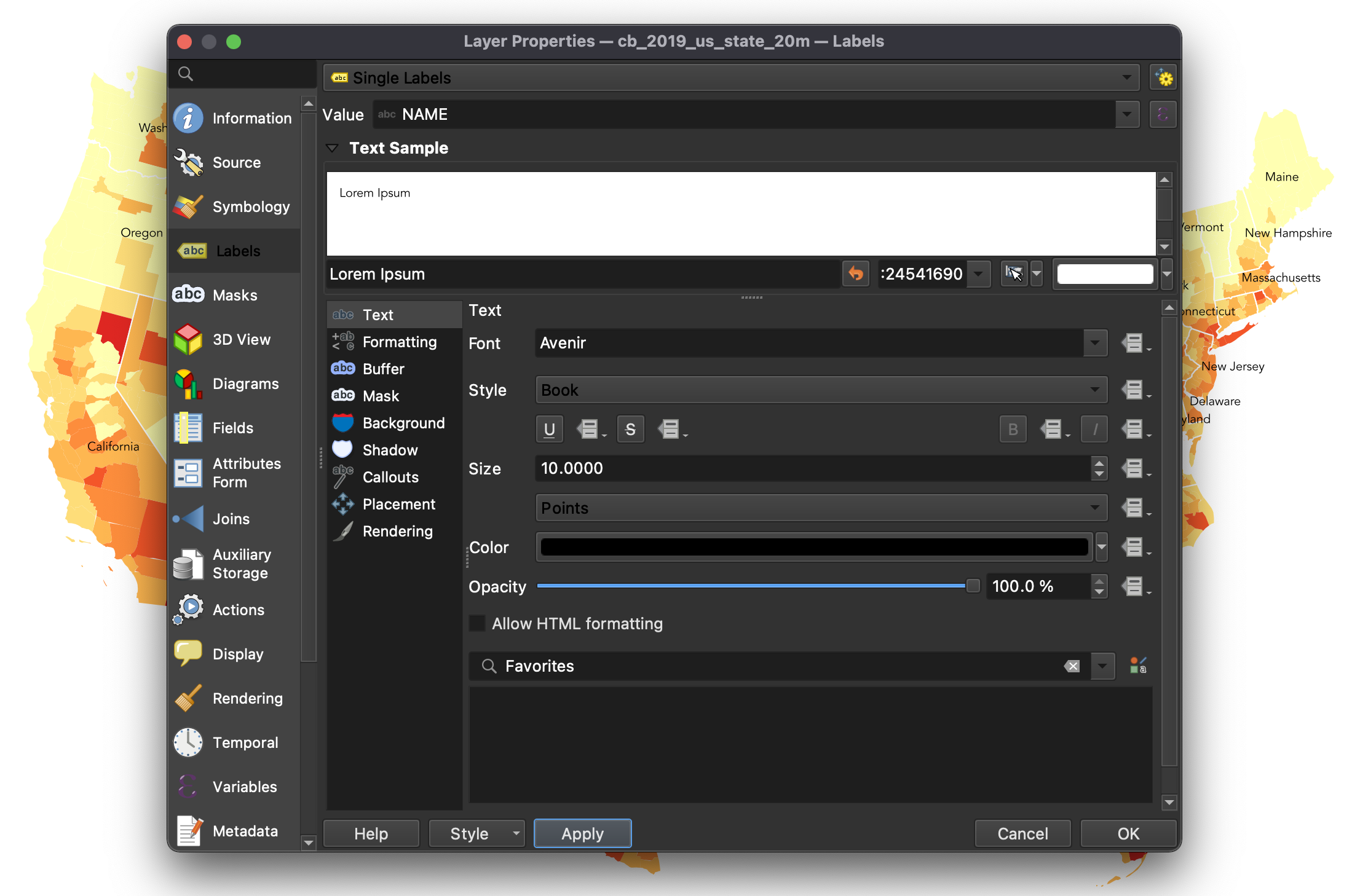
Under the
Labelstab chooseSingle labels. And underValuechoose theNAMEcolumn. -
Under
Text, select the appropriate font. In our case we are usingAvenir
- Click
OKto close the properties panel.
Print Layout
The Print Layout (formerly known as Print Composer) is where you will format your map for its final output. Here you will specify the output size, you will add a legend, a scale bar (if needed), a north arrow (if needed) and any additional text (titles, sources, explanations and credits). Although the Print Layout exists as its own window it will still be linked to the map Project we have been working on.
-
First, create a new
Print LayoutinProject,New Print Layout. Give it a custom name if you want, although this is not necessary. -
Once you are in the
Print Layoutyou need to add a new map. Think of it as if you had a blank piece of paper and you were adding a window onto the map you’ve been working on. That window is a link to yourProjectand if you change things in theProjectthose changes will still be reflected in thePrint Layout. -
To add a new map, click on the button
Add new mapon the left-hand panel and draw a rectangle on the blank page.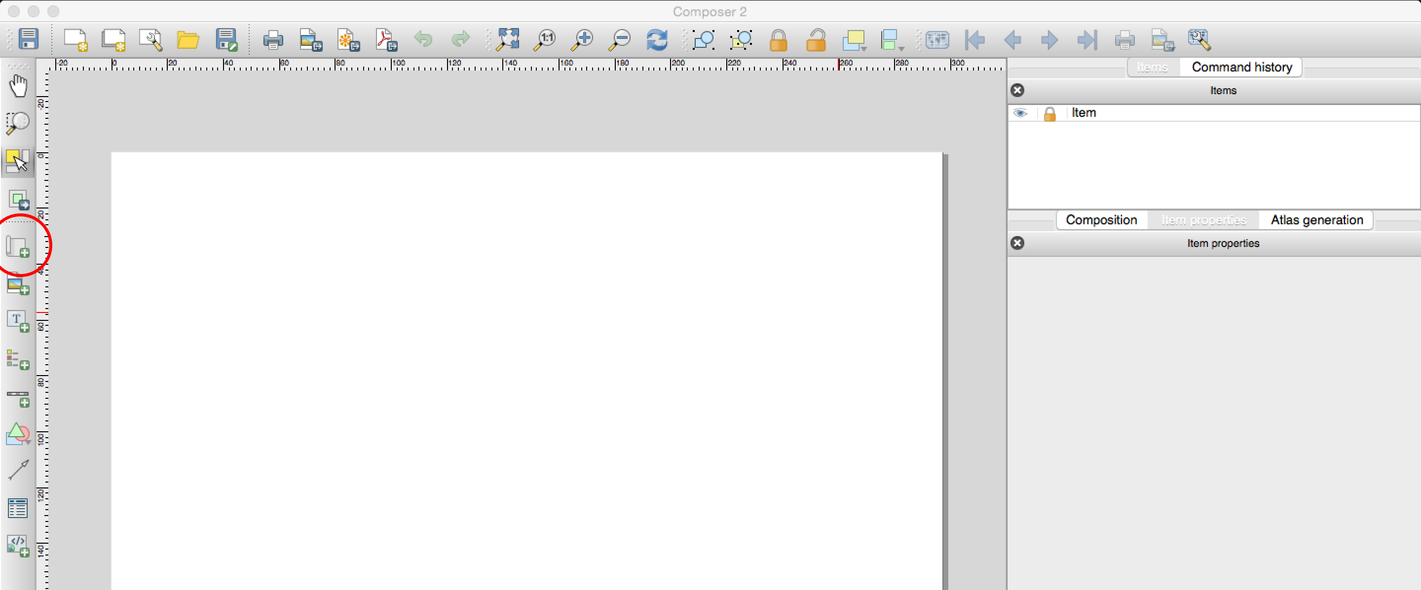
-
Once you add the map you can adjust its size and position by dragging it from its corners.
-
You might notice that if you change the size of the map it doesn’t necessarily update. To avoid this, on the right-hand panel, where it says
Main properties, click onUpdate preview. -
To move the content inside the
Print Layout(as opposed to the whole page) use theMove item contenttool on the left-hand panel. -
Next, you need to center and zoom in the map on the area you want to focus on. After you’ve centered the map adjust the scale by typing the desired value (
18000000) on the right-hand panel, underMain properties/Scale. -
If any of the colors or line weights seem too big or two small or not correct, you can always go back to the
Projectand change them there. When you return to your Print Layout you can update your preview and the changes will be reflected.-
Currently, the label font seems too large. Go back to the
Projectand set it to8points. -
Once you return to the
Print Layoutclick on theUpdate Map Previewbutton on the right-hand panel (the circle arrows) to refresh the map and see the changes.
-
-
Since this is a national map not made for measurements we don’t really need a scale bar or a north arrow. If you were to add them you would do so by clicking on their buttons on the left-hand panel and placing them on the map.
-
To add a legend click on
Add ItemAdd legendand then click on the map. You will notice that QGIS automatically generates a line in the legend for every layer in the map. We only need the Covid-19 one, so we need to customize the legend:-
On the right-hand panel, under Legend items uncheck
Auto updateand then select the layers that you don’t want in the legend and remove them with the ‘minus’ button. -
To hide the title of the layer right-click on it on the right-hand panel and select
Hidden. -
Next, let’s customize the actual values in the layer. Double-click on each value (on the right hand panel) and type the correctly formatted value. For most entries we suggest just adding the comma separators. For the last entry you can add a greater than (>) sign.
-
Under
Fontschange theItem fonttoAvenirwith a size of9points. -
Under
Symbolchange theSymbol widthto4.0 mm. -
And under
Spacingchange theLegend title/Space belowto0.00 mm, theSpace between symbolsto2.00 mmand theSymbol label spaceto1.5 mm. -
Finally, to make the background of the legend transparent go further down and uncheck the
Backgroundoption.
-
-
Since we did not rotate the map we don’t need to add a north arrow. If you rotate your map you should add a north arrow. If you wanted to, you could add a north arrow by clicking on
Add ItemAdd arrow. -
Finally, to add a title and a ‘source’ text, click on the
Add new labelbutton on the left-hand panel and click on the map. Customize these labels by changing their color, size and location. -
The last step is to export the map as a .pdf file. Use the
Export as PDFbutton on the top toolbar and save your map. -
Your final map should look something like this: