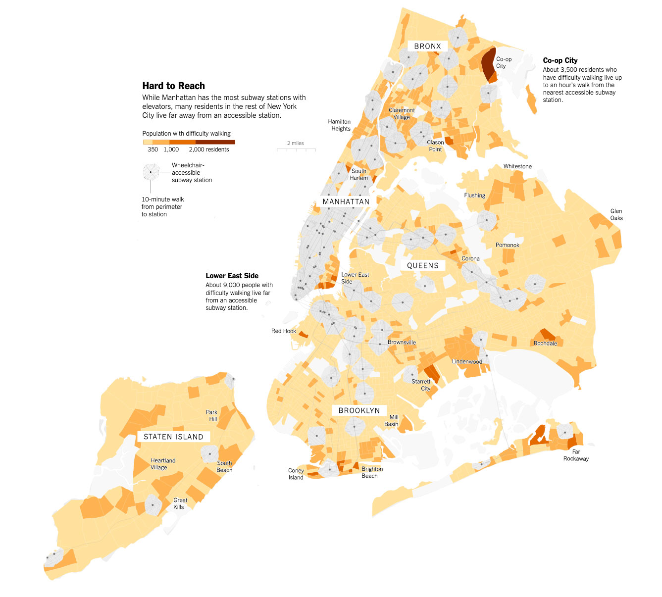
This tutorial is based on reporting/mapping by Jugal Patel of the New York Times (shown below) using data from the US Census Bureau and Openrouteservice.org. For the purposes of this tutorial, we will provide an alternative to Openrouteservice, as its functionality is limited. We will also provide additional analysis, estimating a proportional population found within each census tract outside (or partially outside) the 10-minute walking buffer.
In this tutorial, we will begin by importing various data that we will be operating on. After preparing the census data we will conduct the network analysis. Finally, we will estimate the population within walking distance of accessible subway stations by splitting the census tracts based on the results from our network analysis.
Datasets
To create these maps we will be using the following datasets:
-
American Community Survey - Table B99185 (Allocation of Ambulatory Difficulty for the Civilian Noninstitutionalized Population 5 Years and Over). Download from the U.S. Census Bureau FactFinder site.
-
American Community Survey - Table S0101 (AGE AND SEX). Download from the U.S. Census Bureau FactFinder site.
-
Census Tracts - New York State 2019 census tracts. Download from U.S. Census Bureau - Tiger/Line Shapefiles. Go down to the
Census Tractssection and chooseNew Yorkin the1:500,000 (state) shapefiledropdown menu. -
Boroughs - New York City boroughs. Download from NYC Planning - Open Data. Choose “Borough Boundaries (Clipped to Shoreline)”, under “Borough Boundaries & Community Districts”.
-
National Hydrography Dataset (NHD HU-4 Subregion). Download from the United States Geological Survey (USGS).
-
LION - A single line representation of New York City streets containing address ranges and other information. Download from nyc.gov.
-
NYC Subway stations. Download from the MTA.
A packaged file with the census and tract data can be found here. This assumes you will complete the generation of the Percentage of the population less than 5 years old or with ambulatory difficulties. map. A package of the already prepared map (with layers), is available here.
Importing/Prepping Data in QGIS
This tutorial builds largely upon the tutorial 2: Joins & Census Data. If you have time, it is strongly recommended to complete this tutorial before moving on to this tutorial. If you completed Tutorial 2, please open up your QGIS workspace from that tutorial. Otherwise, please download a package of the already prepared map (with layers), available here. Links to each of the datasets can be found above at the beginning of this tutorial.
Start by adding the following layers:
-
Borough boundaries
-
Hydrography
-
Census mobility data
-
Subway lines
-
Subway stations
-
LION database:
- For this one you will have to choose
Add vector layerand then underSource TypeselectDirectory. UnderSourceclick on theTypedropdown menu and chooseOpenFileGDBand then choose thelion.gdbfolder, but do not click into the folder, just highlight it and clickOpen.
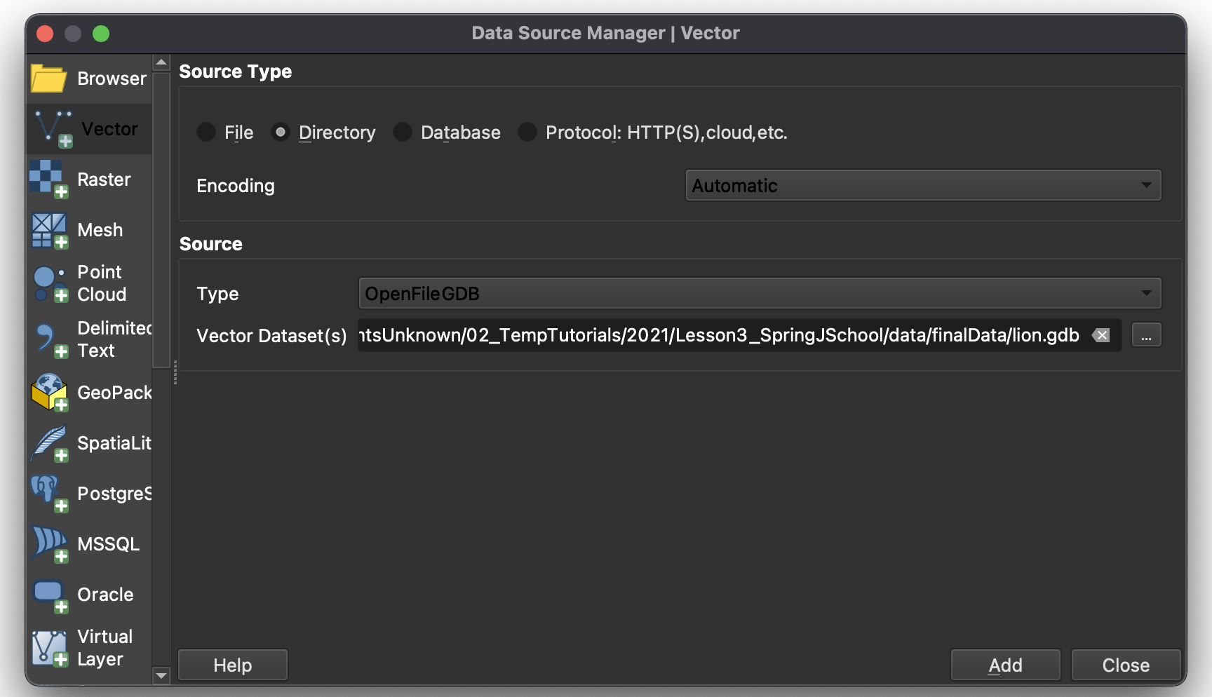
- Once the next window opens, choose just the
lionlayer and clickOK.
- For this one you will have to choose
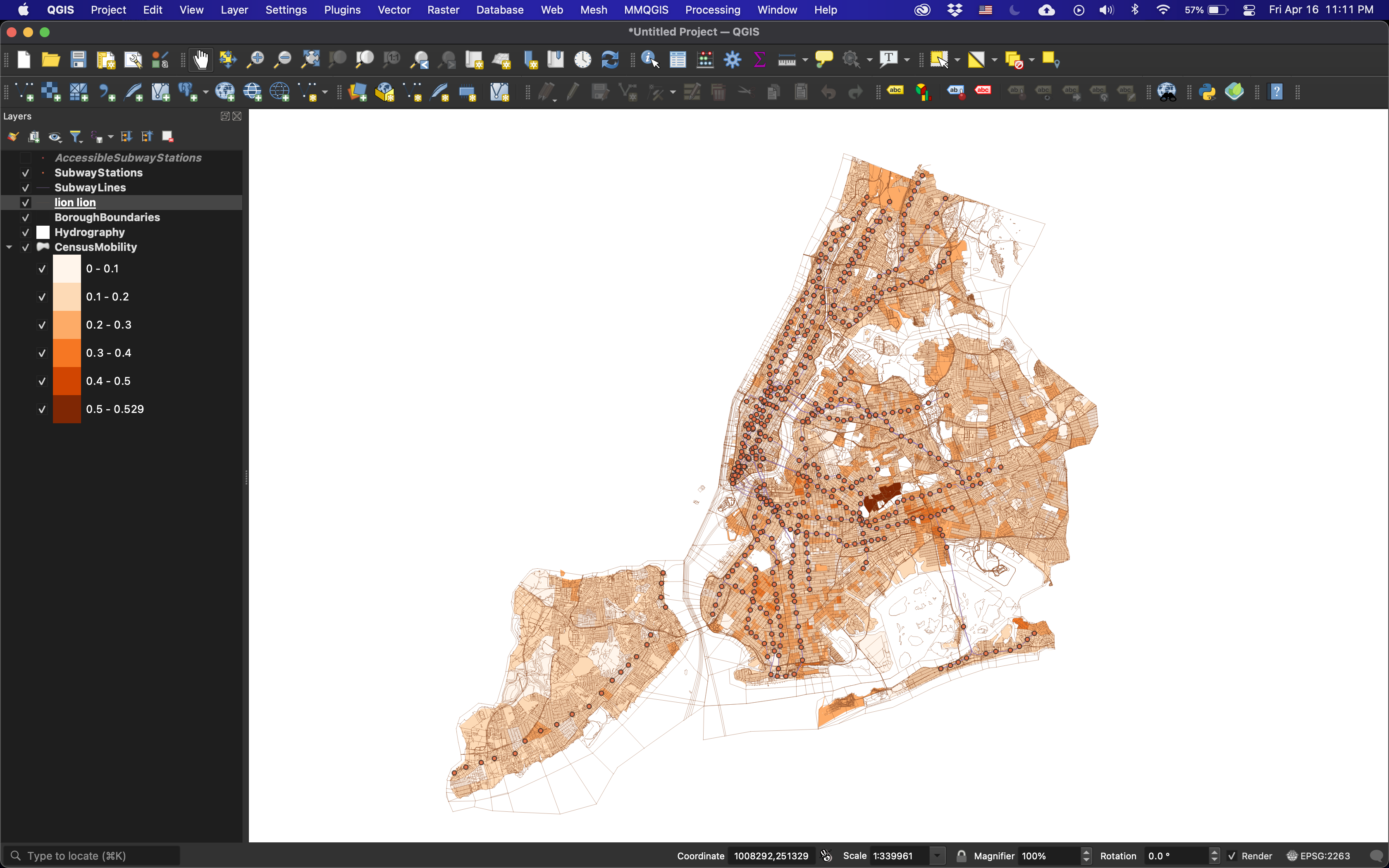
Upon adding each layer, be sure to rename them to names you understand. In this tutorial, we will generate over a dozen layers and coherent naming conventions will be critical in understanding which data layer you’re operating on.
Create the pedestrian network
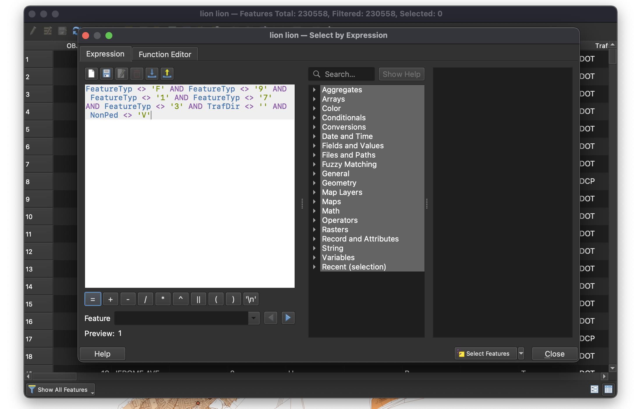
Once you have your workspace setup, begin by extracting the pedestrian accessible roads from the LION layer. Do this by opening the Attribute Table and clicking on the Select features using an expression button. You should always reference the metadata of the dataset to determine what query fields you have available to you. The LION metadata document can be found alongside the dataset at nyc.gov. The query to select pedestrian accessible roads is as follows: FeatureTyp <> 'F' AND FeatureTyp <> '9' AND FeatureTyp <> '1' AND FeatureTyp <> '7' AND FeatureTyp <> '3' AND TrafDir <> '' AND NonPed <> 'V'.
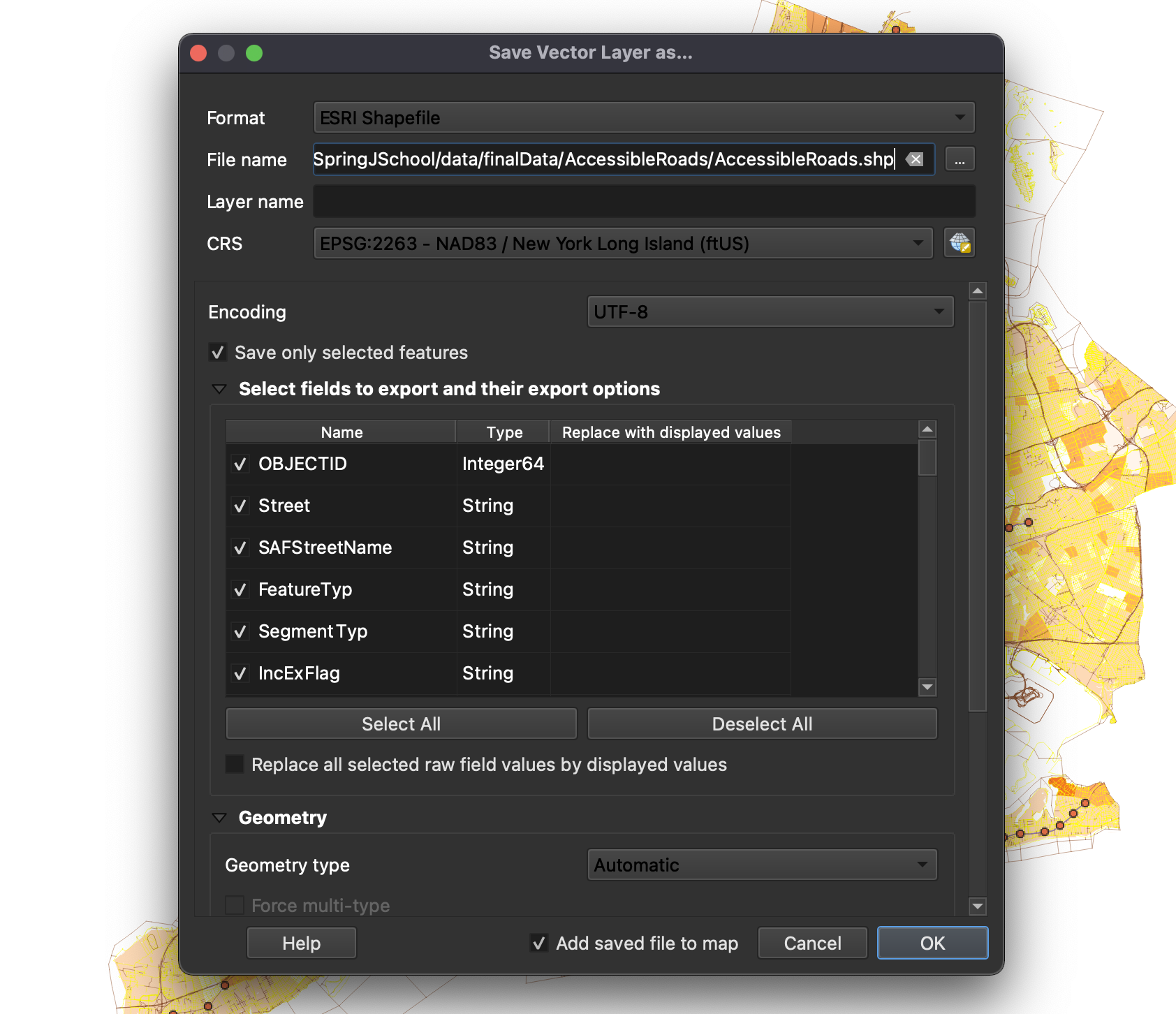
Once selected, save selected features by right-clicking on the LION layer and selecting Export / Save Selected Features As. In this window, save selected features as an ESRI Shapefile in your working directory. Make sure check the Save only selected features box is checked. In addition, make sure you save your file using the EPSG:2263 CRS.
Select the accessible subway stations
The next step is filtering out Subway and Staten Island Railway stations that are enhanced for the mobility impaired. To do so, open the attribute table for the SubwayStations layer and select only the accessible stations. Like the previous operations, use the Select features using an expression option found via the attribute table and enter "ADA" = 1 or "ADA" = 2. Once selected, save a new ESRI Shapefile using the selected features. Remember that a coherent naming convention is important, as we’ve already generated 5 new layers. For example, AccessibleMTAStations would be an accurate description of this layer.
Now we are ready to run some analysis on our data.
Performing Network Analysis
For this tutorial, we are attempting to identify census tracts that have high populations of individuals who are unable to use stairs or access subway stations without the assistance of an elevator or wheelchair accessibility. In addition to this population, we are including all minors under the age of 5 in our analysis, as they’re reliant on similar accessibility features for public services. To highlight these areas, we need to begin by identifying the buffer zones, or the road networks found within a 10-minute walk of the accessible subway stations.
In referencing the New York Times article, there are aspects of the mapping that can be more specific and can better represent the situation on the ground. To begin, we should always highlight how we are estimating any metric that isn’t already pre-defined. For example, the 10-minute walk is a somewhat arbitrary value–specifically how to measure distance over the course of 10-minutes. Thankfully, the U.S. Department of Transportation has a reference guide on calculating speeds of this sort. They indicate that for someone in a wheelchair, travel time in urban environments with crosswalks and stoplights is 1.1m/s. This translates to 66m/minute, or 660m/10 minutes. This is the metric we will use to calculate our buffer.
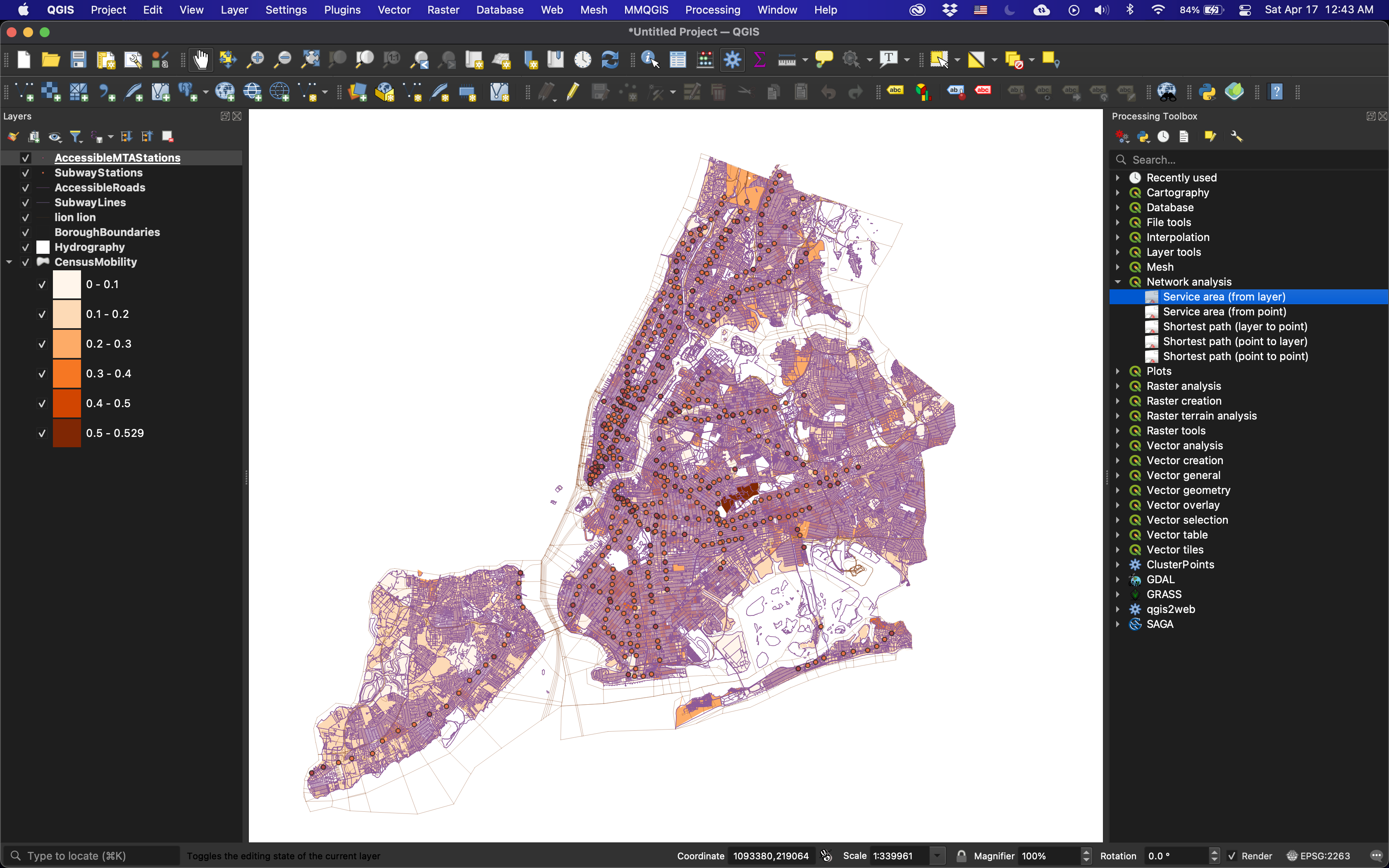
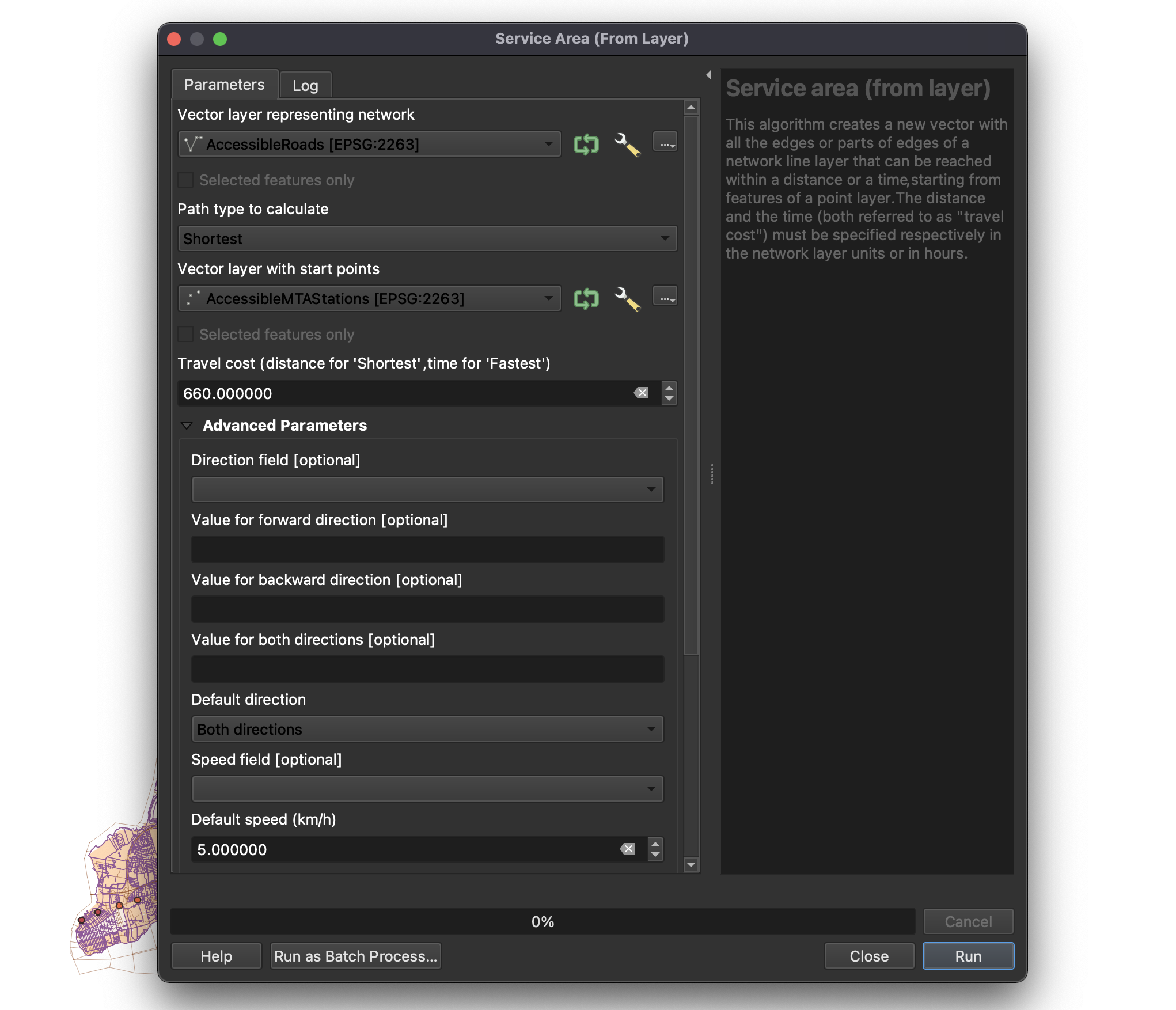
Navigate to Processing in the menubar and select Toolbox. Within the toolbox that appears on the right side of the workspace, expand Network Analysis and select Service Area from Layer. Here we will generate a service area, or a graph of streets from each accessible subway station based upon cost (time or distance). In our case, cost is equal to 660m. For the vector layer representing the network, select PedestrianNetwork and for the Vector layer with start points select AccessibleMTAStations. Set the travel cost to 660, and make sure that Path type to calculate is set to Shortest (distance) and not Fastest (time). In addition, change the Default speed (km/h) to 5.0. All other options can be left at their defaults. Select run, and let the algorithm process the network. This will generate a new temporary layer. Export this as an ESRI Shapefile and save it in your working directory.
Generating Bounding Geometry
After running network analysis on the AccessibleMTAStations the output is insufficient for the representation and future analysis that we’d like to conduct. To begin, we need to turn this network of roads into a polygon. To do so, we need to perform two operations.
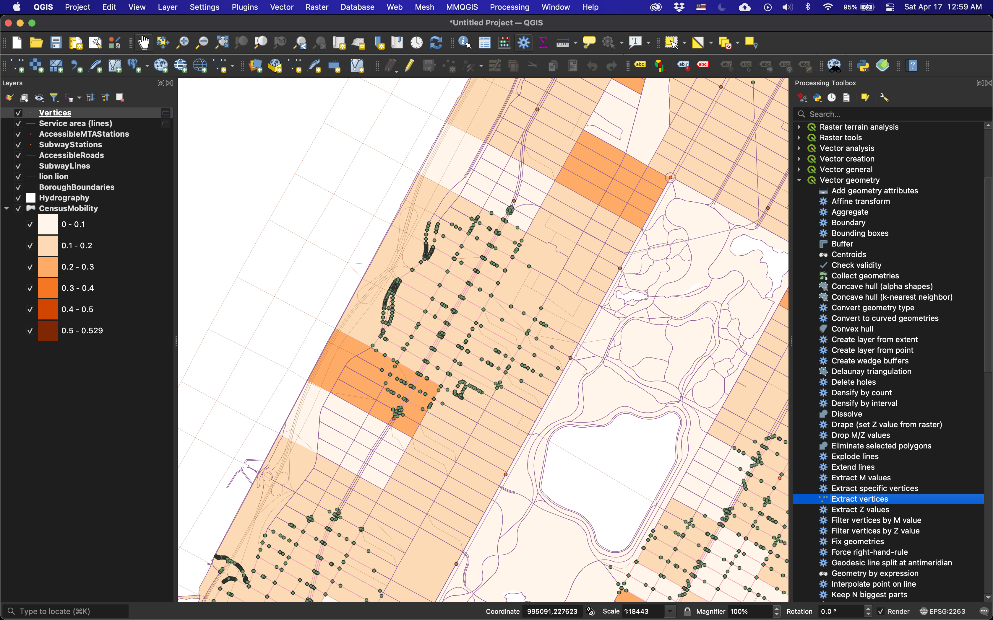
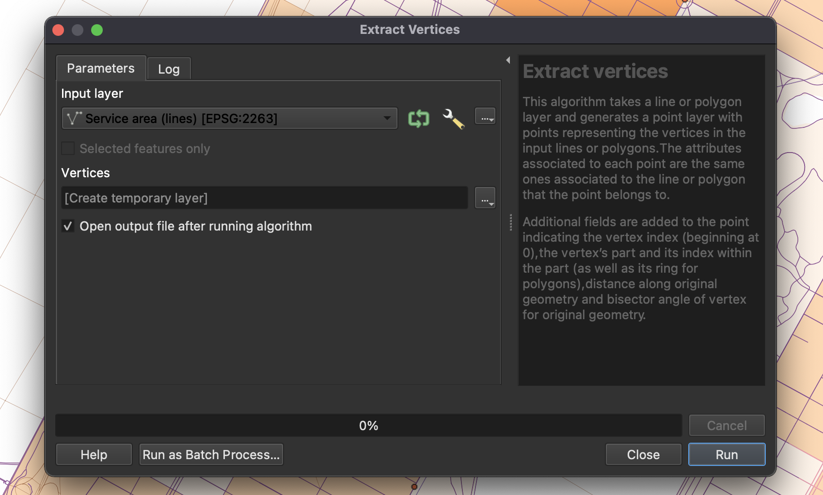
First, we need to generate vertices at each of the line (road) endpoints (nodes). To do so, navigate to the Processing Toolbox and expand Vector geometry. Select Extract vertices. In the algorithm parameter settings, set your input layer to the first of your network outputs (MTAServiceArea). Save the temporary vertices output file as a new ESRI Shapefile (MTAVertices).
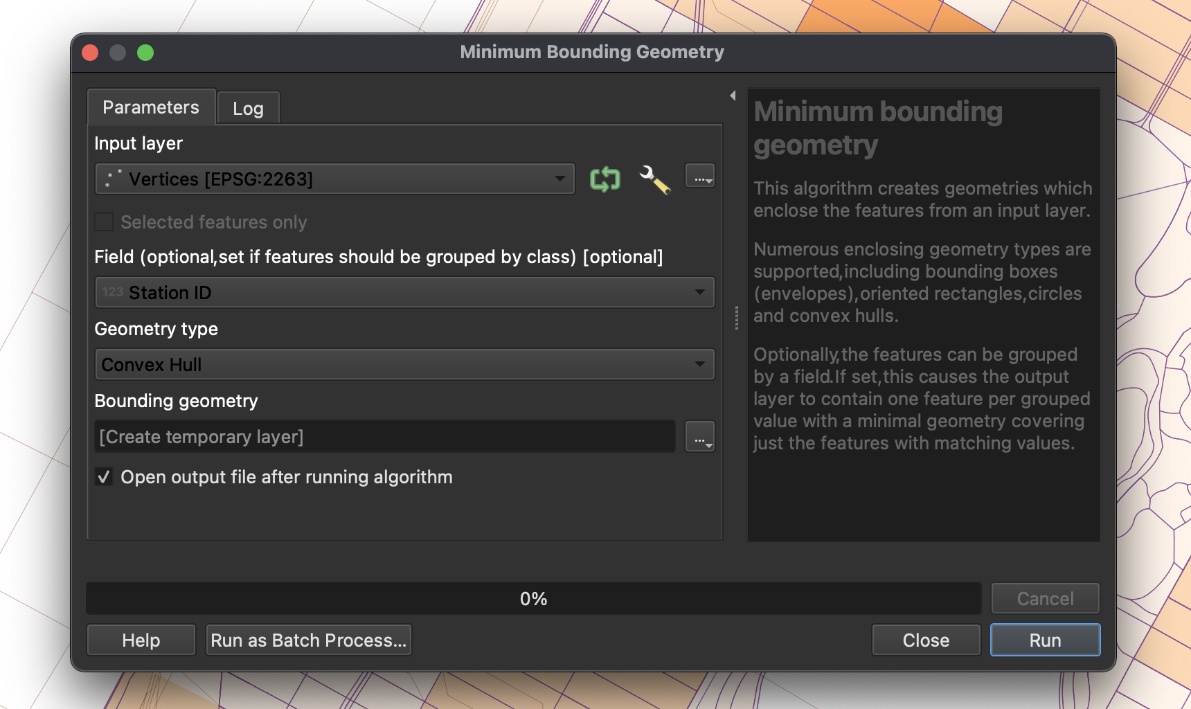
Now we are able to draw a polygon based on the newly generated vertices. Navigate to your Processing Toolbox and expand Vector geometry. Select Minimum bounding geometry. For your input layer, select Vertices and identify the field Station ID. This makes sure that the geometry is bound to the vertices of each subway station, not the collective set of vertices. For Geometry type, select Convex Hull. Once you run this process, it will again generate a temporary layer. Save this layer as a new ESRI Shapefile (MTAServiceAreaBoundary).
Now you’ve generated 10-minute walking buffers around each of accessible MTA Subway station, and it is a great time to clean-up your workspace, removing any layers that won’t be needed in our final analysis. A cleaned up workspace should include:
-
Borough boundaries
-
Hydrography
-
Census mobility data
-
Subway stations
-
Subway lines
-
Pedestrian road network (as generated from LION)
-
Service area boundary (as generated from our Vertices vector layer)
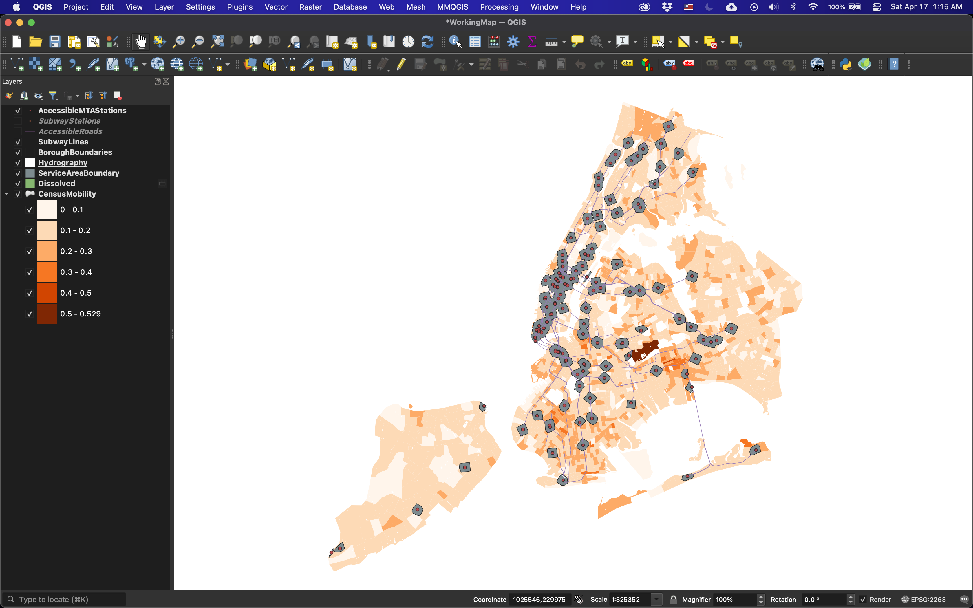
Using layer groups can help keep your workspace clean. Now we could style the map and be done, but this would result in a false picture of what the census tract populations actually are surrounding accessible subway/staten island railway stations.
Geoprocessing
To properly communicate areas in which there exists a high count of mobility impaired and minors under the age of five, it is important to conduct basic geoprocessing. For instance, the Service Area Boundaries intersect many of the census tracts. For this reason, we should not show their mobility impaired population as the total population in that census tract. Instead, we should try and come up with a more accurate estimate based on the proportion of area. If we had more time, we would allocate population by building outline via the PLUTO dataset, but we will use proportion of area for this exercise.
To begin, we need to add a new field to our Census mobility layer. To do so, open the Attribute Table and select Field Calulator. In the query field, enter the value $area. The field name should be set to Area and the field type should be set to Decimal Number (real). Once you select OK, each row will gain a column with a value set to its polygonal area.
Now, we need to calculate overlap of the Service Boundary Area on our Census Tract layer. To start, we need to generate a single polygon for all service boundary areas that overlap. To do so, navigate to your menubar and select Geoprocessing / Dissolve. Set your input layer to the Service Area Boundary layer (as generated from our Vertices vector layer). This will generate a new temporary layer. Save this as a new ESRI Shapefile.
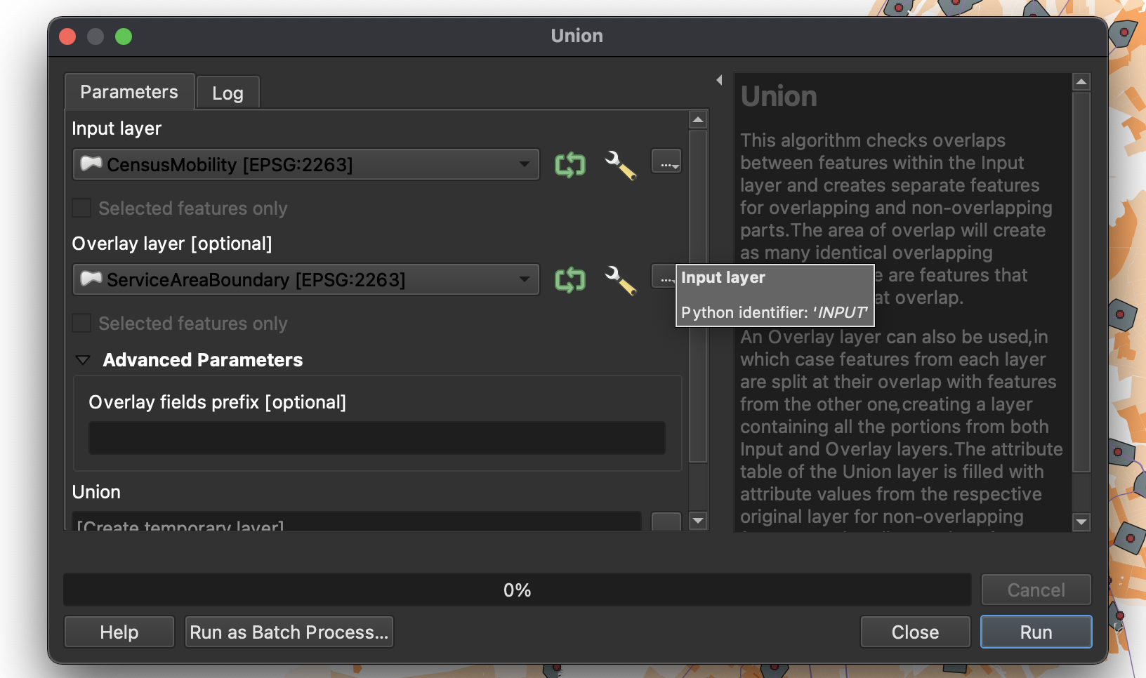
Now we will breakup our census tracts by overlaps from this newly generated ServiceAreaBoundary layer. Navigate to your menubar Vector / GeoProcessing Tools / Union. For your input layer, select your Census layer and for the overlay, select your Joined Service Area Boundary layer. Once you select run, this will generate a new temporary layer. Save this as an ESRI Shapefile, CensusSplitByBuffer.
Now we have the layers needed to run analysis that can generate an estimated population based on proportional area. To do so, open your attribute table of your newly generated Census layer and once again, navigate to the Field Calculator. Begin by navigating to the query field and entering the value $area. The field name should be set to NewArea and the field type should be set to Decimal Number (real). Once you select OK, each row will gain a column with a value set to its newly generated polygonal area based on the Union operation. In instances in which there was no overlap between the census tract and the buffer, the area will remain constant. Next, we will calculate the proportional population of the new area. To do so, once again enter the Field Calculator.
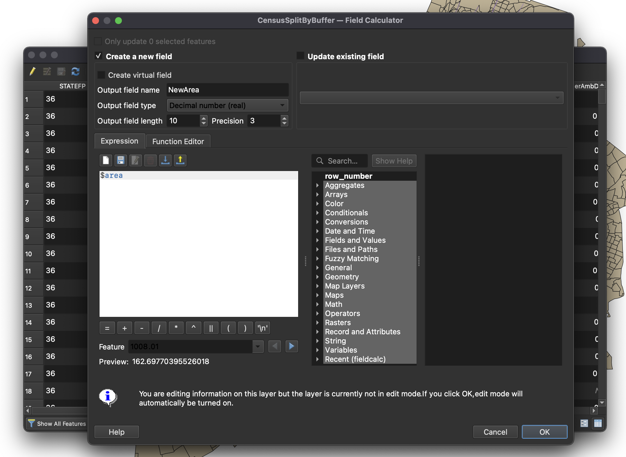
Create a new field labled NewImpPop and set it to Whole Number (Integer). In the query, enter the following equation: ("NewArea" / "area") * "TotDiff". This will generate a new impaired population based on the proportional area of space remaining after removing any buffer overlap. Exit out of the Attribute Table and be sure to save your changes.
Visualizing the Mobility Analysis
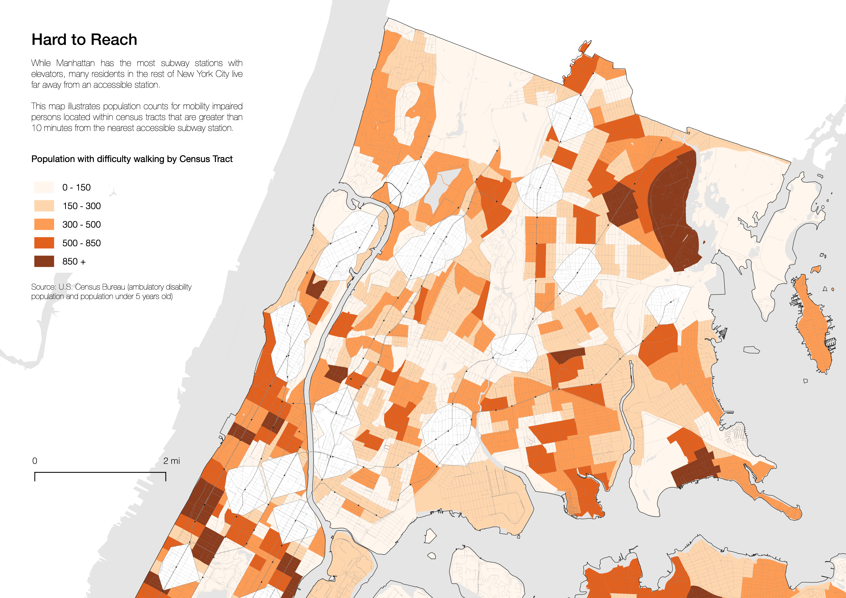
Now let’s visualize our map. Below are settings that produce a quality map that is more indicative to a reader where there populations affected by the MTA’s inadequate station access. Items are ordered as they should be layered, top to bottom, in QGIS.
-
MTA Stations: Simple Marker, .5mm, #000000, No Pen Stroke
-
Transit Lines: Simple Line, .2mm, #888888
-
Borough Boundaries: Simple Fill, No Fill, Stroke width .15mm, #000000
-
Hydrography: Simple Fill, #ffffff, No Stroke
-
Pedestrian Roads: Simple Line, .05mm, #888888
-
Service Area Boundary: Simple Fill, #ffffff, .1mm Dashed Line
-
Census Data: Graduated Ramp, Color Method, Oranges, Trim, Column: New Population:
-
0-150: Simple Fill, #fff5eb, 90% Opacity, No Pen
-
150-300: Simple Fill, #fed2a6, 90% Opacity, No Pen
-
300-500: Simple Fill, #fd9243, 90% Opacity, No Pen
-
500-900: Simple Fill, #df4f05, 90% Opacity, No Pen
-
900+: Simple Fill, #7f2704, 90% Opacity, No Pen
-