This tutorial is based on reporting/mapping Marie Patino and Jackie Gu of the Bloomberg, with analysis by by Judith Chevalier, Jason Schwartz and colleagues. The story makes use of data from the USDA, the Georgia Department of Public Health, the US Census Bureau and Openrouteservice.org. For the purposes of this tutorial, we will provide pre-generated 10-minute driving buffers through Openrouteservice, as its API has strict query limits that would take the duration of the tutorial.
In this tutorial, we will begin by importing various data that we will be operating on. We will then conduct network analysis, analyzing the drive.
Datasets
To create these maps we will be using the following datasets:
-
Georgia Vaccination Sites - A geocoded csv is provided by the Brown Institute. These sites were scraped from the Georgia Department of Public Health and documentation for how the scraping and geocoding was performed (using Python) can be found in the following Colab Notebook.
-
Social Vulnerability Index (tract level). Download from the CDC Agency For Toxic Substances and Disease Registry.
-
US States - United States States File. Download from U.S. Census Bureau - Cartographic Boundaries Files. Select
National FileandShapefile, to download the file. THen filter down to the state folder. -
United States Hydrographic Polygons. Download from the Columbia University Libraries Geodata portal. Download the
Original Shapefile. -
A pre-generated shapefile of 10-minute drives from each Dollar Tree and Dollar General store in the United States.
-
A pre-generated shapefile of 10-minute drives from each vaccination site in the state of Geoergia.
A packaged file with the census and block group data can be at brwn.co/ws3-data. A package of the already prepared map (with layers), is available at brwn.co/ws3-complete.
Importing/Prepping Data in QGIS
This tutorial will largely build on point data relating to dollar stores in the state of Georgia, US geography filtered down to the state of Georgia, and vaccination sites from the Department of Health in the state of Georgia. Please import the following files to get started:
-
US States Geography (Shapefile)
-
Social Vulnerability Index (Shapefile)
-
Georgia Vaccination Sites (csv)
-
SNAP Retailers (csv)
Upon adding each layer, be sure to rename them to names you understand. In this tutorial, we will generate a lot of layers and coherent naming conventions will be critical in understanding which data layer you’re operating on.
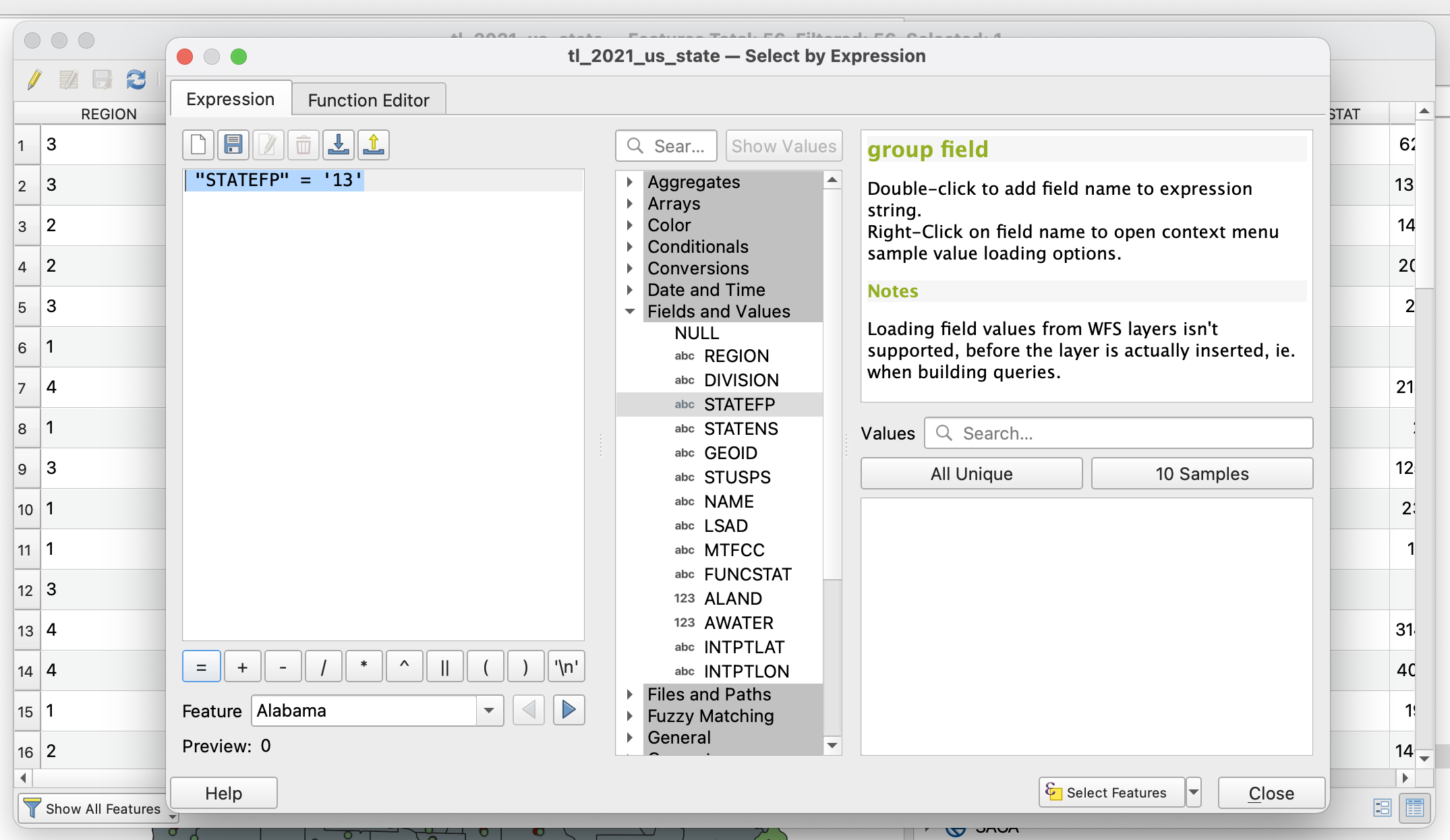
Once you have your workspace setup, begin by filtering your geography down to state level geography. To do this, begin by filtering down your states file. Once you have selected the tl_2021_us_state layer, open the attribute table and navigate to the Select Features using an Expression. In the filter, write the following query: "STATEFP" = '13' and hit apply.
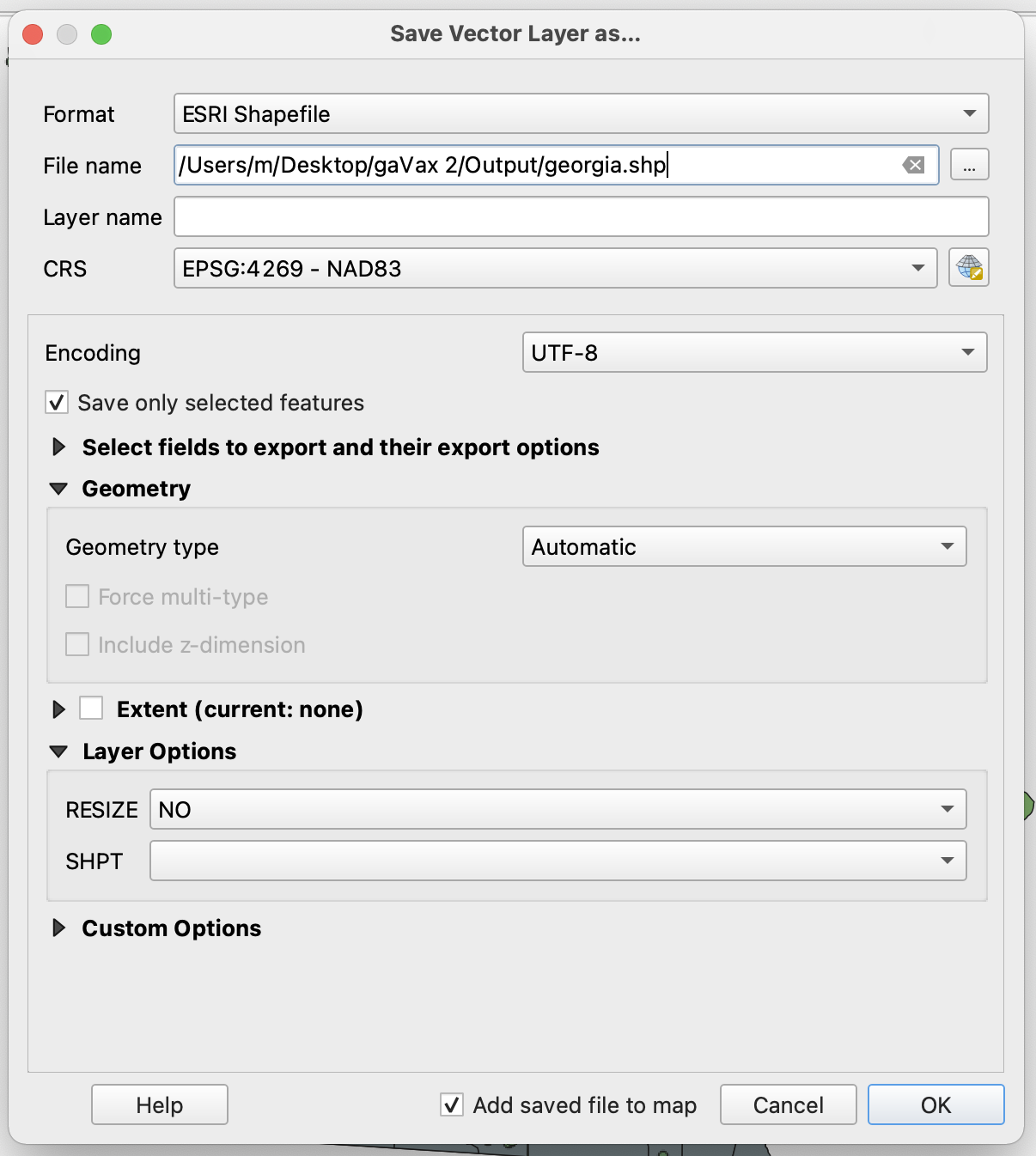
Save selected features by right-clicking on the tl_2021_us_state layer and select Export -> Save Selected Features As. In this window, save selected features as an ESRI Shapefile in your working directory.
Similarly, we will now select Georgia counties from the cb_2019_us_county_5m layer. This requires the same argument: "STATEFP" = '13'. Once selected, Save selected features by right-clicking on the cb_2019_us_county_5m layer and selecting Export -> Save Selected Features As. In this window, save selected features as an ESRI Shapefile in your working directory.
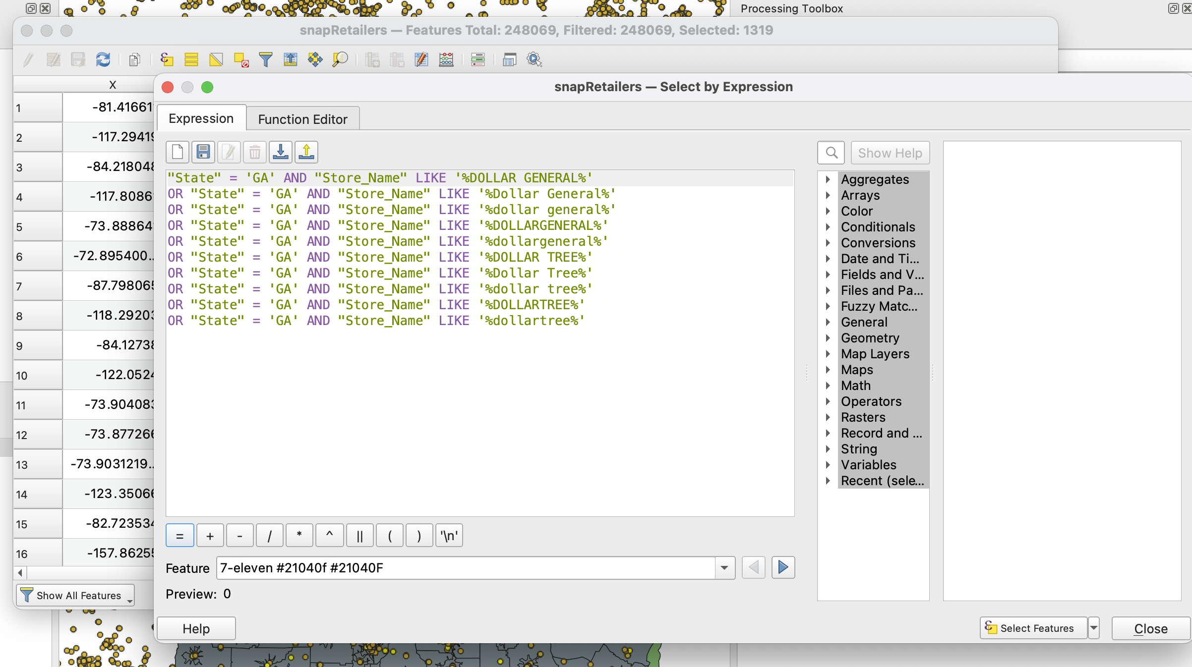
The next thing we want to do is filter down the SNAP retailer sites down to Dollar Tree and Dollar General stores. This requires a more complicated query, because the data isn’t clean. We could write a complex regex filter, but we will save that for a more advanced class. Instead, we will use the LIKE query in the expression builder.
Our goal here is to identify these stores, despite their listings including titles like Dollar Tree, DOLLAR TREE, dollar tree, DOLLARTREE and dollartree. So let’s use the following filter to capture all of these:
"State" = 'GA' AND "Store_Name" ILIKE '%DOLLAR GENERAL%' OR "State" = 'GA' AND "Store_Name" ILIKE '%DOLLARGENERAL%' OR "State" = 'GA' AND "Store_Name" ILIKE '%DOLLAR TREE%' OR "State" = 'GA' AND "Store_Name" ILIKE '%DOLLARTREE%'
Once selected, Save selected features by right-clicking on the snapRetailers layer and selecting Export -> Save Selected Features As. In this window, save selected features as an ESRI Shapefile in your working directory.
Now we are ready to run some analysis on our data.
Performing Network Analysis
For this tutorial, we are attempting to identify areas within a 10-minute drive both of the Georgia vaccination sites as well as areas within a 10-minute drive of dollar stores (Dollar General and Dollar Tree). To do this, we need to generate isochrones, which are buffers in the form of polygons that are generated using an external routing engine. We could build our own network if we imported streets and highways, or we can use a prebuilt network and outsource all processing. In this instance, we will do that, making use of the OpenRouteService API. To do this, we need to install a new plugin, ORS Tools.
Important to note, OpenRouteService only allows for a set amount of queries per minute. Since we have ~1300 dollar stores and 300+ vaccination sites, we will only try out OpenRouteService on a small subset to show you how the plugin works. We will then load into QGIS a pre-generated set of isochrones for both vaccination sites and dollar stores.
Generating Isochrones
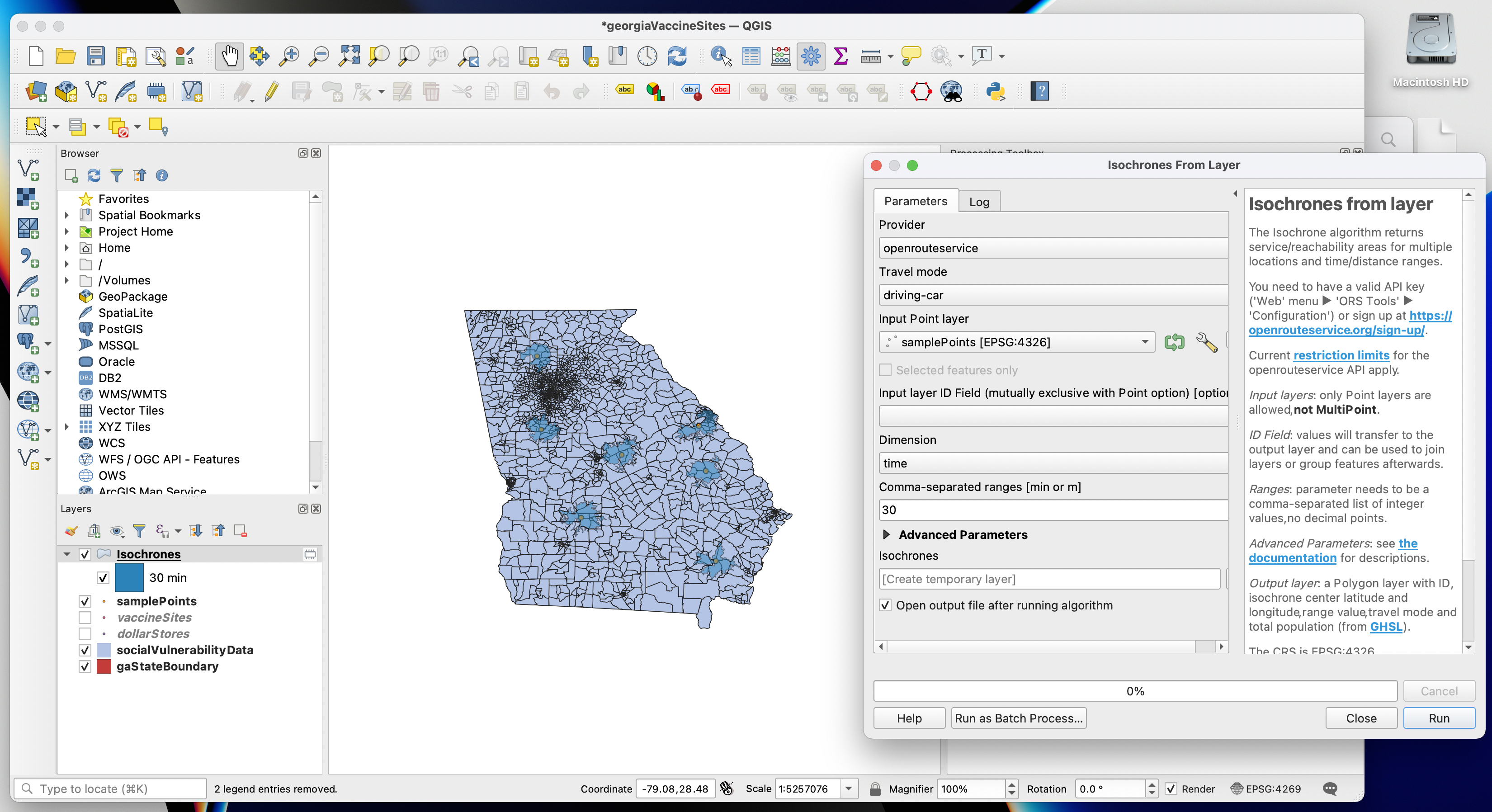
To generate isochrones on a new layer of points, begin by importing our sample point data shapefile. Next, click on the ORS Tools icon in the upper toolbar. Click on the cog wheel to add the API key you generated in your OpenRouteService account.
Now that your API key has been added, navigate to the Processing menu bar and select Toolbox. In the Processing Toolbox that will now be visible on your screen, expand the ORS Tools panel and then expand the Isochrones subfolder. Now, select Isochrones from Layer.
In this example, I know we are going to work with 10-minute driving isochrones around vaccination sites and around dollar stores. So for our test, I’ll generate 30-minute driving isochrones. This is how the parameters read for that operation, and what their output is.
Importing our Isochrone Files
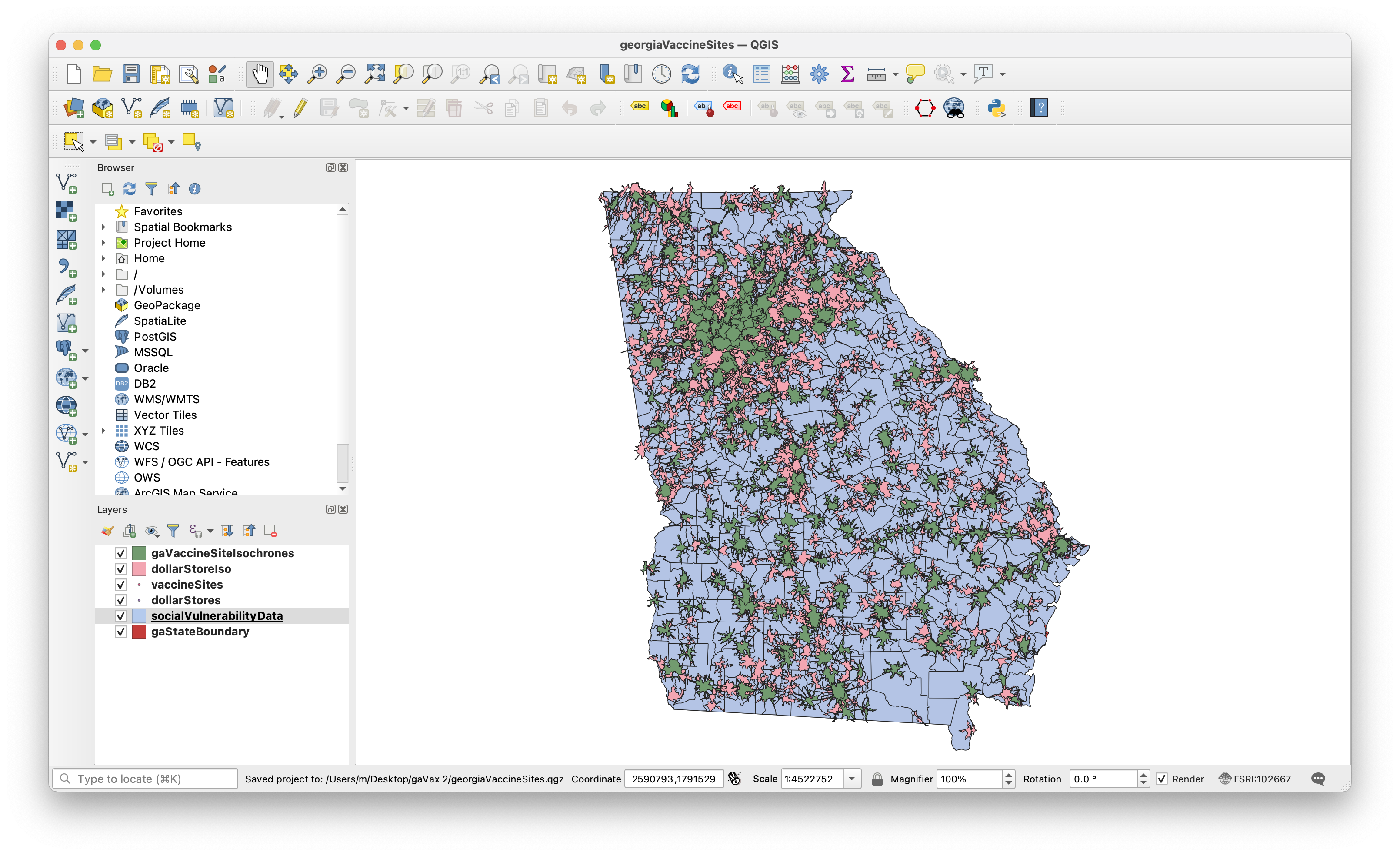
Now that we know how OpenRouteService works, let’s import the full isochrone shapefiles both for vaccination sites and dollar stores.
Last, let’s set our CRS to the NAD 1983 State Plane Georgia East (102667). Our workspace should look something like this:
Geoprocessing
To properly communicate the population that is within a 10-minute drive of dollar stores but outside of a 10-minute drive from the nearest vaccination site, we will need to conduct basic geoprocessing. To calculate population numbers, we willl need to first determine where the Service Area Boundaries intersect the census tracts. We should not show the total population of the census tract, but instead we should try and come up with a more accurate estimate based on the proportion of area.
First, we need to merge our polygons in both the vaccine site isochrone layer and the dollar store isochrone layer. Then, we need to find the difference between the two layers.
To begin, let’s flatten the isochrone layers by navigating to Vector -> Geoprocessing Tools -> Dissolve. Begin by doing this for the vaccination site isochrone. Then save the layer to permanent and repeat the process for the dollar store isochrones.
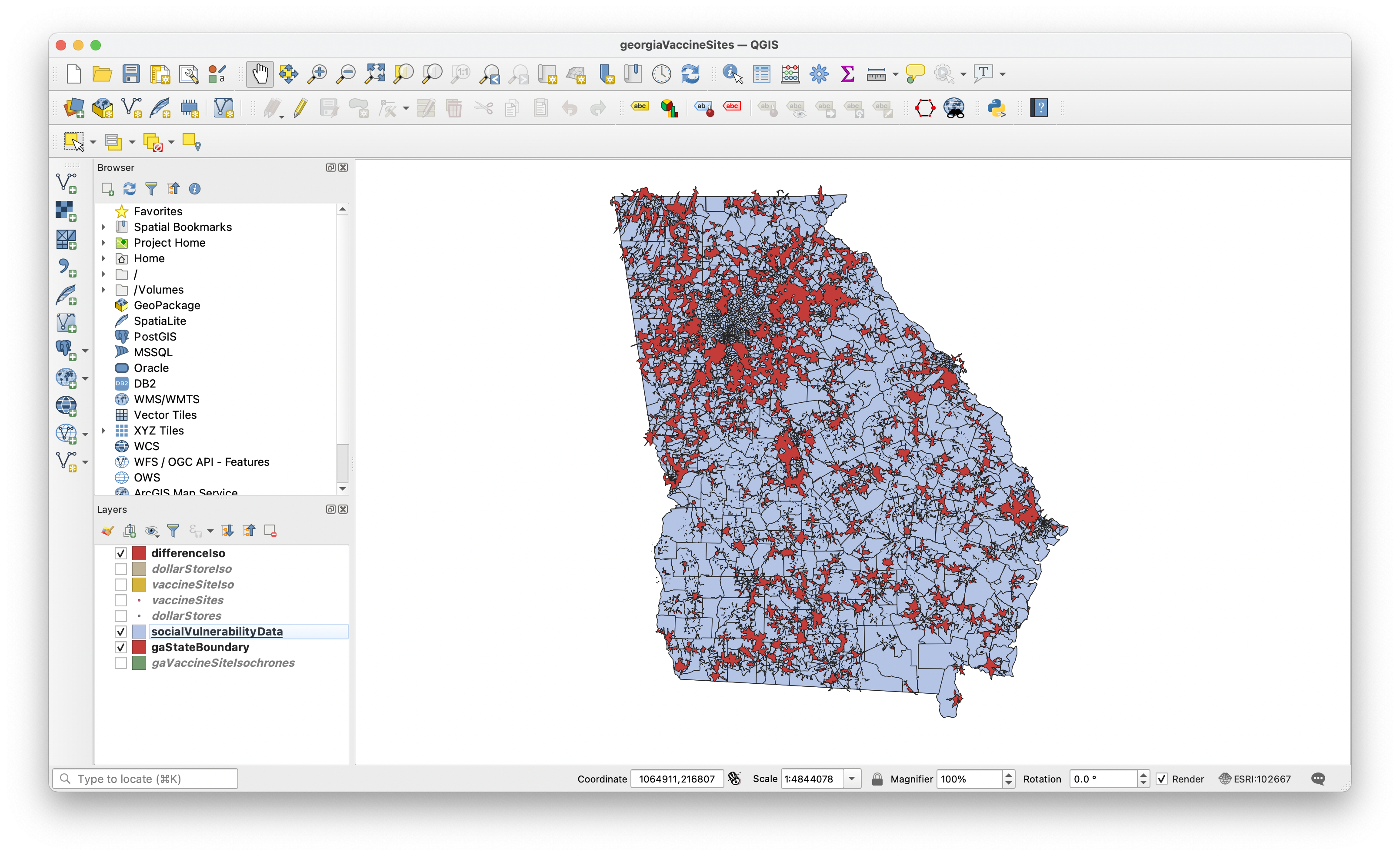
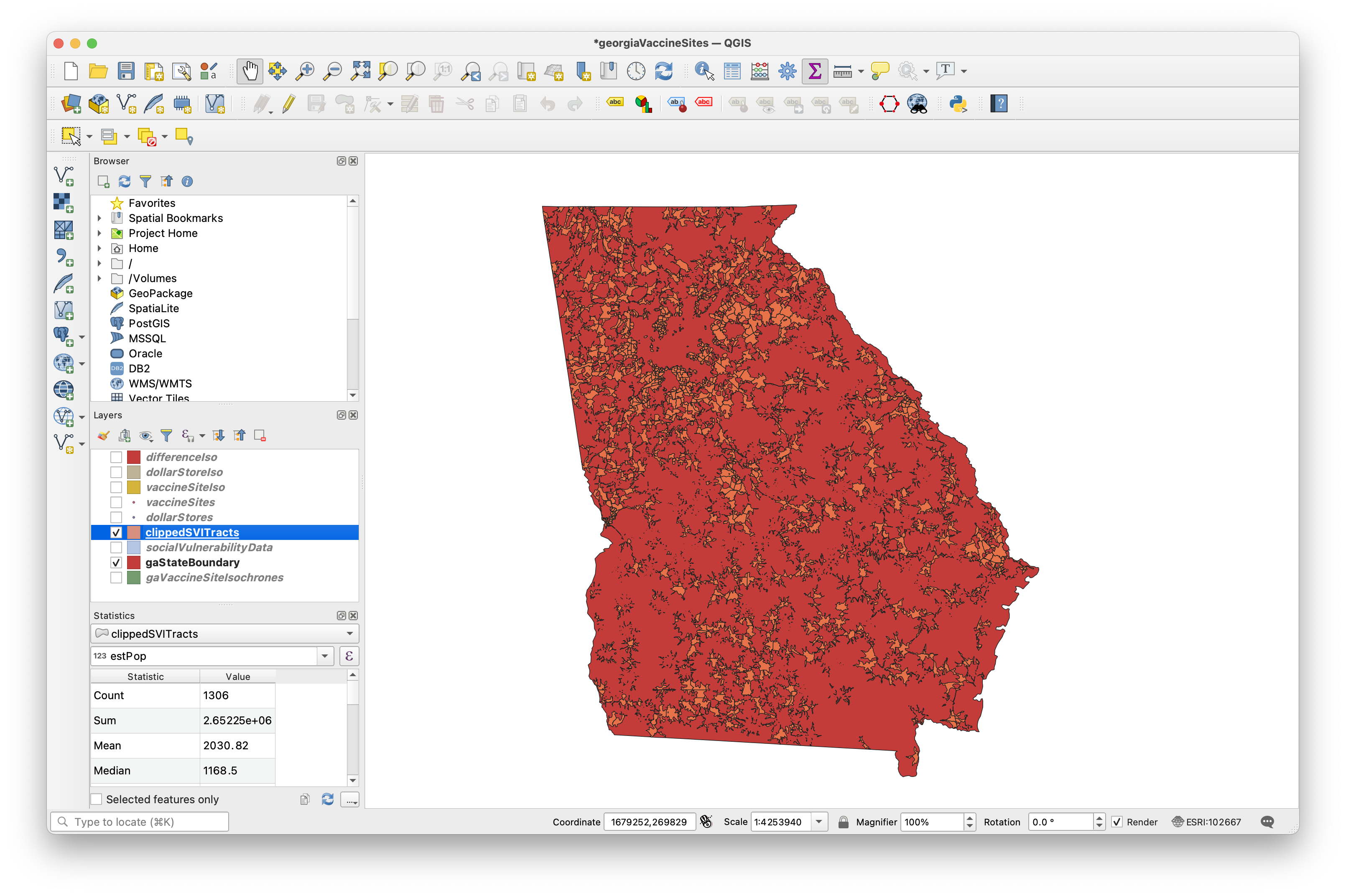
Next, we need to identify all of the areas that are within a 10-minute drive of dollar stores but outside the 10-minute drive of vaccinations sites. To do this, navigate to Vector -> Geoprocessing Tools -> Difference. Select the dollar store dissolved isochrone as the input layer and the dissolved vaccine site isochrone as the overlay layer.
Your workspace should now look something like this:
Calculating Population Statistics
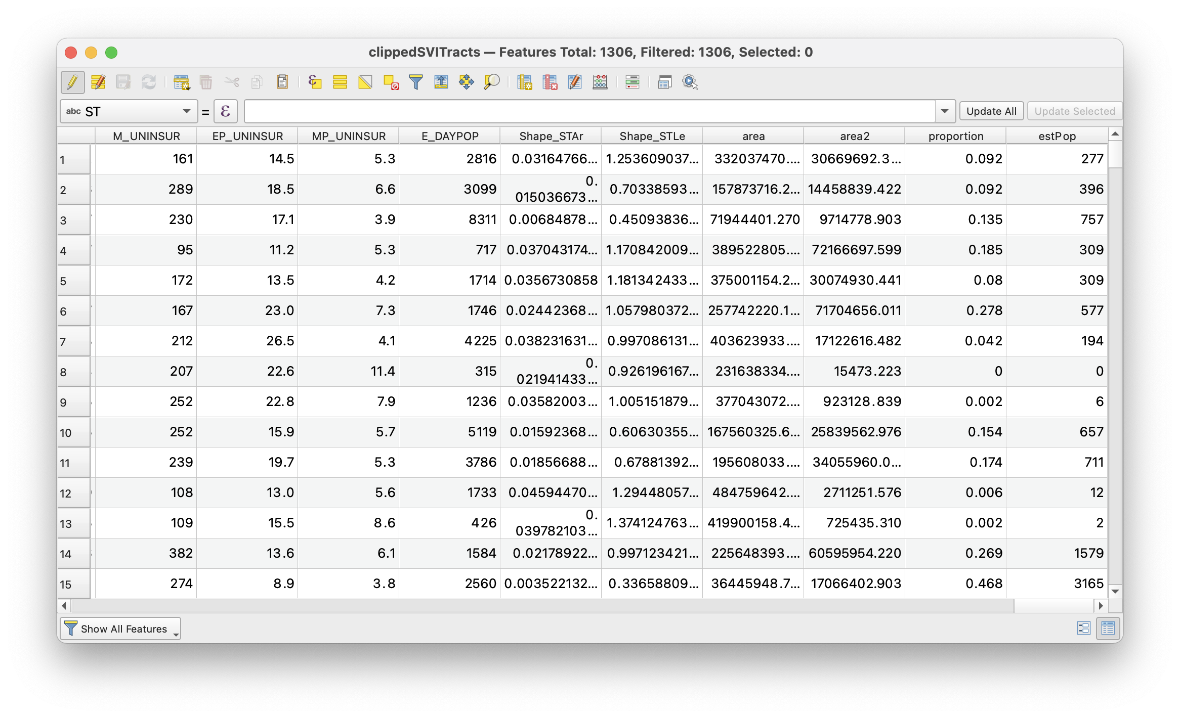
To begin, we need to add a new field to our social vulnerability layer. To do so, open the Attribute Table and select Field Calulator. In the query field, enter the value $area. The field name should be set to Area and the field type should be set to Decimel Number Real. Once you select OK, each row will gain a column with a value set to its polygonal area.
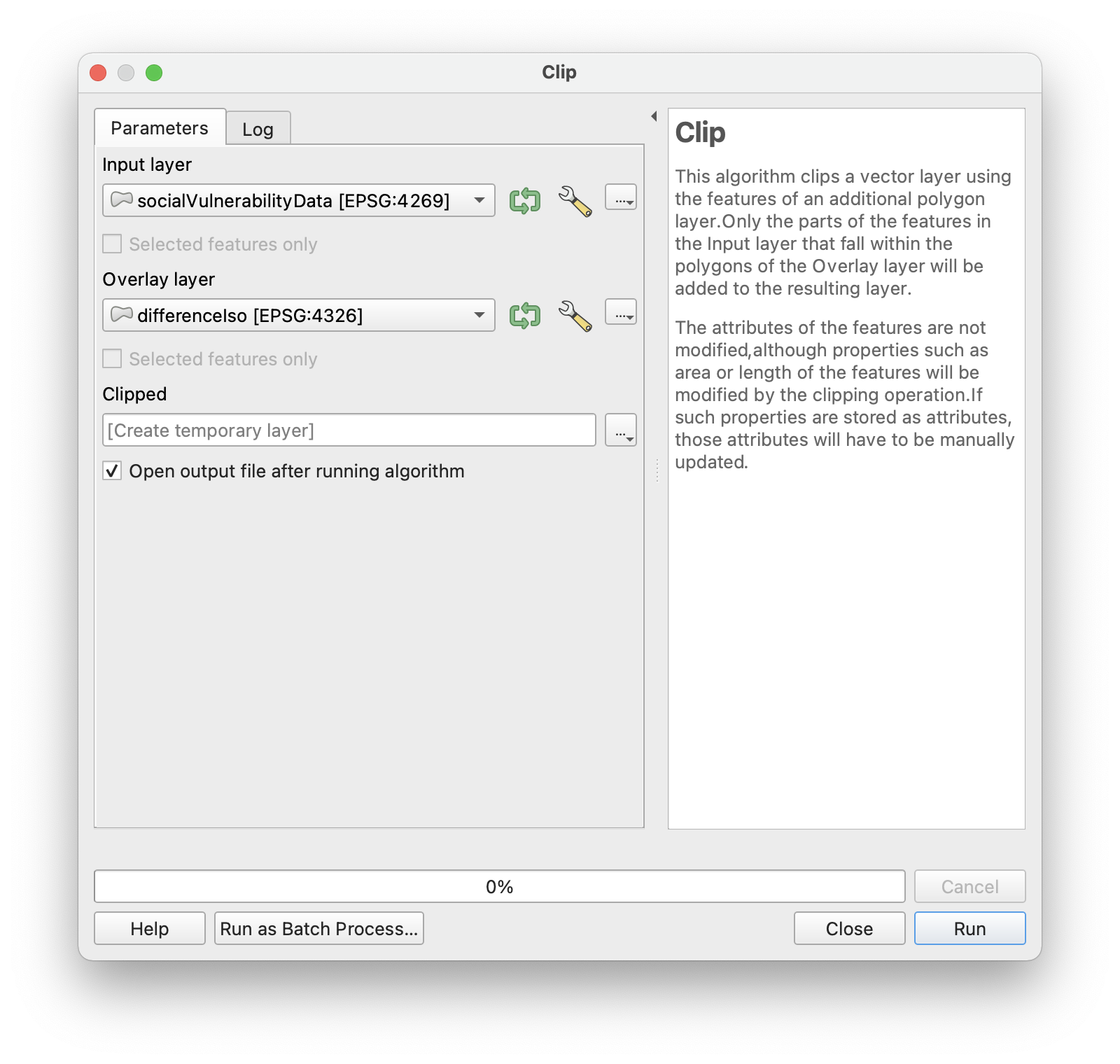
Next, we will want to clip the census tracts and extract the portion of census tracts that fall within the difference layer. To do this, navigate to Vector -> Geoprocessing Tools -> Clip.
Now, we need to do some basic statistics. First, let’s create a new field titled Area2 and set it equal to $area. Then, calculate the proportion of the tract found within the dissolved layer. This will be equal to Area2 / Area. Then, let’s calculate the proportion of people in this area. To do this, multiple this new proportion by the estimated total population.
Our new attribute table should look like this:
And now let’s calculate the total population of this group.
To do this, open the statistical summary layer by clicking on the sigma icon or right clicking and selecting Statistics Summary Layer. Then, select the clippedSVITracts file and select the estPop column that we just created. Here, we can see the sum, which is equal to 2,652,250 people, or roughly 25% of the state population!
Now we could spend a long time visualizing the data, but this exercise was focused most on highlighting the opportunity in private/public partnerships between public health departments and dollar stores. A side-by-side of vaccination site isochrones next to dollar store isochrones would be effective, especially when coupled with statistical summary data.
For isochrone maps that are better suited to visuals, check out our spatial analysis tutorial focused on highlighting accessible subway stations.