Note: If you haven’t downloaded and installed the program, you can find the instructions here. You can also find QGIS’s documentation here.
Datasets
To create these maps we will be using the following datasets:
-
Boroughs - New York City boroughs. Download from NYC Planning - Open Data. Choose “Borough Boundaries (Clipped to Shoreline)”, under “Borough Boundaries & Community Districts”.
-
Hydrography - New York City hydrography. Download from NYC Open Data. Once you get to the NYC OpenData page, click
Exportand choose theShapefileformat. -
Department of City Planning - Housing Database Unit Change Summary Files at the Census Tract Level NYC Planning - Open Data. Once you get find the HousingDB_by_2020_CensusTract file, click
Downloadunder theShapefileformat. -
NTAs - New York City’s neighborhood tabulation areas. Download from NYC Planning - Open Data. Neighborhood Tabulation Areas (NTAs) are medium-sized statistical geographies for reporting Decennial Census and American Community Survey (ACS). NTAs were delineated with the need for both geographic specificity and statistical reliability in mind. Though NTA boundaries and their associated names roughly correspond with many neighborhoods commonly recognized by New Yorkers, NTAs are not intended to definitively represent neighborhoods, nor are they intended to be exhaustive of all possible names and understandings of neighborhoods throughout New York City. Once you get to the NYC Planning Open Data page, download the
shapefileformat. -
Planimetric - New York City planimetric data. Download from NYC Open Data. This is a large dataset. It includes geographical data for boardwalks, curbs, medians, parks, open space, railroad, and roadbed, amongst others. This dataset comes in the form of a
geodatabase. Download the zip file.
A packaged file of the above data can be found at brwn.co/lesson_01. Note that this package may contain partial datasets meant for this tutorial. To get the full datasets please refer to the links above.
Setting up QGIS
For many of you, this might be your first time opening QGIS. For reference, this tutorial is written using (and providing screenshots from) QGIS 3.22.14 on a Mac. It is important to know that QGIS is a free and open source piece of software. As such, it is continually evolving and continually solving for bugs and errors in the code. Although it is far more stable than just a few years ago, it is still important to get in the habit of oversaving your work at everystep.
Simplifying the Interface
Because we are going to begin with relatively simple operations, it can be helpful to simplify the QGIS interface. See below for a screenshot of how a new project opens in the sample QGIS.
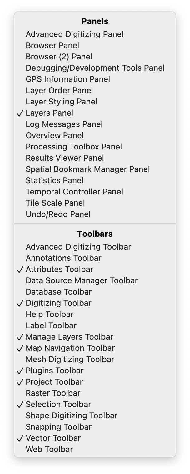
To achieve an interface that looks similar, right click anywhere in the panel or toolbar layer and turn on/off the following layers:
Setting up Auto-save
Since QGIS is open-source, and because it is a community-oriented piece of software, it allows for the installation of plugins that extend the capabilities of the basic software. To make use of these plugins, navigate to Plugins in your toolbar menu, and select Manage and Install Plugins. Here you can search the ~1000 community contributed plugins available to QGIS. In the searchbar, enter ‘autoSaver’ and click the Install button once you have selected the plugin.
Once installed, you can enable the plugin under Plugins -> autoSaver -> auto save current project in your upper toolbar menu. Enable autosave and set the duration of save to every minute, as opposed to the default which is set at 10 minutes.
Once you have setup autosave, save your project in the directory that you will be working from.
Adding Layers
The first step in creating a basic map is to add the layers associated with this project.
-
QGIS is an adaptable program and has many ways through which you can add new data to the project. The first way is through the toolbar on the lefthand side of the interface. To add the first shapefile, click on the
Add Vector Layerbutton, represented by the V icon. Other types of data will be added using the other buttons, but in this tutorial we will only be using vector data (shapefiles). Other types of data include rasters, csv (comma separated values), and postGIS layers.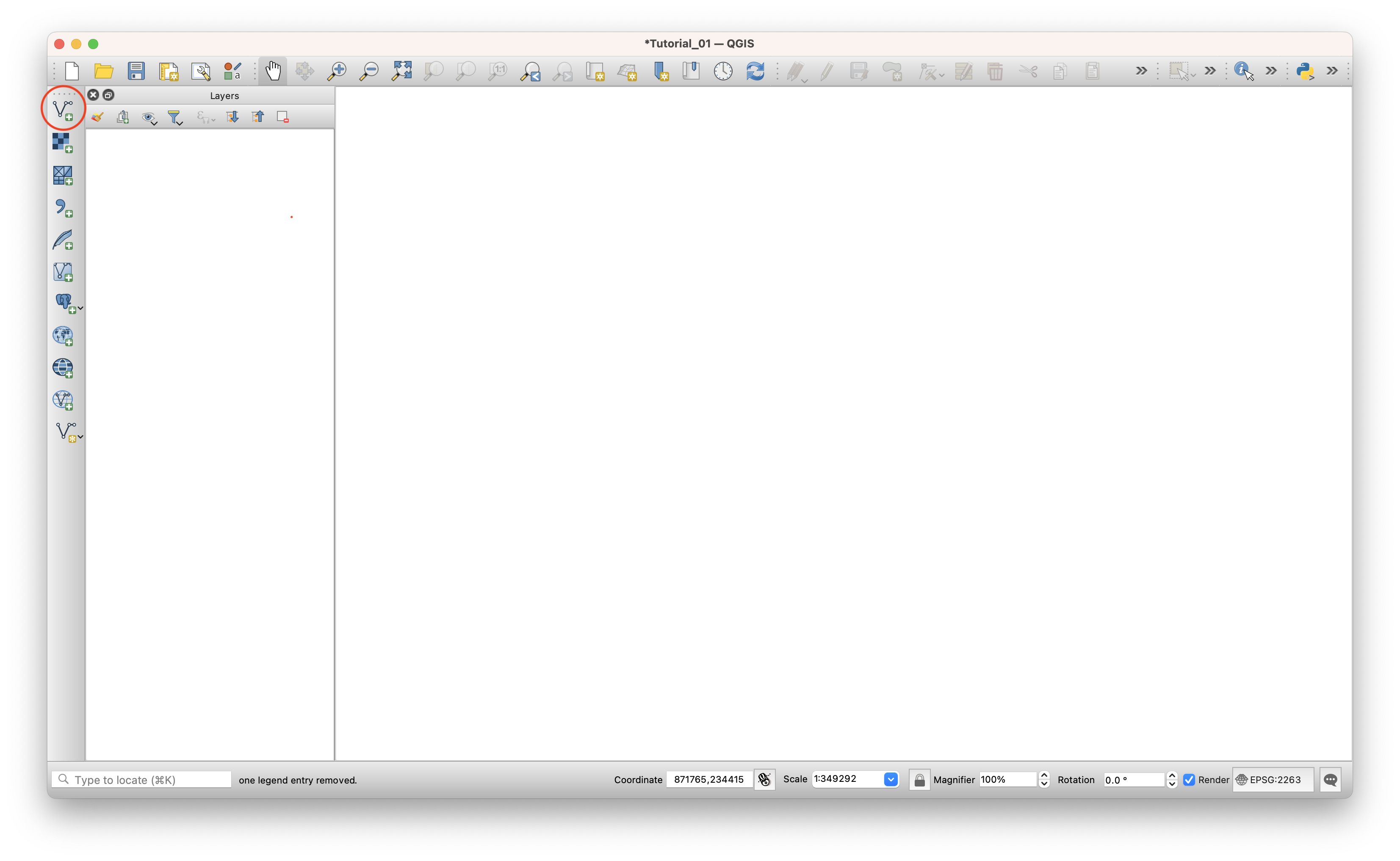
-
Start by adding the Boroughs layer, found in the
nybb_22cfolder. The reason we start with this one is because we know it has the right projection for New York City (NAD_1983_StatePlane_New_York_Long_Island_FIPS_3104_Feet). Since map projects will automatically take the projection of the first layer we add, by loading this layer first we make sure we are working with the right one. -
Under
Source, click on the three dots and make sure you select the file with the extension.shp. Remember that a shapefile is actually made up of 5 or 6 individual files with different extensions. Normally, these individual files are the following:-
.shp- The main file that stores the feature geometry (required). -
.shx- The index file that stores the index of the feature geometry (required). -
.dbf- The dBASE table that stores the attribute information of features (required). -
.sbnand.sbx- The files that store the spatial index of features (these might get corrupted, see note at the end of this tutorial). -
.prj- The file that stores the coordinate system information. -
For more information on these extensions and others see this explanation by ESRI.
-
-
To double check your map took the right projection, take a look at the bottom right corner of your computer and verify that it says
EPSG:2263, which is the “European Petroleum Survey Group” code for the NAD_1983_StatePlane_New_York_Long_Island_FIPS_3104_Feet projection. -
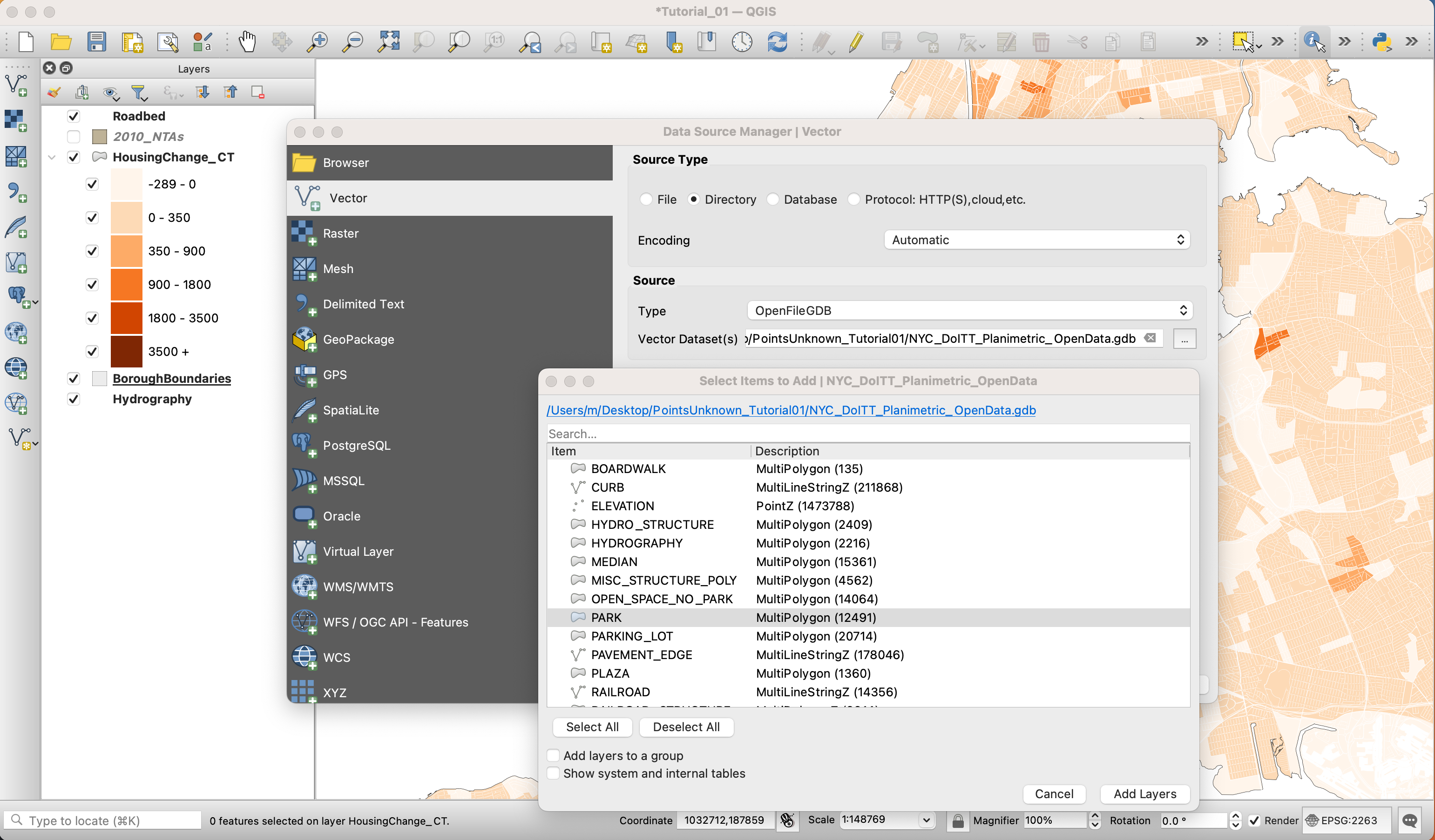
Go ahead and add the rest of the files you downloaded, except the planimetic data (
NYC_DoITT_Planimetric_OpenData.gdb). That means you should add the hydrography shapefile (Hydrography/geo_export_e0938ee0-a080-4b7a-aaa9-c6c30b17e824.shp), the housing database shapefile (nychdb_ctract_22q2_shp/HousingDB_by_2020_CensusTract.shp), and the NTA shapefile (nynta2010_22c/nynta2010.shp). . -
For this the planimetric data, you need to choose
DirectoryunderSource Type, and underTypechooseOpenFileGDB. Choose the folder, not individual files inside it. And once you hitAdd, QGIS will prompt you to select one or multiple layers to add. Here, select and add the one calledRoadbed.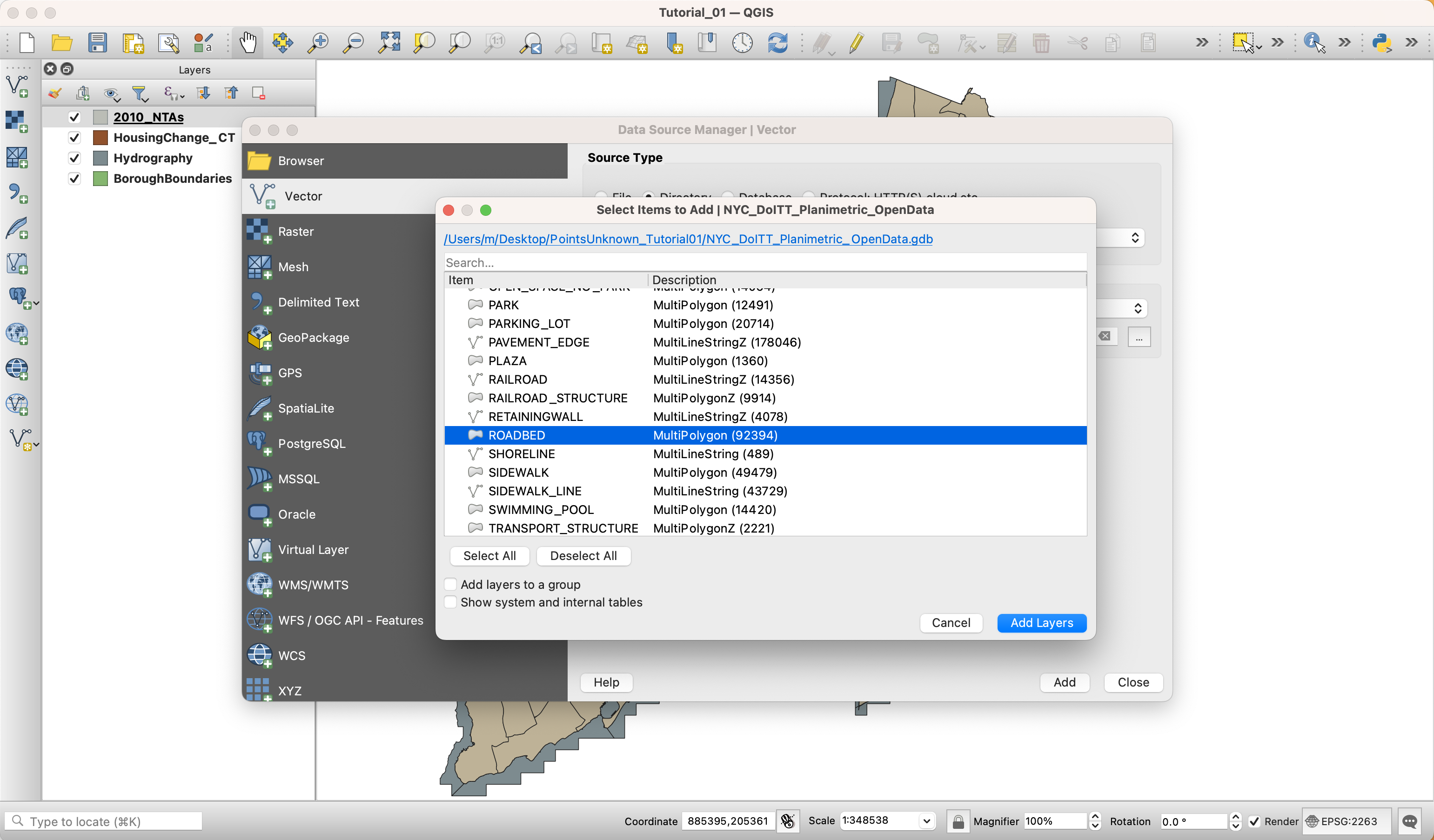
-
Once you’ve added all the layers you downloaded, you need to organize them in the layer panel. At this time, it can also be helpful to rename the layers so that you know what you are operating on. This can be especially helpful when you are working with dozens of layers in the same project. Remember that the layers will be drawn in the same order they appear in the panel: the top layer will be drawn last, on top of the other ones. To rename each layer, right-click on the layer name in the
Layerspanel and selectRenamefrom the menu. -
The final order of the layers should be something like this (from top to bottom):
-
Roadbed
-
2010 Neighborhood Tabulation Areas (NTA)
-
Housing Change by Census Tracts
-
Hydrography
-
Borough Boundaries
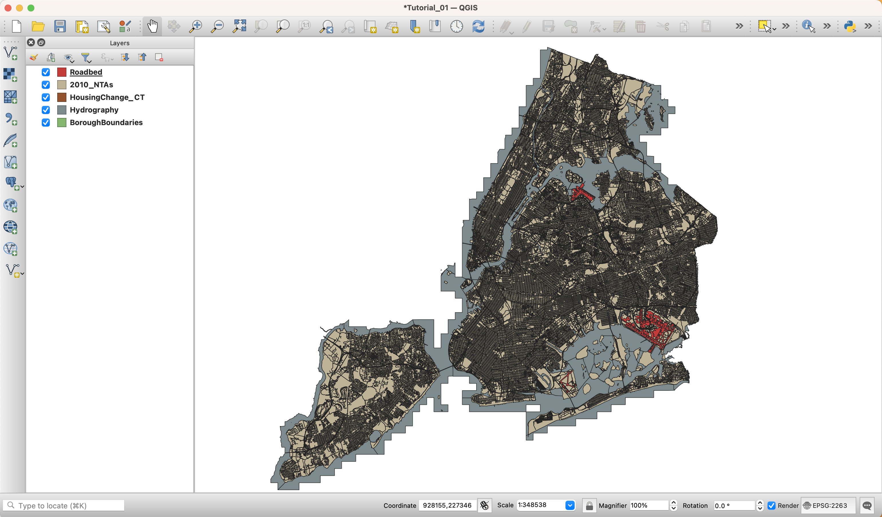
-
-
Each of our workspaces will appear different, as layers take on a random color when being added to a QGIS project. We will style them later, so don’t worry if you don’t like the appearance of your map!
Basic Symbology
Symbology is one of the most important concepts in mapping. At its most basic level, symbology stands for changing the color, line weight, size or outline of a layer. However, and more importantly, it also means changing the appearance of a layer based on one or multiple of its attributes. In this tutorial we will do both, simple color changes and more advanced symbologies based on attributes.
As you may have seen, QGIS assigns random colors to each of the layers you add. To change the appearance of each layer do the following:
-
First, since we are interested in creating a housing change map of a part of New York, you should zoom in into our target area. To do this, right-click on the HousingChange_CT layer and click
Zoom to Layer. This is also very useful when for some reason you’ve panned away from your layers and you can’t find them on your map. Just right-click on any of them and selectZoom to Layerto go back to them. -
There are multiple ways of changing the appearance of a layer. The easiest (and simplest) is to double-click on the icon (point, line or polygon) next to the layer name, or on the actual layer name on the layer panel. This brings up the
Layer Propertiespanel. There, select theSymbologytab. In this tab, you are able to alter the fill (color), stroke weight and fill (outline) and the size of the icon (if using points or icons).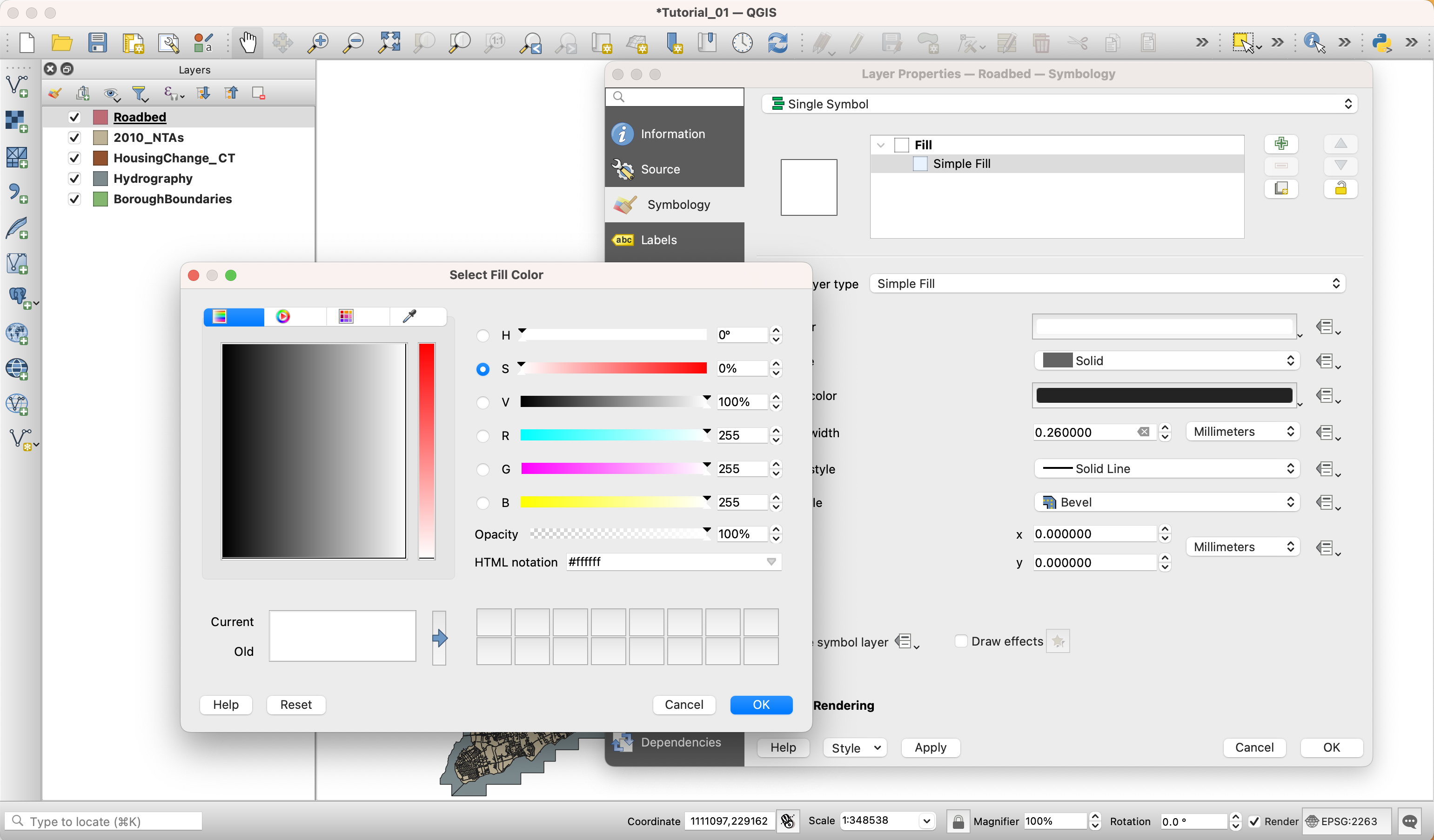
-
In this panel change the style for the following layers in the following ways:
-
Roadbed:
-
Fill color: #ffffff (HTML notation)
-
Fill style: Solid
-
Stroke style: No pen
-
-
Hydrography:
-
Fill color: #ffffff (HTML notation)
-
Fill style: Solid
-
Stroke style: No Pen
-
-
Boroughs:
-
Fill color: #ececec (HTML notation)
-
Fill style: Solid
-
Stroke style: Solid Line
-
-
-
If you wanted to, you also are able to change the appearance of the background by selecting the
Projectmenu, and navigating toProject Properties. Then, in theGeneraltab you can change theBackground colorto match your water or land hex value. Since we set the hydrography to #ffffff we don’t need to alter this setting.
Basic Table Operations
The next step in visualizing change requires making sense of the Housing Change data file that we imported into our workspace, now renamed HousingChange_CT. In the folder that contains the shapefile for the housing database unit change summary is a data dictionary file stored in an excel spreadsheet. Here it contains a sheet highlighting information about the dataset. This includes:
- Department in charge of maintaining the dataset
- A summary of what constitutes a row in the table
- A frequency of publication
- An interval of change captured by the department
- A description of the dataset
- A description of why the data is collected, how its collected, and how it can be used
- A list of characteristics and limitations of the data
- and the projection the data presents in
Let’s look at the description of the dataset: “Net change in housing units arising from new buildings, demolitions, or alterations for specified geography (Census Block, Census Tract, City Council district, Community District, Community District Tabulation Area (CDTA), Neighborhood Tabulation Area (NTA)”.
In addition to the Dataset Information sheet is a sheet on Column Information, on Revision History, and Primer Page for the dataset.
Now that we’ve familiarized ourselves with the dataset, let’s open its table and look at the raw data. To do so, right click on the layer (HousingChange_CT) and select Open Attribute Table.

For this map, what we are interested in is looking at ten years of development. So we will sum the values in completions from 2010-2019, and place the sum in a new column. To do so, we need to open the Field Calculator which is represented in the attribute table icons as an abacus.
In the Field Calculator, create a new field and name the field Change1019. There is a character limit within the attribute table, hence the brevity.
To calculate this sum, use the expression prompt to write a basic expression adding the values of the fields. To identify the field names, you can expand the Fields and Values list. In the expression builder, the prompt takes SQL-style expressions. Full documentation on the field calculator can be found on the main QGIS website.
For this expresion, we are simply taking the sum of 10 fields, so the expressions is best accomplished through basic addition.
"comp2010" + "comp2011" + "comp2012" + "comp2013" + "comp2014" + "comp2015" + "comp2016" + "comp2017" + "comp2018" + "comp2019"
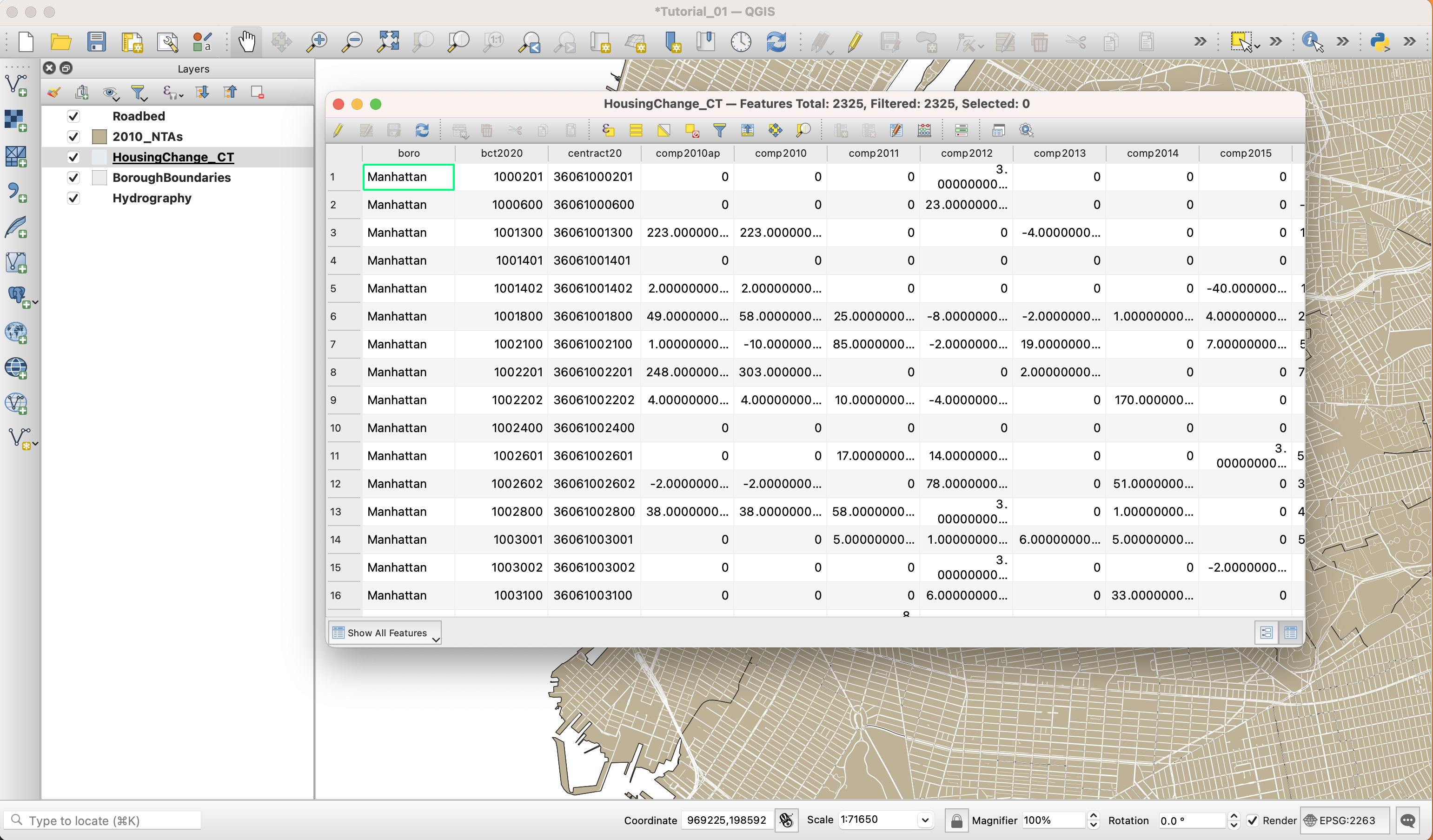
Once you confirm in the attribute table that your new field has been correctly created, click the save icon in the attribute table, as represented by a floppy disc. You can also then toggle off edits by click the pencil icon in the attribute table.
Classification by Value
Now that we have calculated the total change in housing units per census tract from 2010-2019, we will symbolize the housing change layer. However, since we want to differentiate the various levels of change, instead of simply symbolizing all the features in the layer with the same color, we will classify the data into a graduated color scale based on different values in its attribute table.
-
Just like for the other layers, right-click on the HousingChange layer and choose
Properties. Go to theSymbologytab. Here, however, chooseGraduatedinstead ofSingle symbolin the drop-down menu at the top. -
Next, choose the
Change1019field in theValueoption. -
For the Color ramp, select Oranges. To read about different color schemes and how to select a color, go to Color Brewer 2 run by Cynthia Brewer.
-
In the panel, under Mode, select
Classifyto classify the data and display the different values. -
You will notice that QGIS creates 5 classes. This default classification method is called
Equal Interval. Before you hitOKclick on theSymbolbutton and set theStroke styletoNo Pen. This way you’ll be able to see the results of the classification method much better. To see your results, temporarily disable the2010_NTAslayer. -
Once you hit
OKyou will notice that a few trends as made evident by the data and the classification scheme selected.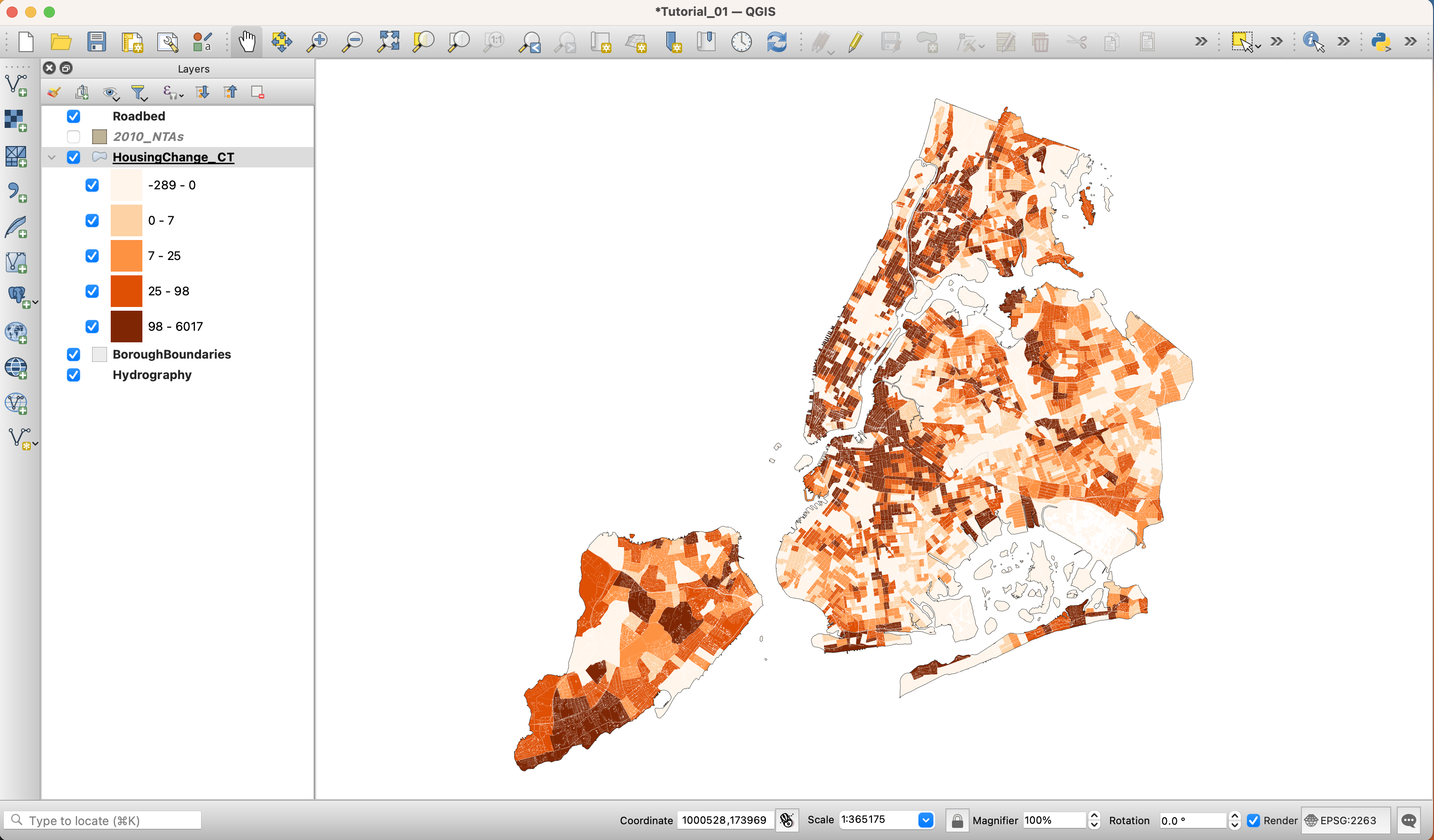
-
Open the
Symbologypanel again and click on theHistogramtab. Click onLoad Values. Here, you can see how this classification method is creating the buckets for your data. As you can see, some of the outliers of the distribution are significantly outside the standard deviation.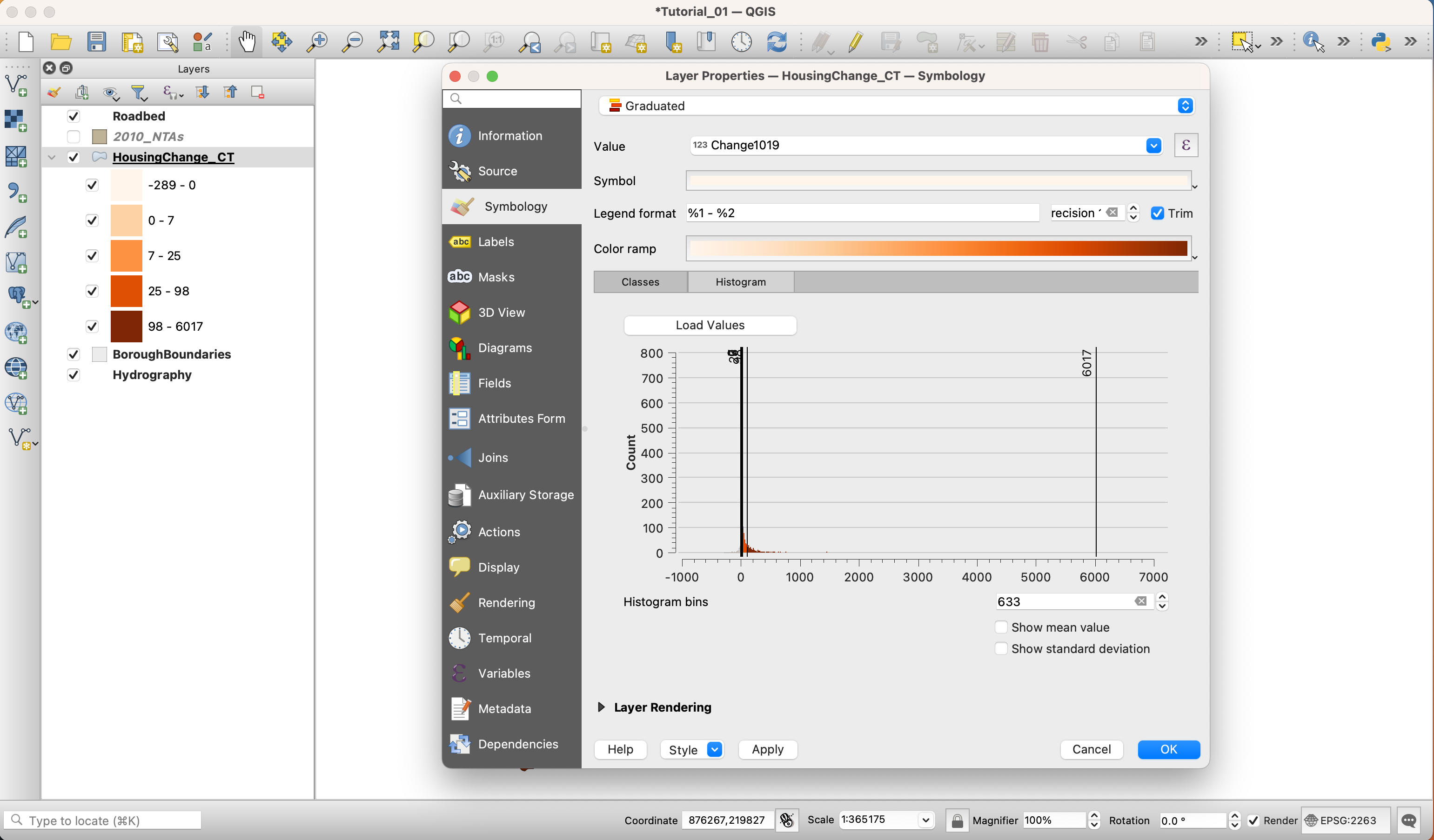
-
If you open up your attribute table and select the top fifteen values based on change, a more clear narrative emerges.
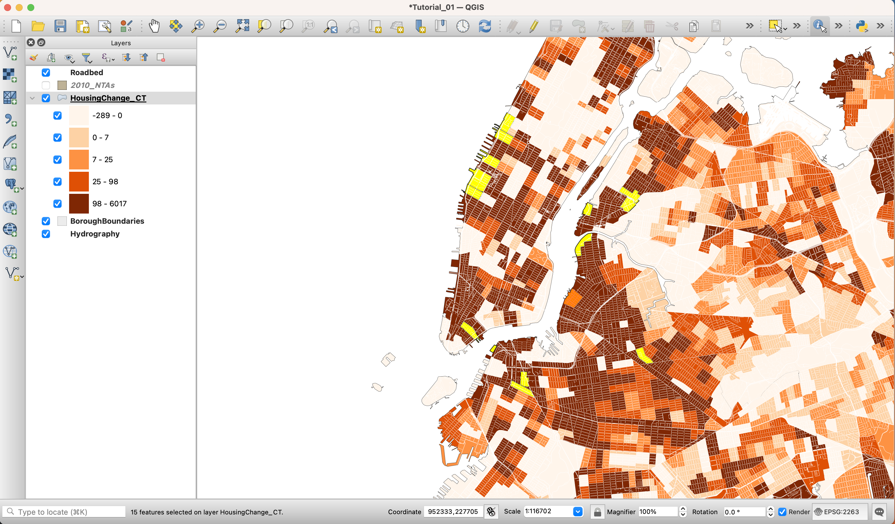
-
This can be a great way to go about investigating your data. Creating a view through classification, and also through selecting a subset of the data at the head or tail of your dataset.
-
Go back to the
Classestab and change the classification method toNatural Breaks (Jenks). You might get a warning saying that this method could take a long time. If you have a large dataset you should be careful. However, the dataset that we are using is small enough. Once the classification is done, go to theHistogramtab. The Natural Breaks (Jenks) methods attempts to minimize the difference within groups while maximizing the difference between groups. Many datasets will be best classified using this method.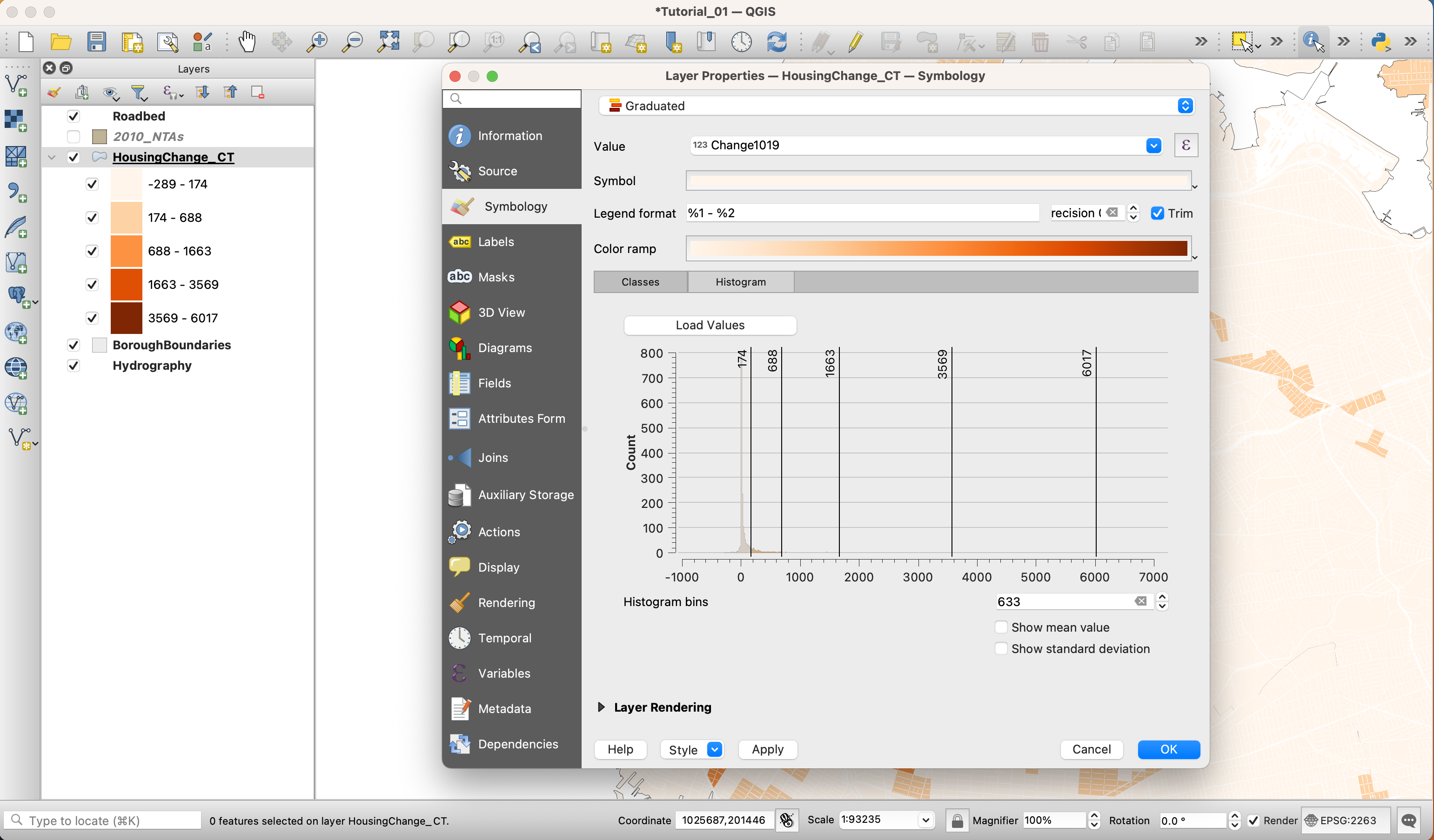
-
Other methods of classification include Quantiles and Standard Deviations. Go ahead and explore them and see how they change our perception of the data on the map.
-
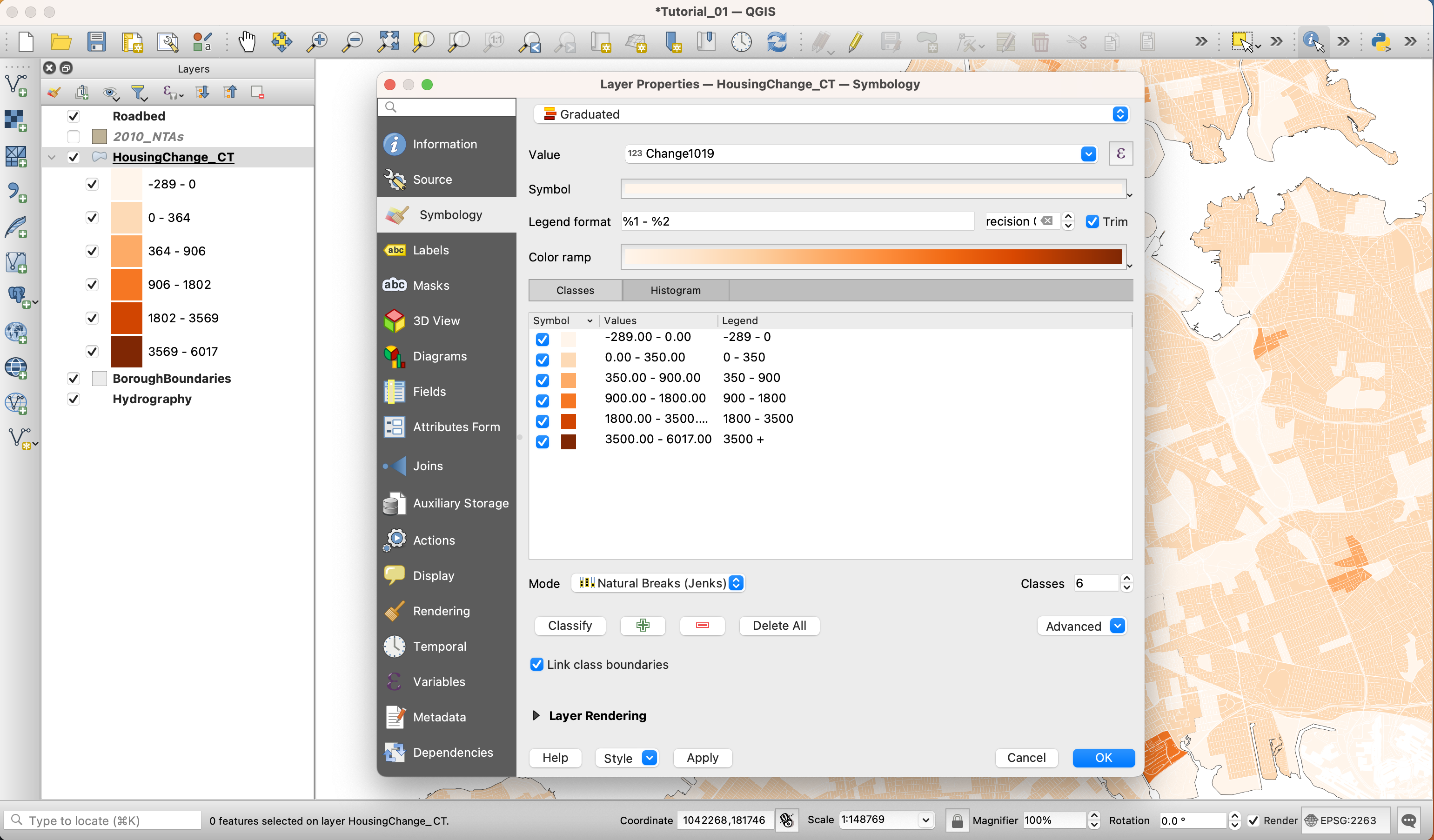
Finally, choose the Natural Breaks (Jenks) method. Because there are areas with negative change, we should avoid clustering these in the same bucket as little change. So we will cluster all negative values into their own bucket by adding a class. We will then clean up the break values so that they are more human-readable. These changes should be minor.
-
Also, be sure to adjust the legend values, as well.
Adding in Parks
Now that we’ve constructed our map, it is evident that parks can be easily mistaken for areas of New York that underwent zero or negative development. This is wildly misleading. So we will need to add a parks layer. Thankfully, this can be found as one of the tables within the planimetric geodatabase. So once again, add a vector layer, select the Planimetric dataset as a director, and add the PARK layer.
Turn off the stroke for this and set the hex value of parks to #eaeaea. Place the Parks layer directly below the Roadbed layer and rename it for better usability.
Adding Labels
We will use the Neighborhood Tabulation Areas layer to add some labels to our map.
-
First, activate it by clicking on the checkbox next to its name on the Layers panel. Next, double-click on it to open its properties.
-
Under
SymbologychooseNo symbols. -
Under the
Labelstab chooseSingle labels. And underLabel withchoose the “NTAName” column.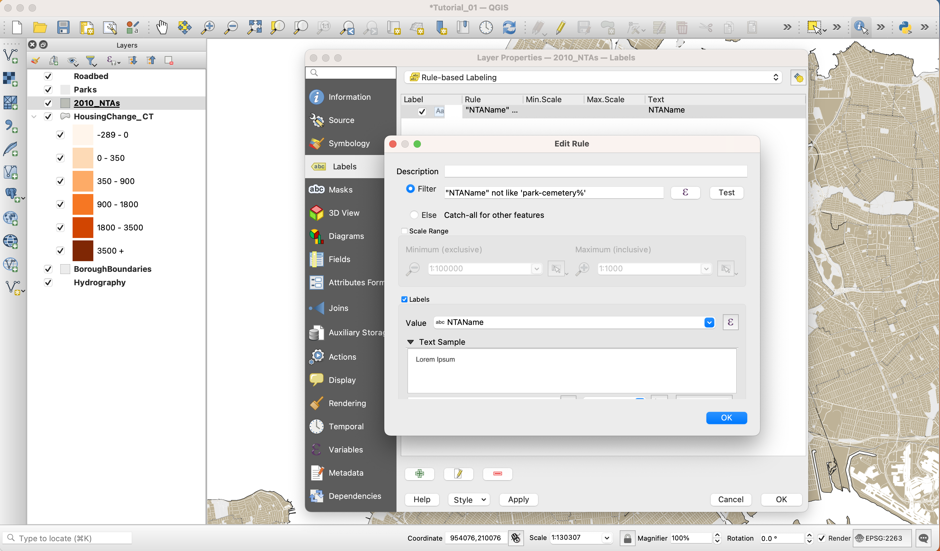
-
If you click
OKyou will notice that some of the labels say something like “park-cemetery-etc”. In order to not display these labels we will create a “rule based” label expression. Go back to the layer’s properties and in theLabelstab, chooseRule-based labelinginstead ofSingle labels. Here we will write a short rule to ignore those labels that begin with “park-cemetery”. -
Here, double click on the “+” sign at the bottom of the panel to add a rule. Then, next to the
Filteroption, type the following rule:"NTAName" not like 'park-cemetery%'. Finally, below make sure in theLabel withfield you select “ntaname”. -
To make sure the text is more visible, add a white
Bufferaround it.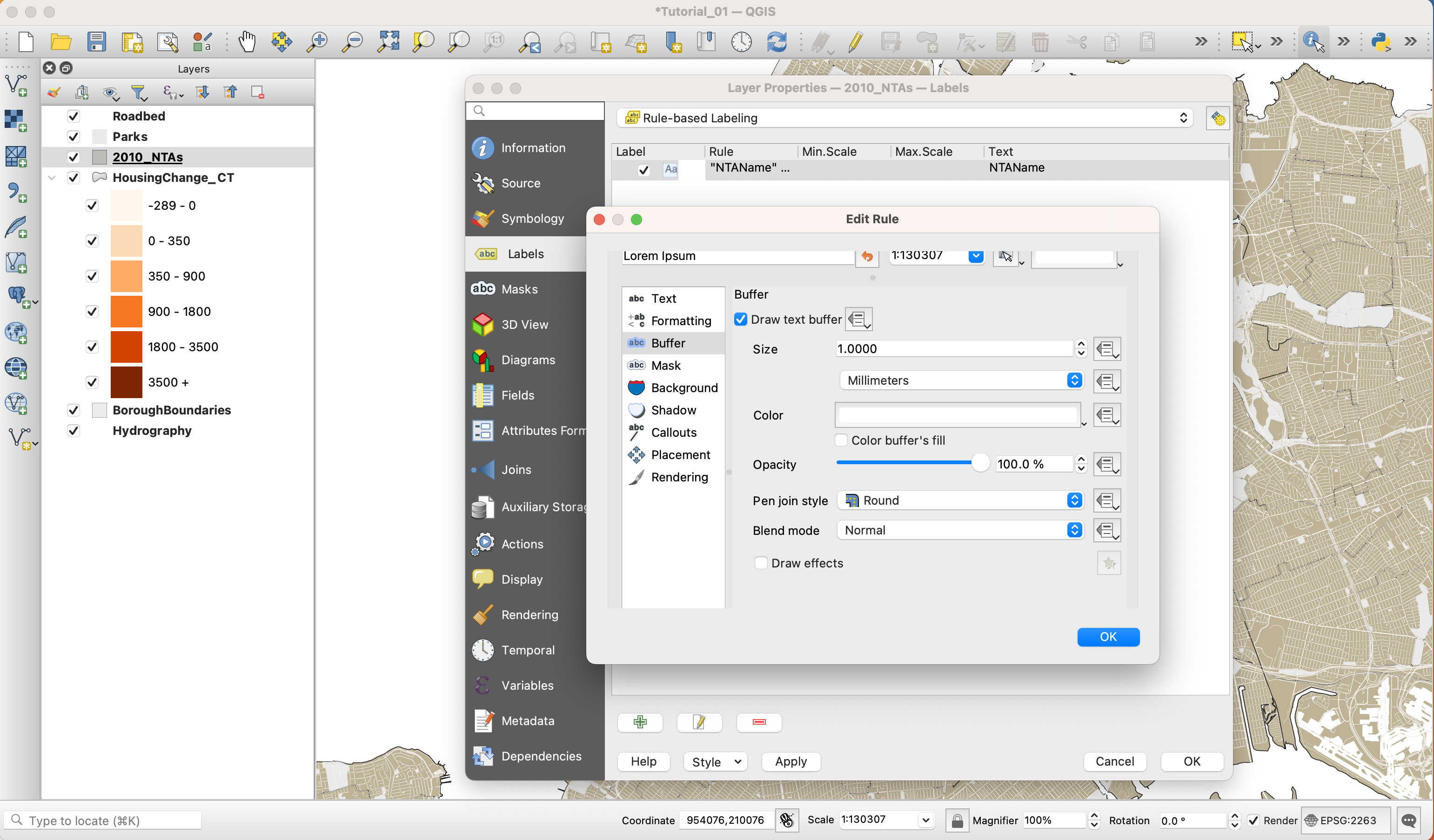
-
Next, add a break for dashes that appear in the text
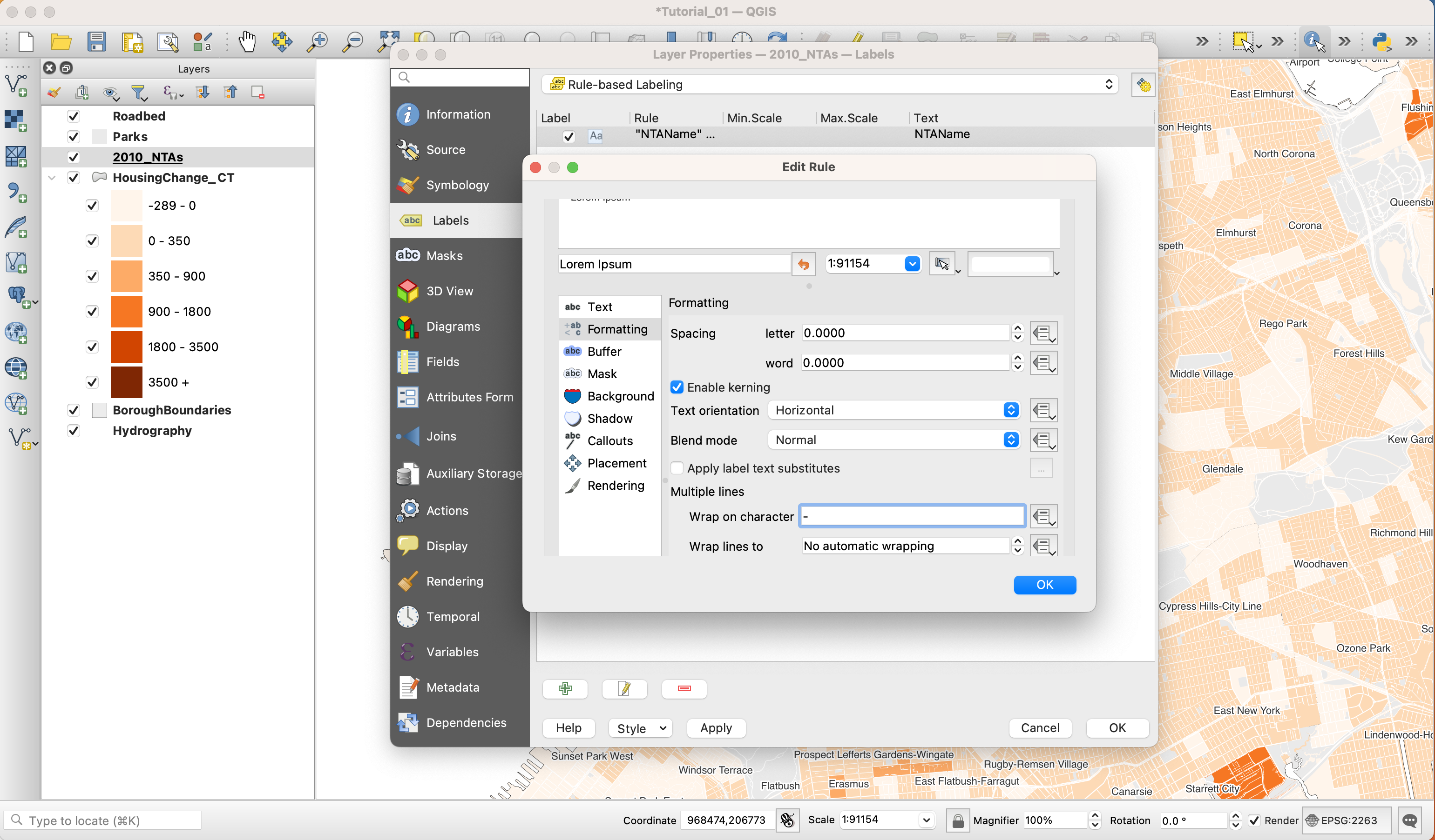
-
Lastly, while in the properties panel, navigate to Symbology and set Simple Fill to No Fill and No Stroke.
-
Click
OKto close the properties panel.
Print Composer
The Print Composer is where you will format your map for its final output. Here you will specify the output size, you will add a legend, a scale bar, a north arrow (if needed) and any additional text (titles, sources, explanations and credits). Although the Print Composer exists as its own window it will still be linked to the map Project we have been working on.
-
First, create a new Print Composer in
Project,New Print Layout. Give it a custom name if you want, although this is not necessary. -
Once you are in the Print Composer you need to add a new map. Think of it as if you had a blank piece of paper and you were adding a window onto the map you’ve been working on. That window is a link to your Project and if you change things in the Project those changes will still be reflected in the Print Composer.
-
To add a new map, click on the button
Add new mapon the left-hand panel and draw a rectangle on the blank page.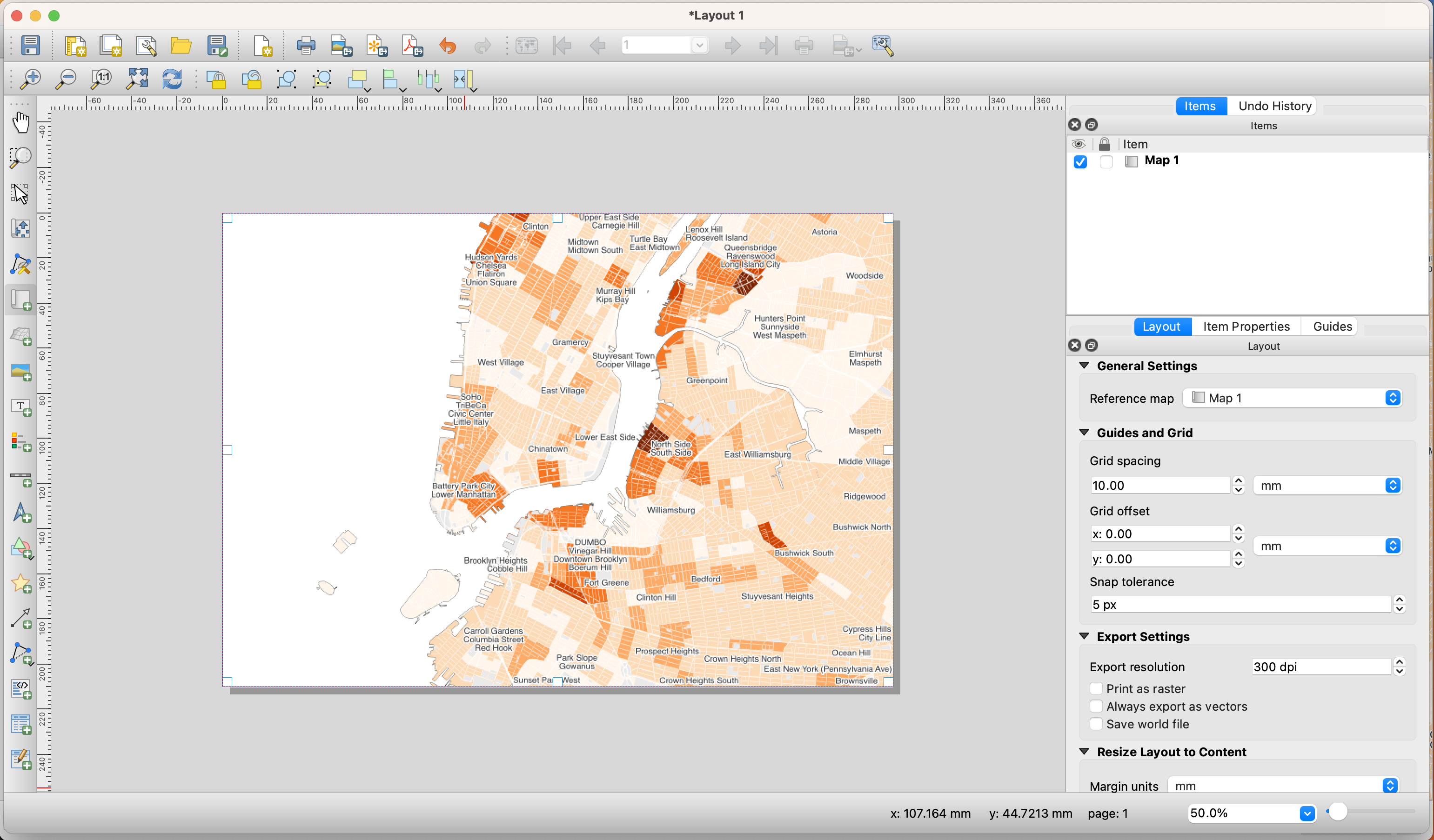
-
Once you add the map you can adjust its size and position by dragging it from its corners.
-
To move the content inside the Print Composer (as opposed to the whole page) use the
Move item contenttool on the left-hand panel.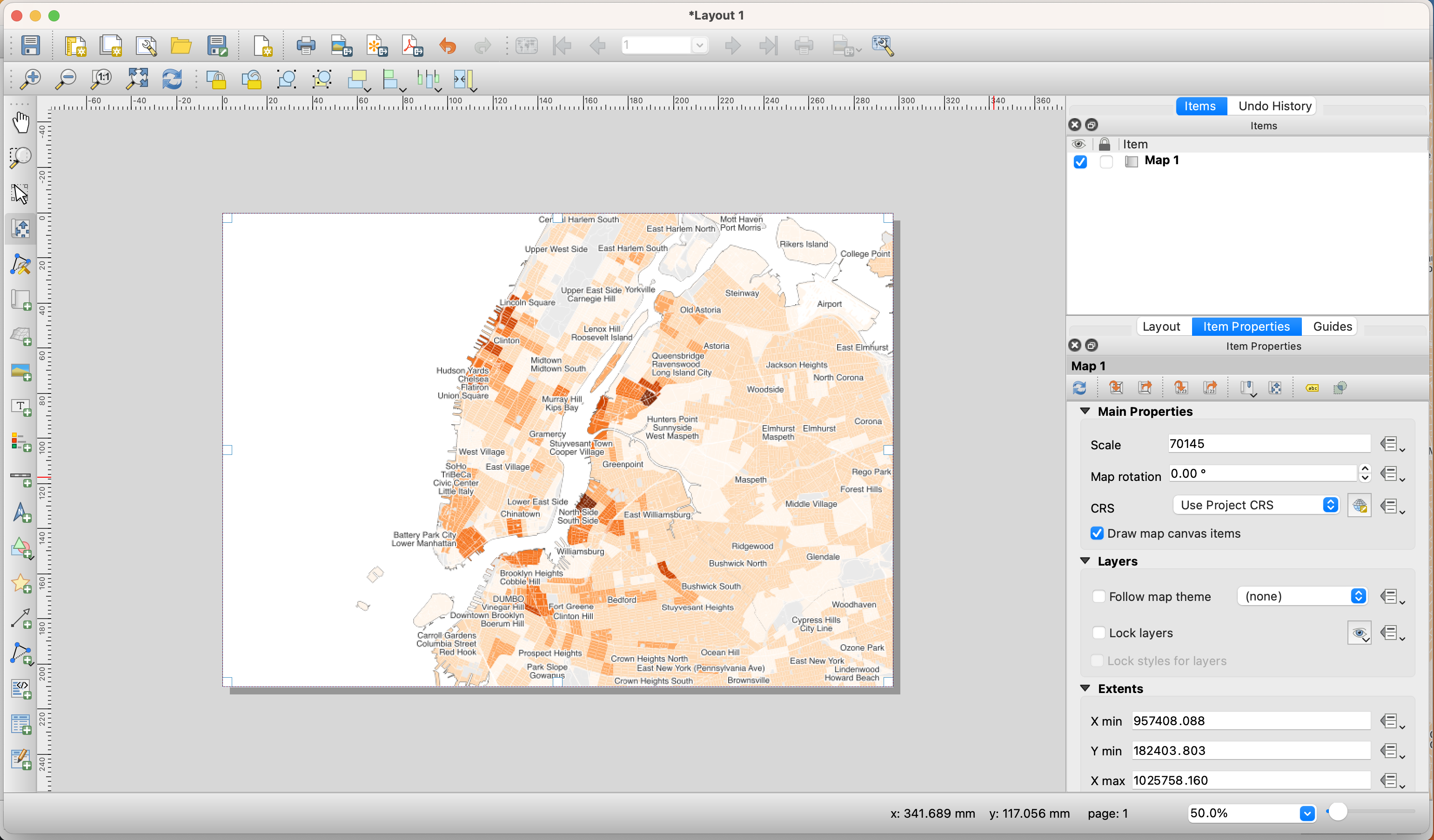
-
Next, you need to center and zoom in the map on the area you want to focus on. For the purposes of this tutorial, we will center around downtown Manhattan and downtown Brooklyn. To do this, move the content of the map to this area and on the right-hand panel, under
Item properties, adjust yourScaleto 70,145. -
If any of the colors or line weights seem too big or two small or not correct, you can always go back to the Project and change them there. When you return to your Print Composer you can update your preview and the changes will be reflected. For instance, the NTA Labels seem too large, so we can adjust the point of those labels to
8and refresh our map in the print composer. -
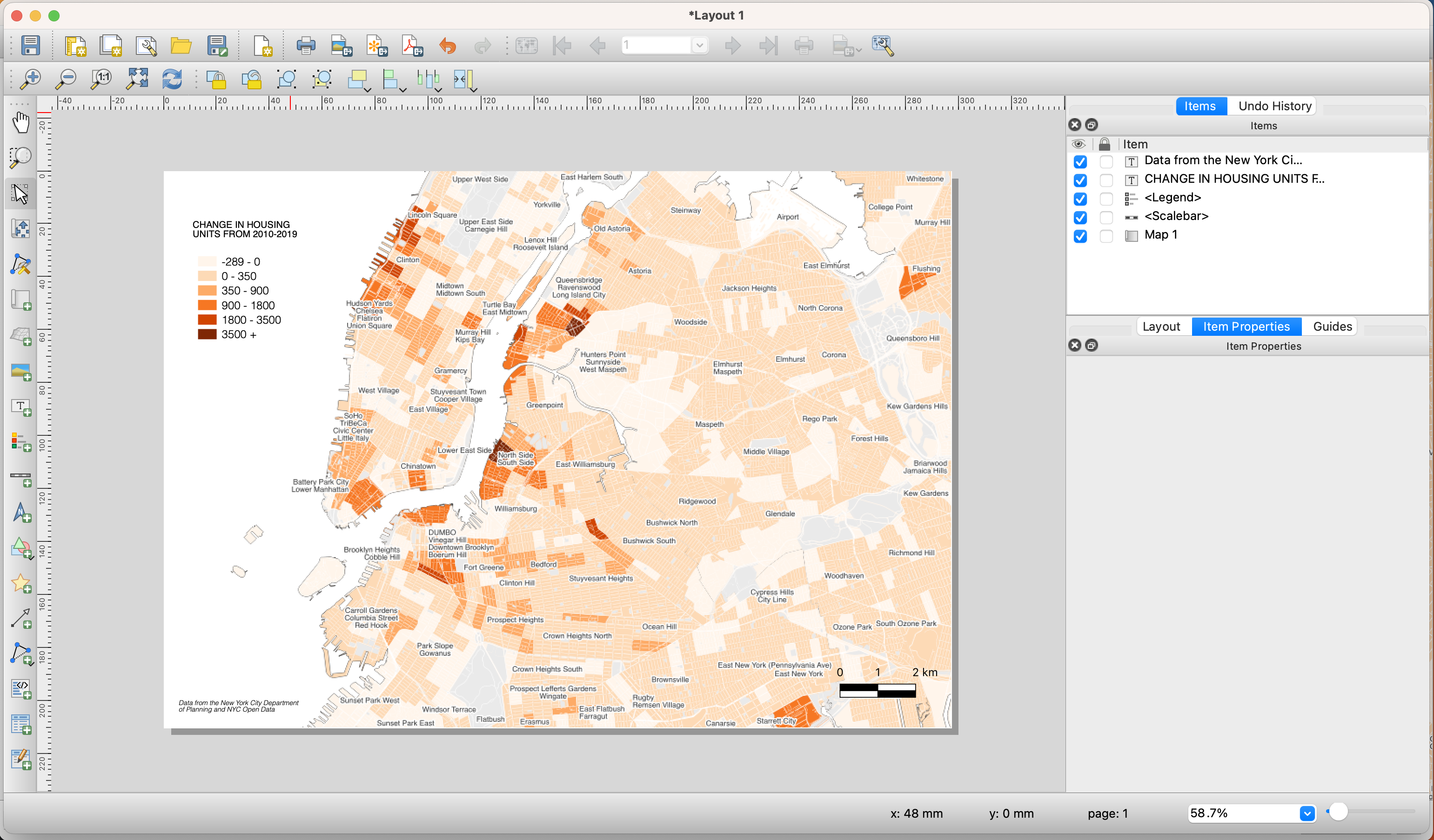
Next, let’s add a scale bar by going to
Add ItemAdd scale barand clicking on the map. -
The default scale bar is too big. To change this, go to the right-hand panel, in the top part make sure you select the
Scale bar, and adjust its properties in theItem Propertiespanel. You can also adjust its units, its colors and even its font. -
To add a legend click on
Add ItemAdd legendand then click on the map. You will notice that QGIS automatically generates a line in the legend for every layer in the map. We only need the land use ones, so we need to customize the legend: -
On the right-hand panel, under Legend items uncheck
Auto updateand then select the layers that you don’t want in the legend and remove them with the ‘minus’ button. -
Since we did not rotate the map we don’t need to add a north arrow. If you rotate your map you must add a north arrow. If you wanted to, you could add a north arrow by clicking on
Add ItemAdd arrow. -
Finally, to add a title and a ‘source’ text, click on the
Add new labelbutton on the left-hand panel and click on the map. Customize these labels by changing their color, size and location. -
The last step is to export the map as a .pdf file. Use the
Export as PDFbutton on the top toolbar and save your map. -
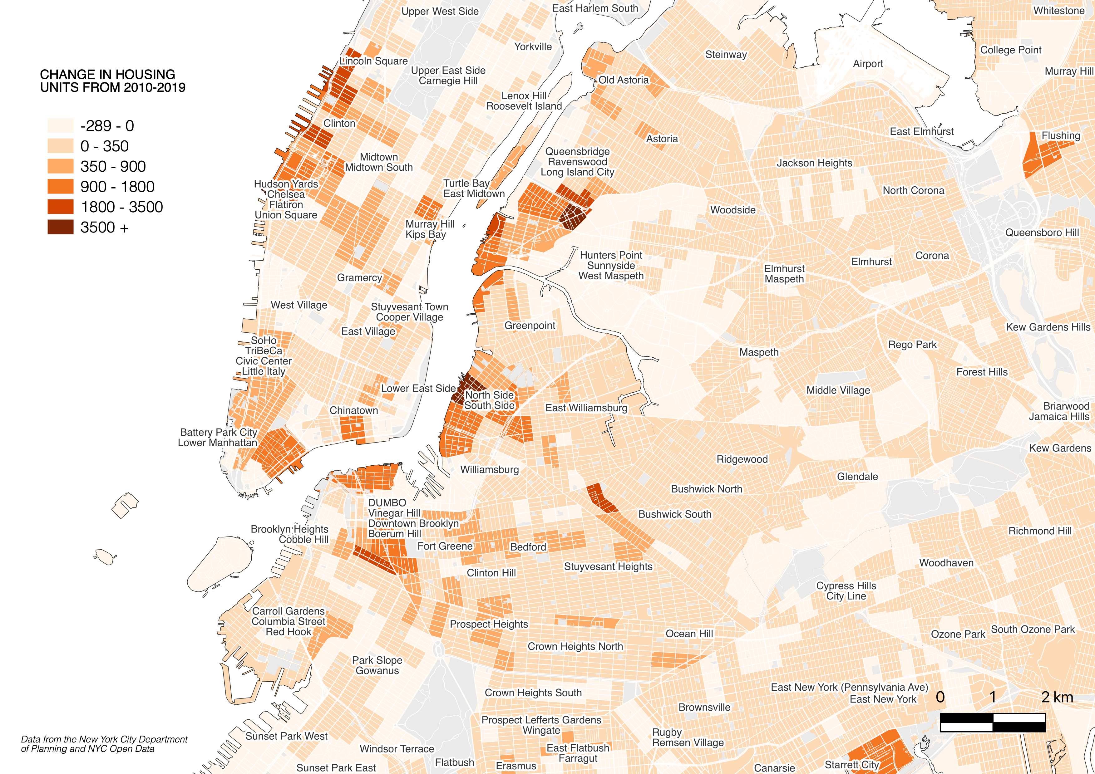
Your final print composer should look something like this:
-
And your final output should look something like this:
Note
If, after adding some datasets, you zoom in and some of the features disappear, you probably need to rebuild the dataset’s “Spatial Index”. To do this right-click on the layer, select Properties and go to Source. Under Geometry and Coordinate reference system click on Create Spatial Index. This should solve your problem. Sometimes, specially with the New York City PLUTO files, the “Spatial Index” is tied to one of the attribute fields and when you zoom in only the features with that specific attribute show up. “Spatial Index” are specially useful when doing operations over large datasets, for example see this post.