Introduction
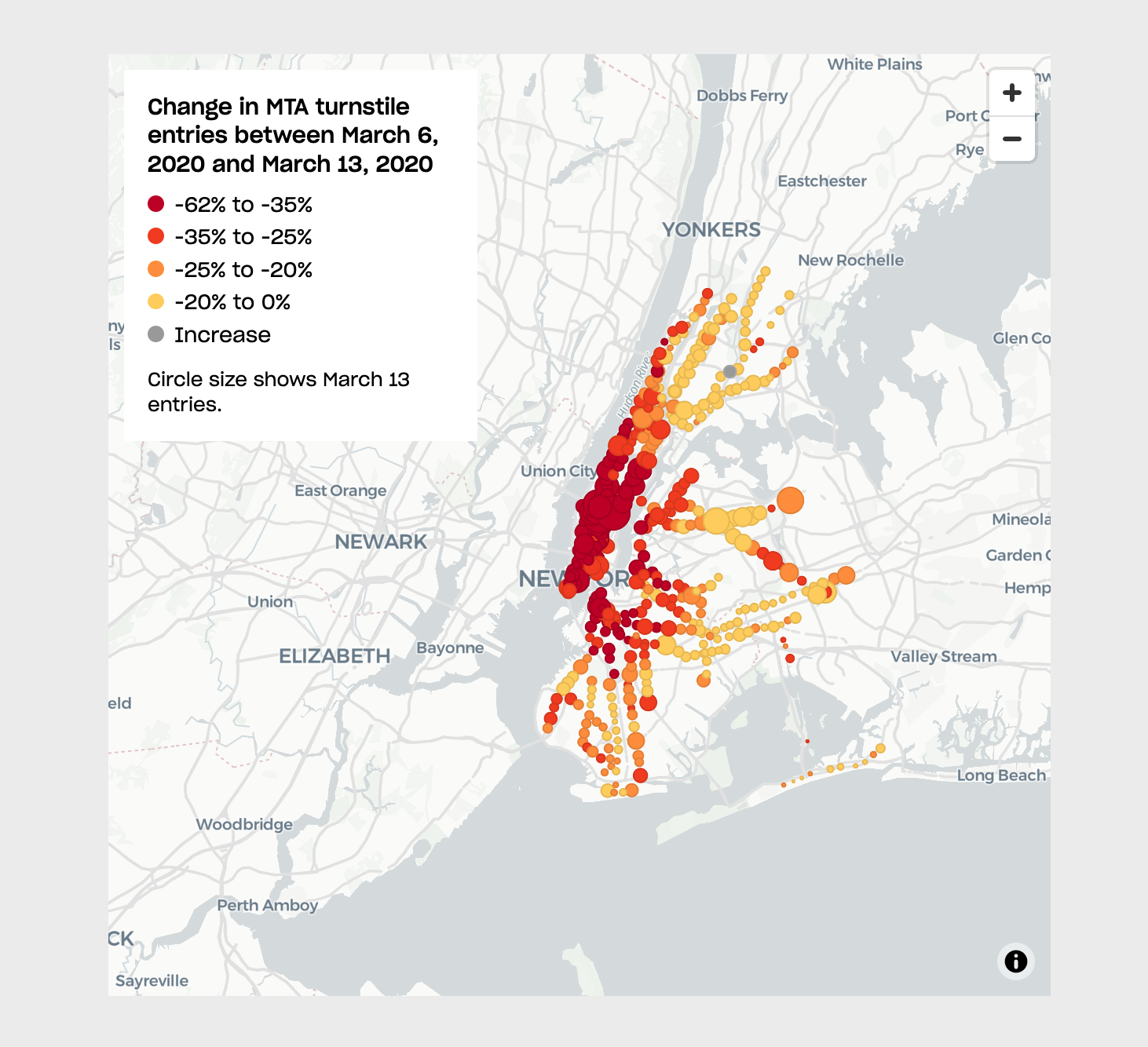
In this tutorial we will use Mapbox GL JS to create an interactive webmap displaying MTA turnstile data. We will recreate a map first produced by Ben Wellington in his I Quant NY blog and later reproduced by news outlets like this one from The City.
Other Mapping Libraries
This tutorial uses Mapbox GL JS. However, this is by no means the only mapping library out there. Other notable libraries are:
-
Tangram - Tangram is a JavaScript library for rendering 2D & 3D maps live in a web browser with WebGL. It is tuned for OpenStreetMap but supports any source of GeoJSON/TopoJSON or binary vector data, including tilesets and single files (Documentation). Pairs well with Nextzen Vector Tiles.
-
Leaflet - Leaflet is the leading open-source JavaScript library for mobile-friendly interactive maps.
-
OpenLayers - OpenLayers is a high-performance, feature-packed library for creating interactive maps on the web. It can display map tiles, vector data and markers loaded from any source on any web page. OpenLayers has been developed to further the use of geographic information of all kinds.
-
Google Maps JavaScript - The Maps JavaScript API lets you customize maps with your own content and imagery for display on web pages and mobile devices. The Maps JavaScript API features four basic map types (roadmap, satellite, hybrid, and terrain) which you can modify using layers and styles, controls and events, and various services and libraries.
-
Carto JS - CARTO.js is a JavaScript library that interacts with different CARTO APIs. It is part of the CARTO Engine ecosystem.
-
D3.js - D3 is not necessarily a mapping library, but more of a general visualization library. It does include many mapping functions and can produce excellent maps.
Datasets
This tutorial uses the following datasets:
-
MTA turnstile entries for March 6 and March 20, 2020: Downloaded from MTA Turnstile Data. To create the final version used here, we downloaded the files for Saturday, March 7 and Saturday, March 21. Make sure you also check out their data dictionary.
-
Geocoded turnstiles by Chris Whong.
-
Median Household Income by block group. This data comes from the U.S. Census Bureau, table B19013 of the American Community Survey, 2017 5-year estimates. That dataset has been joined to New York City’s block groups.
-
Note that the MTA turnstile data is notoriously difficult to work with. The downloaded files were parsed and combined in Python (and Pandas). The combined dataset was then merged with the geocoded station dataset, also in Python. The resulting dataset was finally exported as a GeoJSON file.
A packaged file turnstile data can be found here.
Final Data Structure
The final dataset contains the following fields:
UNIT: Unique station idENTRIES_06: Total entries for that station for March 6, 2020EXITS_06: Total exits for that station for March 6, 2020ENTRIES_20: Total entries for that station for March 20, 2020EXITS_20: Total exits for that station for March 20, 2020ENTRIES_DIFF: Percentage change in the number of entries between March 6 and March 20stationName: Name of the stationlat: Latitude of the stationlon: Longitude of the station
Setting Up the Base Map in Mapbox Studio
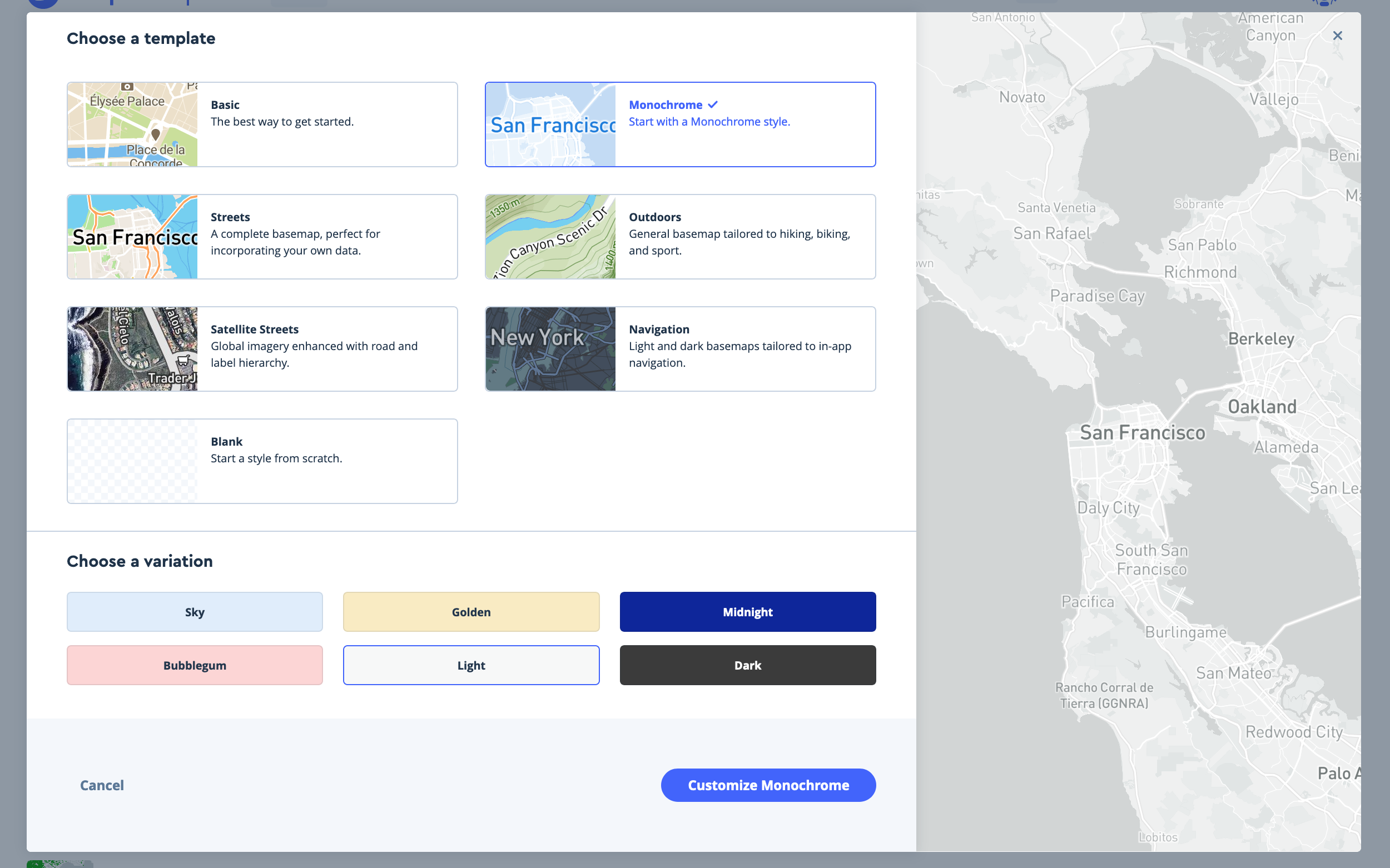
Before setting up our mapping site we should style the basemap we will use. To do this, go to your Mapbox Studio page and create a New style.
-
It is usually much easier to start from a template, otherwise you will have to add and style every single layer your map will use and do this for all zoom levels. The templates provided by Mapbox already include all this styling and have been tested and refined many many times.
-
To create our turnstile map we will use the
Monochrometemplate with aLightvariation. Choose it and clickCustomize Monochrome. This template provides a very neutral background on which to display our turnstile data.
-
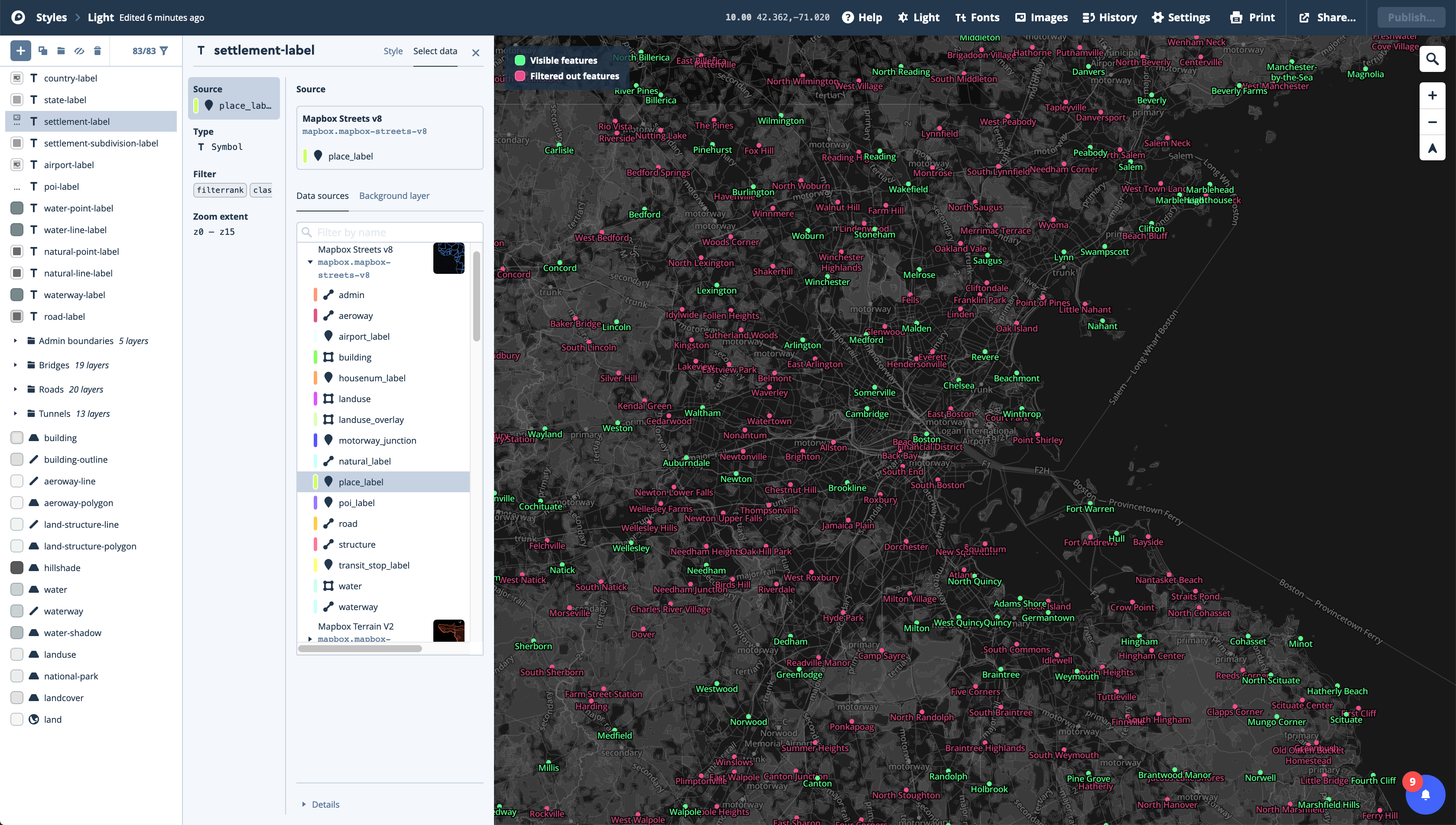
On the next screen you’ll see the actual editor view with all the
componentsandlayersincluded on the map listed on the left hand side.Componentsare just groups of layers that have the same style.Layersare the individual parts of the components. You can adjust the values forcomponentsor for individuallayers. However, if you want to modify only alayeryou’ll have to override the component style and unlock the layer. -
Layers with a
Ton their left represent label layers. There are also point, line, and polygon layers, and groups of layers. -
At the top of the editor you will see the current zoom level (10 by default at the start of the editing session), and the map starting coordinates.
-
If you click on a
componentor on alayeryou will see its style, and depending on the type of layer it is (point, line, polygon, text) you will be able to style different attributes. -
In the
layerpanel I find it very useful to click on theSelect databutton at the top of the menu, and to cycle through the layers in this view.- Here, the items belonging to this specific layer will be highlighted in two colors, green for those items that are visible at this zoom level, and mauve for the items that belong to the layer but are not visible because of some styling condition.
-
For this basemap we are actually going to do very little editing. Just a couple of adjustments to the road style and hiding a few layers we don’t need.
-
First, rename the style by clicking on the
Monochrometext at the top left corner of the window. Rename it to something likeCustomMonochromeor something like that. -
Second, go into the
Road networkcomponent. There change the overall style fromStandardtoSimple, and reduce theRoad widthto the minimum using the slider. -
Third, go into the
Point of interest labelsand disable it completely by clicking on the eye icon next to it. -
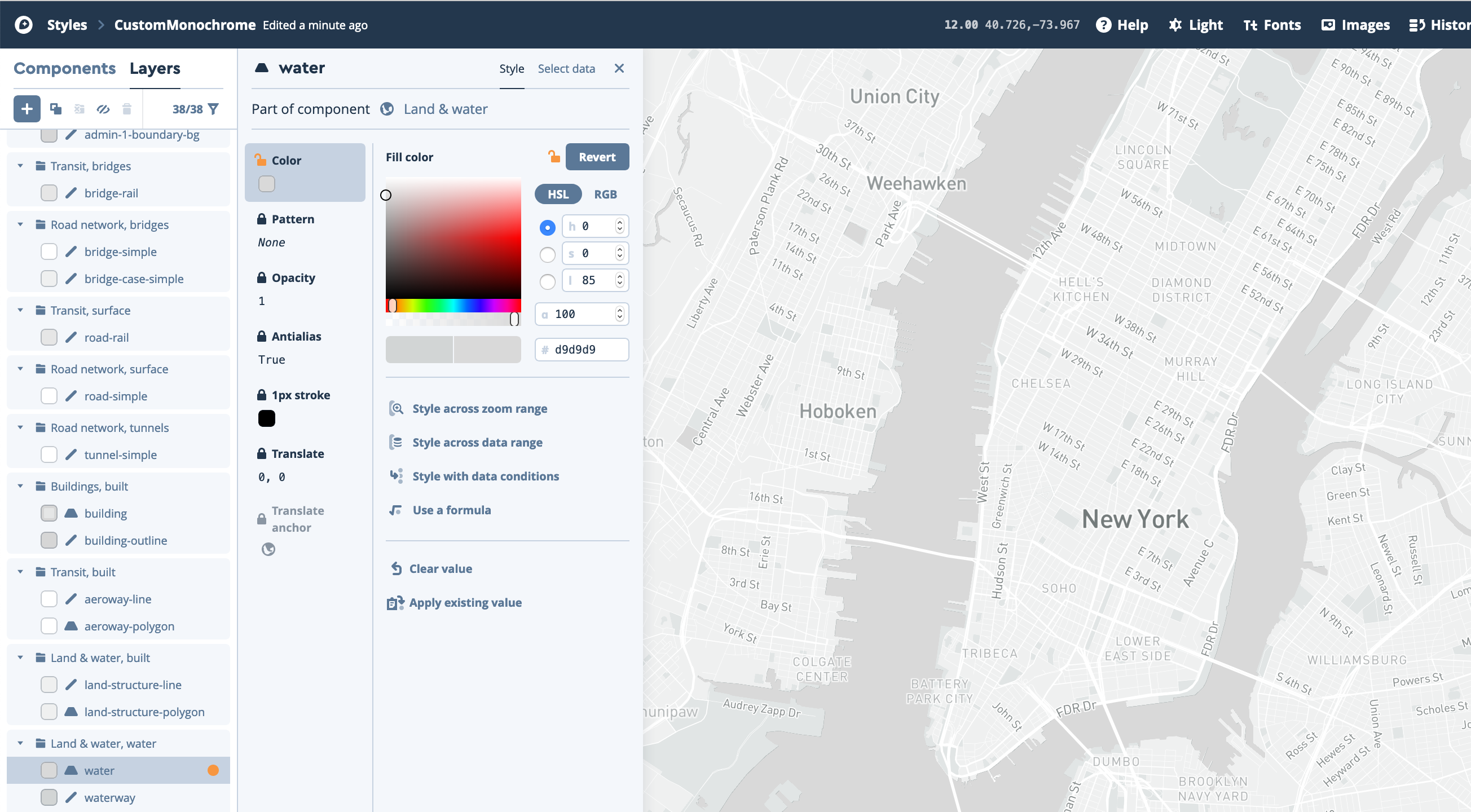
Fourth, change the water color by going into the
layerstab and choosing thewaterlayer underLand & water, water. There, first select theColortab. Then, click on theOverridebutton. And finally, change the color value to#d9d9d9.
-
-
Once these adjustments are done, click on the
Publishbutton. You will ge a window were you can compare the original vs. the modified style. Make sure everything is alright and clickPublishagain. -
Finally, click on the
Stylesbutton at the top-left corner of the editor to go back to your styles list. You should see your new style listed there. -
To use this style on your interactive map, click on the
Sharebutton right of the style and copy theStyle URLunderDeveloper resources. It should look something likemapbox://styles/xxxxxx/xxxxxxxxxxx. -
The last thing we need to do in Mapbox is to generate an
Access token.-
To do this, click on the helmet at the top-right corner of the page and select
Account, or go to Mapbox’s account page. -
Once there, click on
+ Create a token. Give it a name, (usually corresponding to your project), and, for now, leave the URL blank. Once you have a set URL for your live webmap you will have to come back here and set the URL for this token, to restrict its use just for this address. -
Once this is done, click
Create token. You will see your new token in your token list page. It should look something likepk.xx...Copy it and have it handy for the next section.
-
Setting Up Your HTML, CSS, and JavaScript
The next step in the process is to create the basic setup for a webmap. This will comprise, initially, three files: index.html, styles.css, and map.js. The index.html file will contain the basic information your site will display, the styles.css will contain the styling of that information, and the map.js will contain the JavaScript code powering the map.
For this part of the process it is highly recommended to use an advanced text editor like VS Studio Code, Atom, or Sublime Text. These editors provide advanced functionality and formatting that will make writing code much easier and faster.
-
First, create a new folder on your computer for your webmap. In there, create the three (empty) files mentioned above
index.html,styles.css, andmap.js. -
Copy the following code to your
index.htmlfile:
<!DOCTYPE html>
<html>
<head>
    <meta charset='utf-8' />
    <title>Subway Usage During the Covid-19 Outbreak</title>
    <meta name="viewport" content="initial-scale=1,maximum-scale=1,user-scalable=no">
    <link href="https://api.mapbox.com/mapbox-gl-js/v2.7.0/mapbox-gl.css" rel="stylesheet">
    <script src="https://api.mapbox.com/mapbox-gl-js/v2.7.0/mapbox-gl.js"></script>
    <link rel="stylesheet" href="styles.css">
</head>

<body>
    <div id='map'></div>
    <script type='text/javascript' src="map.js"></script>
</body>

</html>
-
This html page contains the following elements:
-
In the
head:-
Information about the encoding of the site
-
The title (see on the tabs of your browser)
-
Links to Mapbox’s Javascript libraries and styles
-
And a link to your own style page (
<link rel="stylesheet" href="styles.css">). If you move or rename yourstyles.cssfile, make sure to adjust this link.
-
-
In the
body:-
A new
divelement to hold the map (with amapid) -
And a link to the
map.jsJavaScript file
-
-
-
Next, copy the following code to your
map.jsfile:
mapboxgl.accessToken = 'Add your access token here';
const map = new mapboxgl.Map({
    container: 'map',
    style: 'Add your style URL here',
    zoom: 10,
    center: [-74, 40.725]
});
-
This
map.jsfile contains the code that creates and controls the map:-
Here, first, you setup your access token and then you create a
mapvariable that creates the map and sets its basic characteristics:-
What div it is in
-
The style to use
-
The starting zoom level
-
And the starting coordinates.
-
-
-
Finally, copy the following code to your
styles.cssfile:
body {
    margin: 0;
    padding: 0;
}

#map {
    width: 60%;
    height: 800px;
    margin: 5em auto;
}
-
This
cssfiles sets some very basic styling:-
For the
bodyit declares margins and padding to be 0. -
And for the
mapdiv, it sets the width to be 90% of the page, the height to be 600px, and horizontal margins to be of 5em up and down, and automatic on each side. -
Note that a height of 100% doesn’t work. The best bet is to set a fixed height, like 600px.
-
-
With this setup you can open your browser and there select
File / Openand choose yourindex.htmlfile. Your page should load with an interactive map centered on New York City and using your Mapbox style. You should be able to pan around and zoom in and out in this map.
Finally, official documentation for Mapbox GL can be found here. It is worth checking out the examples page and, more importantly, the style specification page.
Adding Layers to Your Interactive Map
Running a Localhost
One thing to note before proceeding is that for this part of the tutorial, and for the rest of it, you will need to run a localhost on your machine in order for the map to work properly. Running a localhost is equivalent to starting your own swerver on your computer and accessing through your browser.
Liver Server Extension (VS Studio Code):
- The easiest way to run a localhost is to use VS Studio Code as your text editor and install the Live Server extension. Once you’ve installed this extension, just go to your
index.htmlfile in VS Studio Code and click on theGo Livebutton at the bottom left hand corner of your editor.
Through Python and the Terminal (MacOS):
-
To run a
localhoston a MacOS do the following:-
Open your
Terminalapplication. -
Use
cd(change directory) to navigate to your map folder. For example type something likecd pointsunknown/mymapto navigate to themymapfolder inside thepoinstunknownfolder. -
Once you are in the directory where the
index.html,styles.cssandmap.jsfiles are located typepython -m SimpleHTTPServer 8000if you have Python 2.x orpython3 -m http.server 8000if you have Python 3.x on your computer (by defaults, Macs come with Python 2.7 installed but to check which version you are running you can typepython -Vin your terminal). -
Finally, open your browser and navigate to
http://0.0.0.0:8000/. You should see your map there.
-
Adding a GeoJSON Layer
-
First, create a sub-folder in your map folder. Call it
data. Add your GeoJSON turnstile data file there. -
Next, we need to create a function within our
map.jsfile that will add a new layer to the map and provide its basic settings:- Add the following code to the end of the file:
map.on('load', function () {
    map.addLayer({
        'id': 'turnstileData',
        'type': 'circle',
        'source': {
            'type': 'geojson',
            'data': 'data/turnstileData.geojson'
        },
        'paint': {
            'circle-color': '#ff7f50',
            'circle-stroke-color': '#4d4d4d',
            'circle-stroke-width': 0.5,
            'circle-radius': 5
        }
    });
});
-
This piece of does the following:
-
Waits until the map is loaded and then adds a new layer.
-
This layer has an
idand is of typecircle(polygon layers are of typefill). Other types includebackground,line,symbol,raster,fill-extrusion,heatmap, andhillshade. -
It provides the
sourcefor this layer. In our case it’s of the typegeojsonand it’s located in thedatafolder. -
Finally, it provides the style (
paint). Here, we are using a very basic ‘coral’ fill and a radius of 5px.
-
-
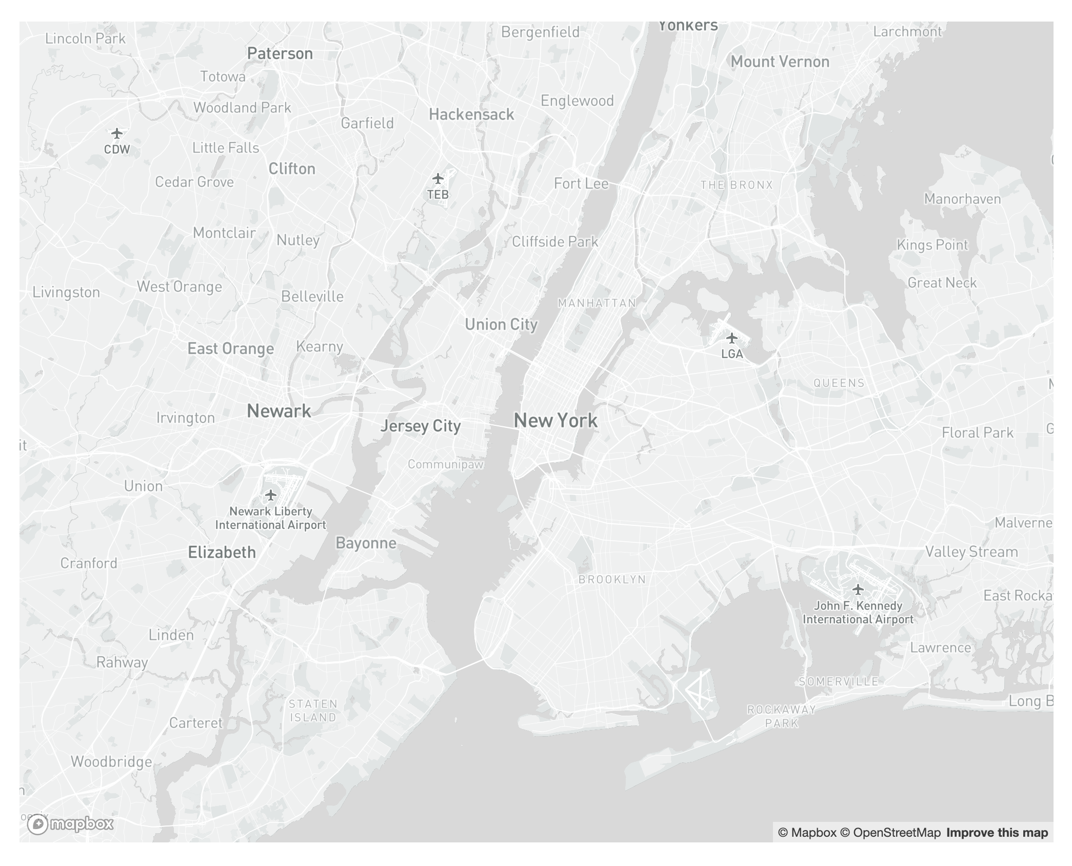
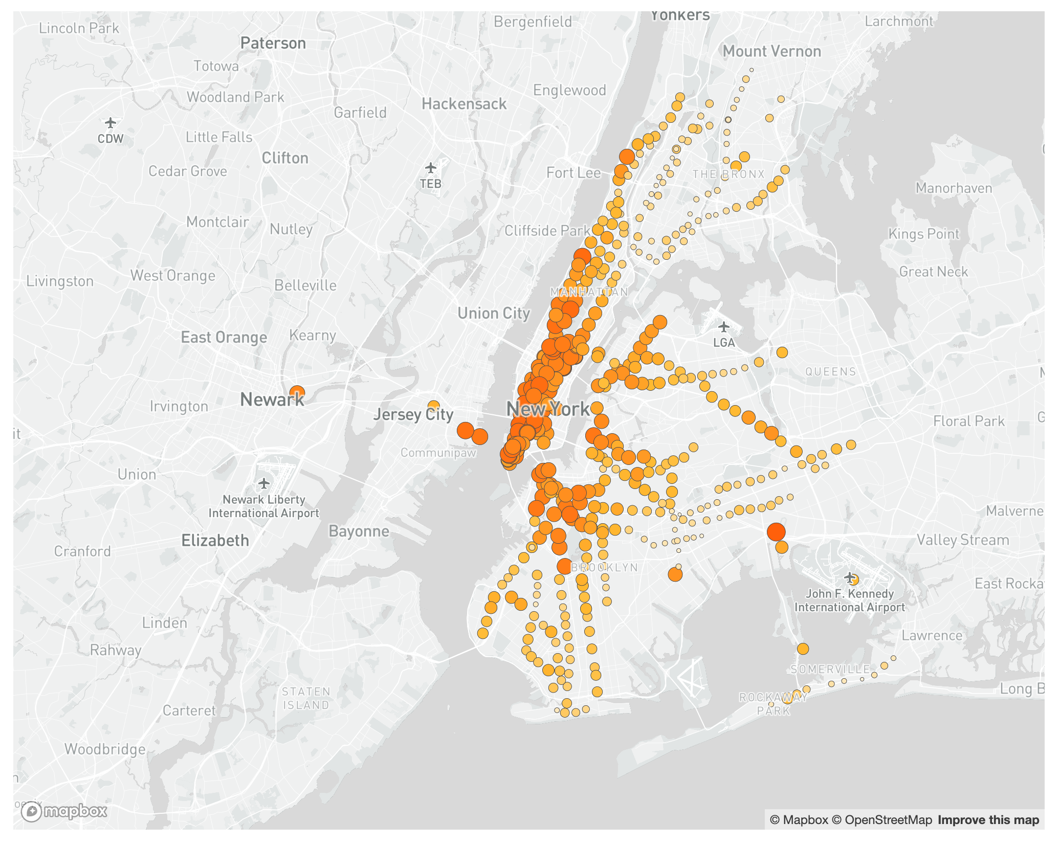
If you reload your map now and zoom out you should see all the stations included in the dataset.
Styling Layers Based on Quantitative Attributes
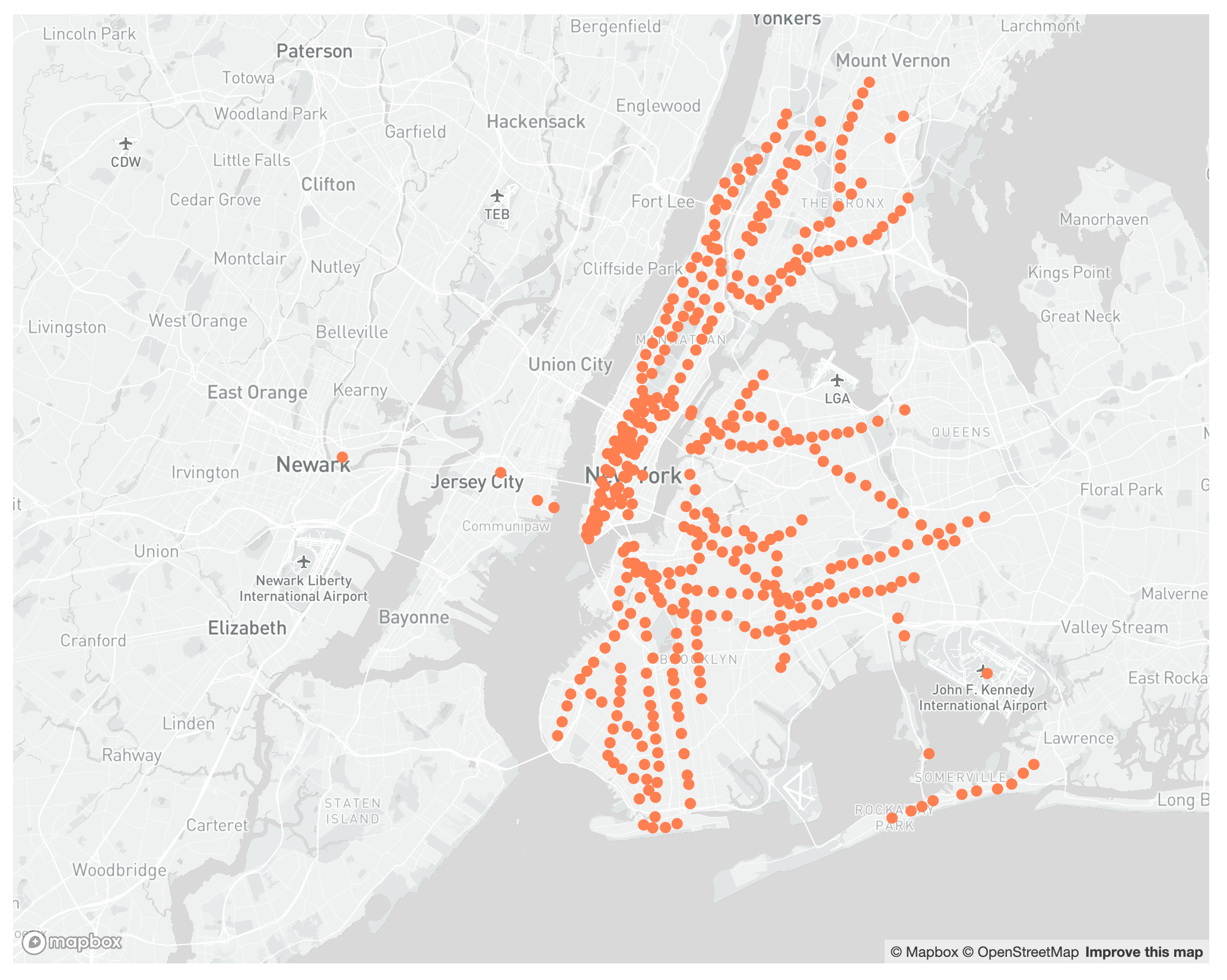
To style the stations based on the percentage change between March 6th and March 20th we need to modify the attributes of that layer at the moment of adding it to the map. We will modify both the color of each station and the radius of the circle.
First, let’s modify the circle-radius property. To do this, update the map.on function to the following:
map.on('load', function () {
    map.addLayer({
        'id': 'turnstileData',
        'type': 'circle',
        'source': {
            'type': 'geojson',
            'data': 'data/turnstileData.geojson'
        },
        'paint': {
            'circle-color': '#ff7f50',
            'circle-stroke-color': '#4d4d4d',
            'circle-stroke-width': 0.5,
            'circle-radius': ['interpolate', ['linear'], ['get', 'ENTRIES_DIFF'],
                -1, 10,
                -0.4, 1,
            ]
        }
    });
});
Here we are using an interpolate function to assign the circle-radius property based on the ENTRIES_DIFF field from the GeoJson file. This interpolate expression takes three arguments:
-
They type of interpolation: in our case
linear -
The value to use for every feature: in our case we
gettheENTRIES_DIFFvalue for each station -
The reference values and the corresponding radius values. In our case, we know our values go from -0.928 to -0.446. We then say that a value of -1 should be represented with a radius of 10 and a value of -0.4 should have a radius of 1, and Mapbox interpolates between those values.
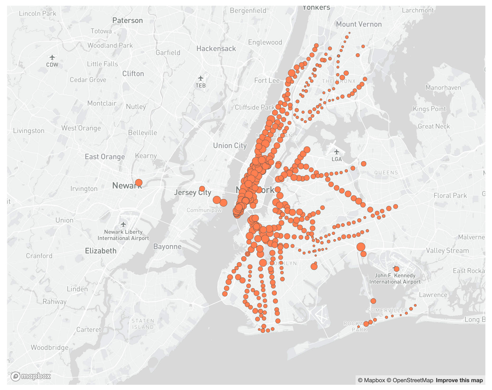
Next, let’s modify the circle-color property, also based on the ENTRIES_DIFF value from the geojson. We are encoding this value on two properties (radius and color), which in some circumstances might be overkill. However, here, this double encoding really helps to drive the point home.
Update your map.on function to the following:
map.on('load', function () {
    map.addLayer({
        'id': 'turnstileData',
        'type': 'circle',
        'source': {
            'type': 'geojson',
            'data': 'data/turnstileData.geojson'
        },
        'paint': {
            'circle-color': ['interpolate', ['linear'], ['get', 'ENTRIES_DIFF'],
                -1, '#ff4400',
                -0.7, '#ffba31',
                -0.4, '#ffffff'
            ],
            'circle-stroke-color': '#4d4d4d',
            'circle-stroke-width': 0.5,
            'circle-radius': ['interpolate', ['linear'], ['get', 'ENTRIES_DIFF'],
                -1, 10,
                -0.4, 1,
            ]
        }
    });
});
Here we are using a similar interpolate expression, but we are applying it to the circle-color property. The only other difference with the for the circle-radius is that in this one we are adding a stop in the middle (-0.7). This allows us to go from white, to yellow, to coral in the color progression.
Adding the Layers Underneath the Labels
If you look closely, you’ll notice that our new layer is sitting on top of the city and borough labels. To correct this we need to identify what layer the turnstile data should be underneath of, and add that as a property of our layer.
- Modify your
map.onfunction to the following:
map.on('load', function () {
    // This is the function that finds the first symbol layer
    let layers = map.getStyle().layers;
    let firstSymbolId;
    for (var i = 0; i < layers.length; i++) {
        if (layers[i].type === 'symbol') {
            firstSymbolId = layers[i].id;
            break;
        }
    }

    map.addLayer({
        'id': 'turnstileData',
        'type': 'circle',
        'source': {
            'type': 'geojson',
            'data': 'data/turnstileData.geojson'
        },
        'paint': {
            'circle-color': ['interpolate', ['linear'], ['get', 'ENTRIES_DIFF'],
                -1, '#ff4400',
                -0.7, '#ffba31',
                -0.4, '#ffffff'
            ],
            'circle-stroke-color': '#4d4d4d',
            'circle-stroke-width': 0.5,
            'circle-radius': ['interpolate', ['linear'], ['get', 'ENTRIES_DIFF'],
                -1, 10,
                -0.4, 1,
            ]
        }
    }, firstSymbolId); // Here's where we tell Mapbox where to slot this new layer
});
-
Here we did two things:
-
First, we added a short function that loops through the existing layers of the map and identifies the first one of type
symbol. That’s the one our states layer should be underneath of. -
Second, at the end of the
map.addLayerfunction, we added this firstsymbollayer to mark where these new layers should be slotted in the stack.
-
Setting Minimum and Maximum Zoom Levels and the Map Bounds
One small thing we must do before moving on to popups and interactivity is setting the minimum and maximum zoom levels for the map, as well as its bounds. This will prevent people from zooming in or out too much and from dragging the map outside of its intended bounds (New York City).
This is quite easy, just update your map object (in your map.js file) in the following way:
mapboxgl.accessToken = 'Your access token here';
const map = new mapboxgl.Map({
    container: 'map',
    style: 'Your Mapbox style URL here',
    zoom: 10,
    center: [-74, 40.725],
    maxZoom: 15,
    minZoom: 8,
    maxBounds: [[-74.45, 40.45], [-73.55, 41]]
});
Here we are adding the following lines:
-
maxZoom: 15andminZoom: 8which restrict how much you can zoom in or out of the map. -
And
maxBounds: [[-74.45, 40.45], [-73.55, 41]]which sets the maximum bounds of the map. The two paris of coordinates represent the southwest and northeast corners of the maximum extent.
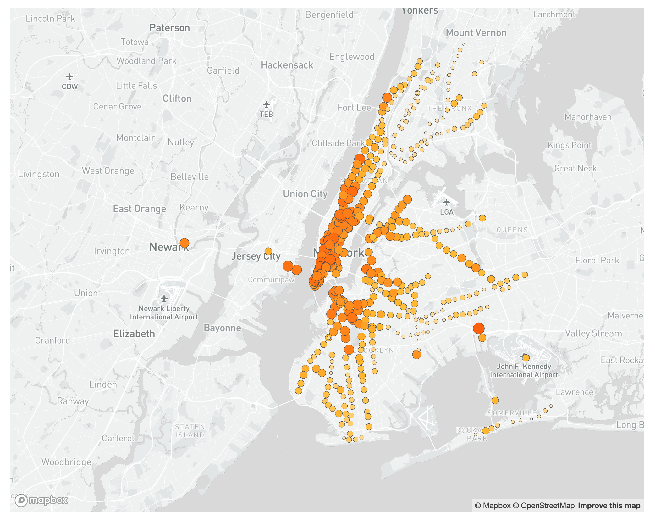
Adjusting map properties based on zoom level
As you zoom into the map you will notice that the circles for the stations look much smaller. That’s not because they are becoming smaller but because everything around them is becoming larger. To maintain readability we need to adjust their size based on the zoom level.
To do this we will update the map.on function and add another interpolation – this time exponential – to the circle-radius property.
map.on('load', function () {
    let layers = map.getStyle().layers;
    let firstSymbolId;
    for (var i = 0; i < layers.length; i++) {
        if (layers[i].type === 'symbol') {
            firstSymbolId = layers[i].id;
            break;
        }
    }

    map.addLayer({
        'id': 'turnstileData',
        'type': 'circle',
        'source': {
            'type': 'geojson',
            'data': 'data/turnstileData.geojson'
        },
        'paint': {
            'circle-color': ['interpolate', ['linear'], ['get', 'ENTRIES_DIFF'],
                -1, '#ff4400',
                -0.7, '#ffba31',
                -0.4, '#ffffff'
            ],
            'circle-stroke-color': '#4d4d4d',
            'circle-stroke-width': 0.5,
            'circle-radius': ['interpolate', ['exponential', 2], ['zoom'],
                10, ['interpolate', ['linear'], ['get', 'ENTRIES_DIFF'],
                    -1, 10,
                    -0.4, 1
                ],
                15, ['interpolate', ['linear'], ['get', 'ENTRIES_DIFF'],
                    -1, 25,
                    -0.4, 12
                ]
            ],
        }
    }, firstSymbolId);
});
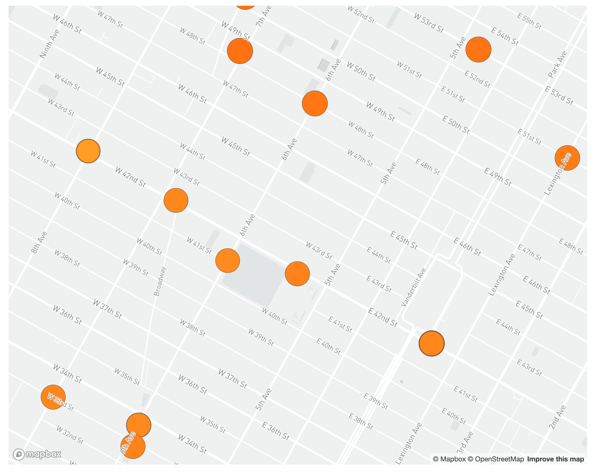
If you look closely at the circle-radius function you will see that there are three interpolations: the main one, exponential, tied to the zoom level, and two more, linear, tied to the ENTRIES_DIFF value. What we are doing here is that we are adding an interpolation expression at each of the stops of the zoom interpolation.
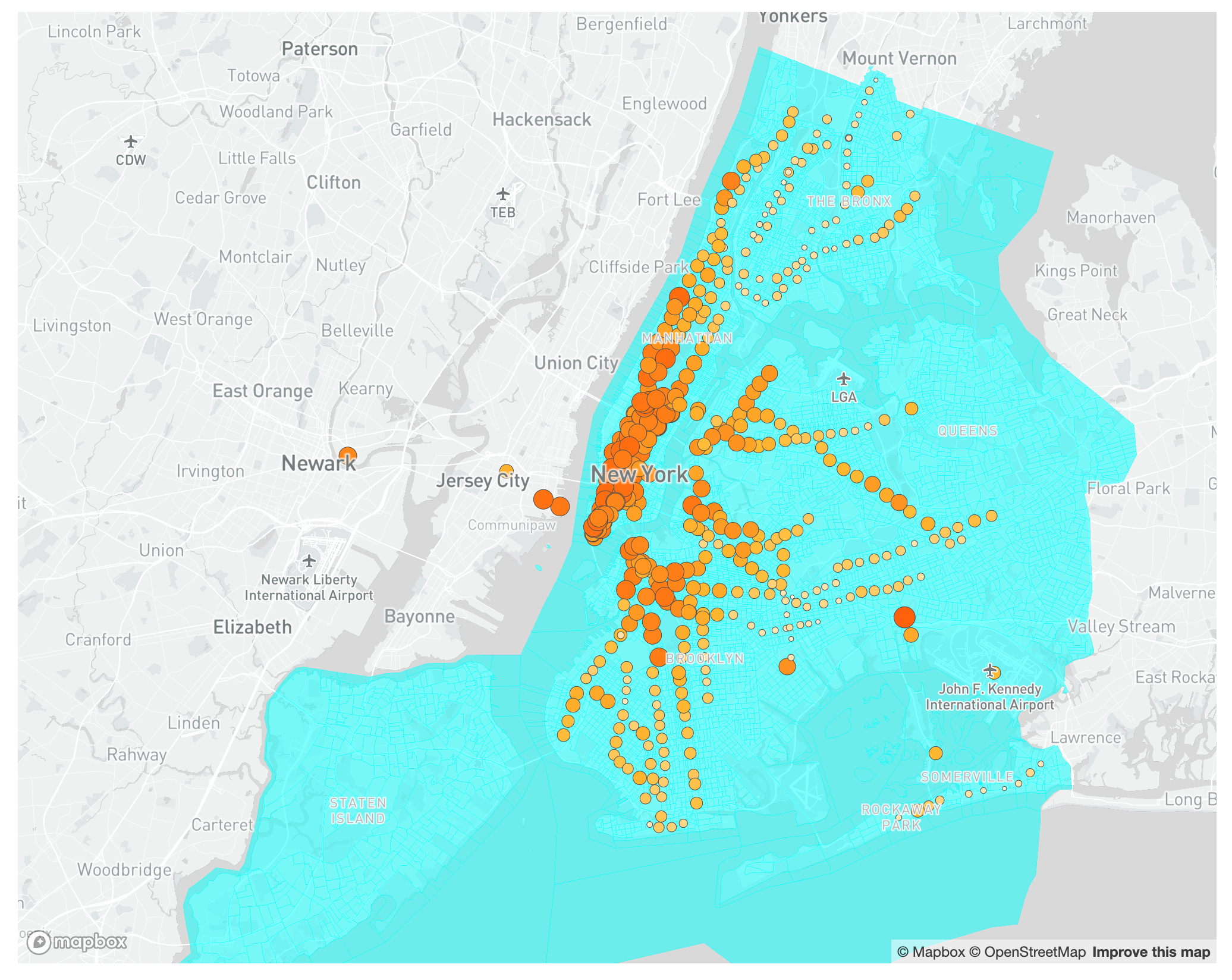
Now if you zoom into the map you will see the stations maintain a proportional size:
Creating Popups
Apart from zooming in and out, and panning, the other main feature of interactive maps is popups, which give you extra information about a specific feature. In this section we will create popups both for the state and the county-level data.
Interacting with the map usually happens in map.on functions. To set the popup behavior we will code six of those functions, three for the state and three for the county data: one function will open the the popup, and two will change the cursor icon – into a hand when hovering over a feature, and back into an arrow when not over one.
- Add the following piece of code at the end of your
map.jsfile:
// Create the popup
map.on('click', 'turnstileData', function (e) {
    let entriesDiff = e.features[0].properties.ENTRIES_DIFF;
    let entries_06 = e.features[0].properties.ENTRIES_06;
    let entries_20 = e.features[0].properties.ENTRIES_20;
    let stationName = e.features[0].properties.stationName;
    new mapboxgl.Popup()
        .setLngLat(e.lngLat)
        .setHTML(stationName + '<br>' + entriesDiff + '%' + '<br>' + entries_06 + '<br>' + entries_20)
        .addTo(map);
});
// Change the cursor to a pointer when the mouse is over the turnstileData layer.
map.on('mouseenter', 'turnstileData', function () {
    map.getCanvas().style.cursor = 'pointer';
});
// Change it back to a pointer when it leaves.
map.on('mouseleave', 'turnstileData', function () {
    map.getCanvas().style.cursor = '';
});
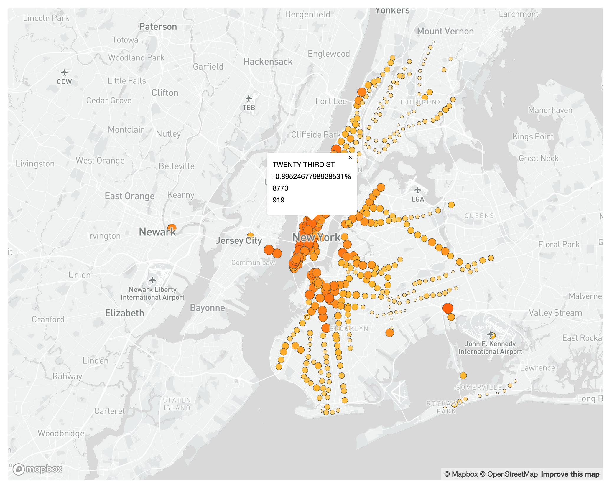
In these functions we are doing the following:
-
First, we are saying, if there’s a click on the map, and that click is on a
turnstileDatafeature, do the following with that feature (which we will calle):-
Get the
ENTRIES_DIFF,ENTRIES_06,ENTRIES_20, andstationNameattributes and assign them to their own variables. -
Create the popup (
new mapboxgl.Popup()) with coordinates from the click element, with somehtmlelements based on the variables, and add it to the map.
-
-
Second, we are saying that if the mouse enters (
mouseenter) or leaves (mouseleave) one of these features, change the icon for the mouse to apointeror back to the default. -
The map with the basic popup should look like this:
The only thing left to do is to add more information to the popup and style it properly.
The final popup JavaScript section should look like this:
// Create the popup
map.on('click', 'turnstileData', function (e) {
    let entriesDiff = e.features[0].properties.ENTRIES_DIFF;
    let entries_06 = e.features[0].properties.ENTRIES_06;
    let entries_20 = e.features[0].properties.ENTRIES_20;
    let stationName = e.features[0].properties.stationName;
    new mapboxgl.Popup()
        .setLngLat(e.lngLat)
        .setHTML('<h4>' + stationName + '</h4>'
            + '<p><b>Friday, March 6th:</b> ' + entries_06 + ' entries<br>'
            + '<b>Friday, March 20th:</b> ' + entries_20 + ' entries<br>'
            + '<b>Change:</b> ' + Math.round(entriesDiff * 1000) / 10 + '%</p>')
        .addTo(map);
});
// Change the cursor to a pointer when the mouse is over the turnstileData layer.
map.on('mouseenter', 'turnstileData', function () {
    map.getCanvas().style.cursor = 'pointer';
});
// Change it back to a pointer when it leaves.
map.on('mouseleave', 'turnstileData', function () {
    map.getCanvas().style.cursor = '';
});
- And the styling in the css should look like this:
.mapboxgl-popup-content h4 {
    font-weight: 500;
    font-size: 0.9em;
    border-width: 0px 0px 0.5px 0px;
    border-style: solid;
    border-color: rgb(80, 80, 80);
    margin-top: 0.5em;
    margin-bottom: 0.5em;
}

.mapboxgl-popup-content p {
    font-weight: 300;
    margin-top: 0.3em;
    margin-bottom: 0em;
}
- Your popups should now look something like this:
Adding an Additional Layer
We could say that the map is done there. However, adding an additional layer showing the median household income for each block group in the city will make our map and story richer and more nuanced. Yes, the system overall has seen an enormous decline in usage, but that decline has not been uniform across the city; usage in poorer neighborhoods has not declined as much as in richer ones.
First, we need to add the medianIncome.geojson layer to the map. To do this, add the following code to the map.on('load') function:
map.addLayer({
    'id': 'medianIncome',
    'type': 'fill',
    'source': {
        'type': 'geojson',
        'data': 'data/medianIncome.geojson'
    },
    'paint': {
        'fill-color': '#00ffff',
        'fill-opacity': 0.5,
    }
}, 'turnstileData');
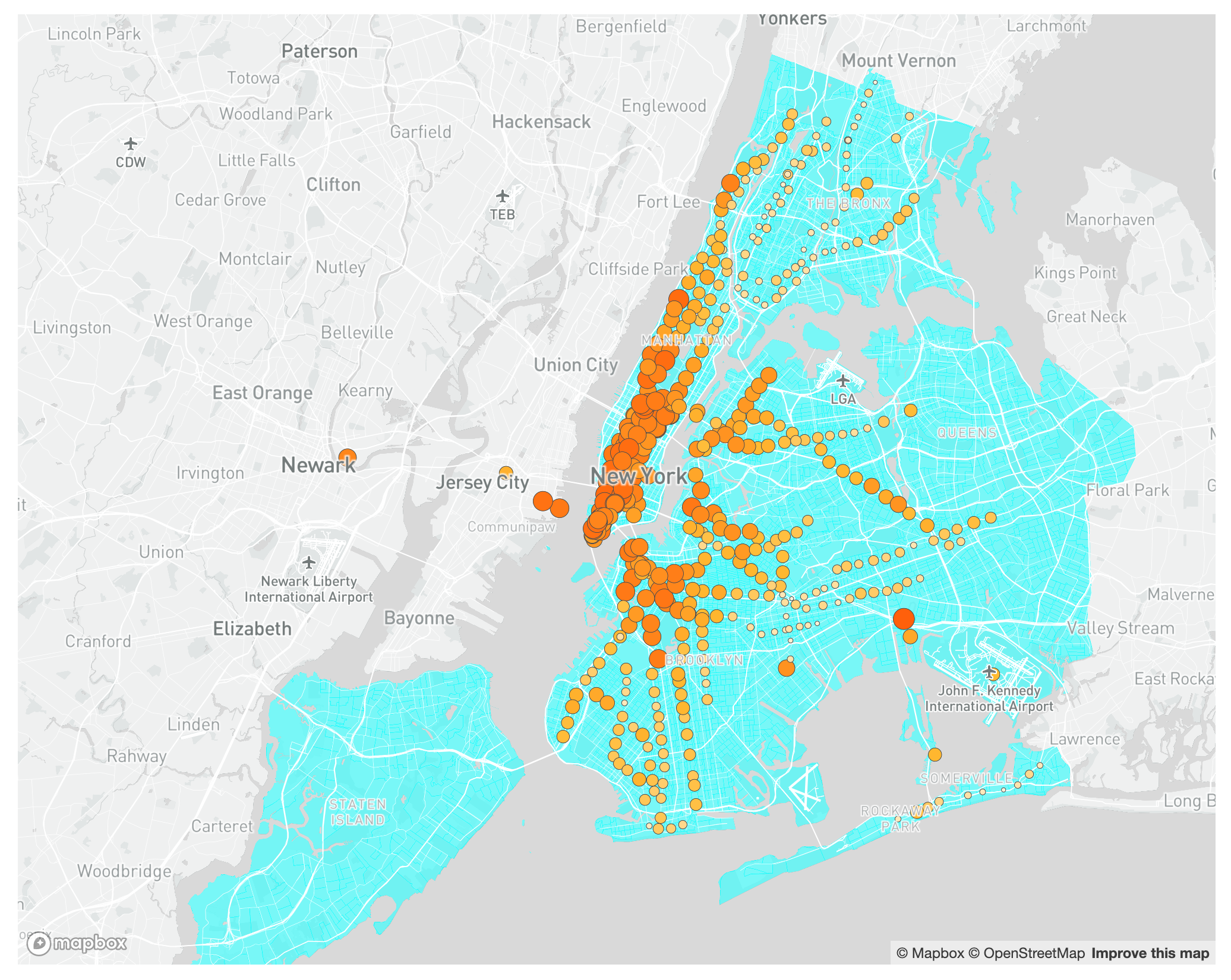
Here we are replicating the addLayer function we have above for the subway stations, but this time we are adding the medianIncome.geojson data. In addition, we are stating that the layer is of type fill and we are specifying the fill-color and fill-opacity attributes. You should see something like this:
As you can see, the layer was added to the map under the turnstile data, which is correct, but census block groups actually go into the water, which doesn’t make sense in the map. To correct this, we should instead add the layer underneath the water, but on top of the land so we can actually see it. We need then to figure out what the id of the water layer is, and specify that in the order attribute for the income layer.
To figure this out we can add one line of code to our loop at the top of the map.on('load') function that prints the ids for every layer in our map. Add this snippet of code to the top of the map.on('load') function:
// This is the function that finds the first symbol layer
let layers = map.getStyle().layers;
let firstSymbolId;
    for (var i = 0; i < layers.length; i++) {
    console.log(layers[i].id); // This is the line of code that we are adding
    if (layers[i].type === 'symbol') {
        firstSymbolId = layers[i].id;
        break;
    }
}
This piece of code gets all the layers in the style and then loops through them printing their id to the browser’s console.
Once you add the code, reload your map and open your inspector / developer tools and go to the console. You should see something like this:
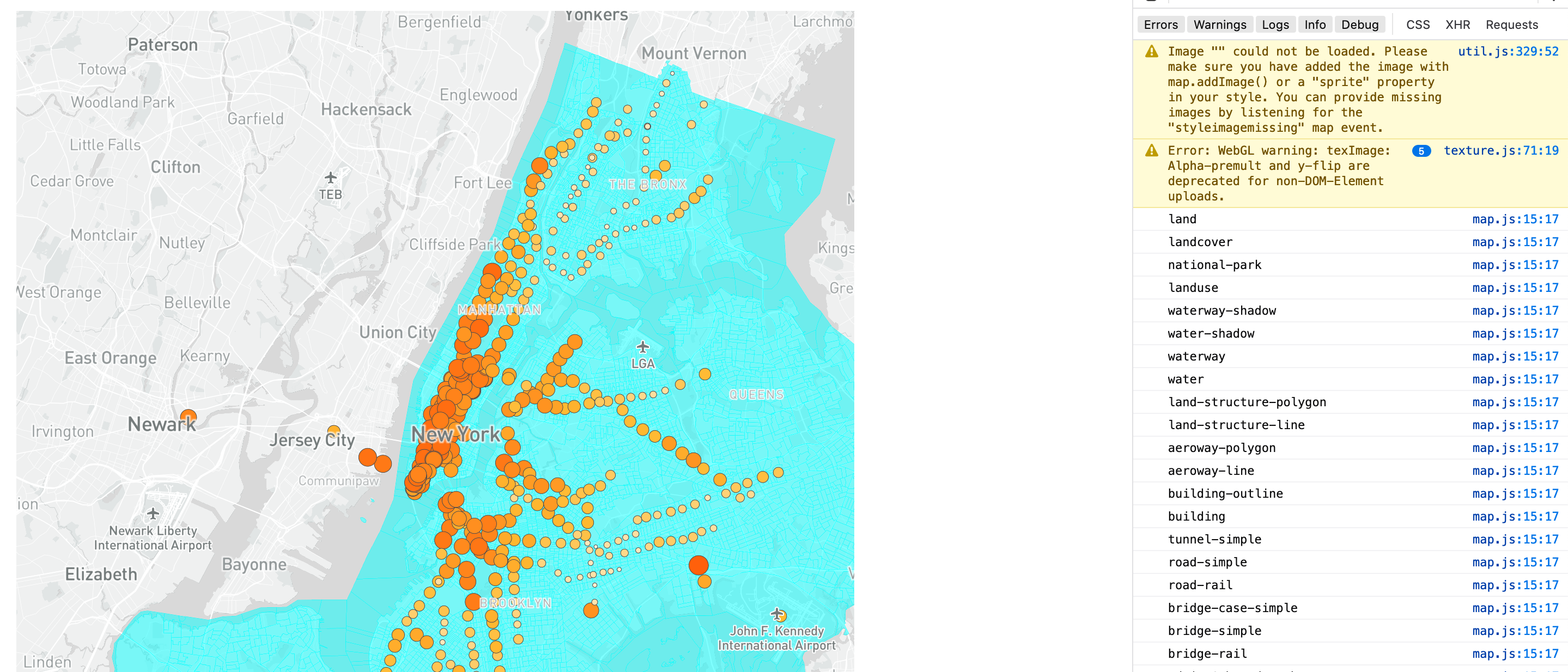
On the console you should see the list of layers. Notice that the water layers are right above (below in the list) the landuse layer. That seems like a good place to put the income layer below the water layers but above the landuse one.
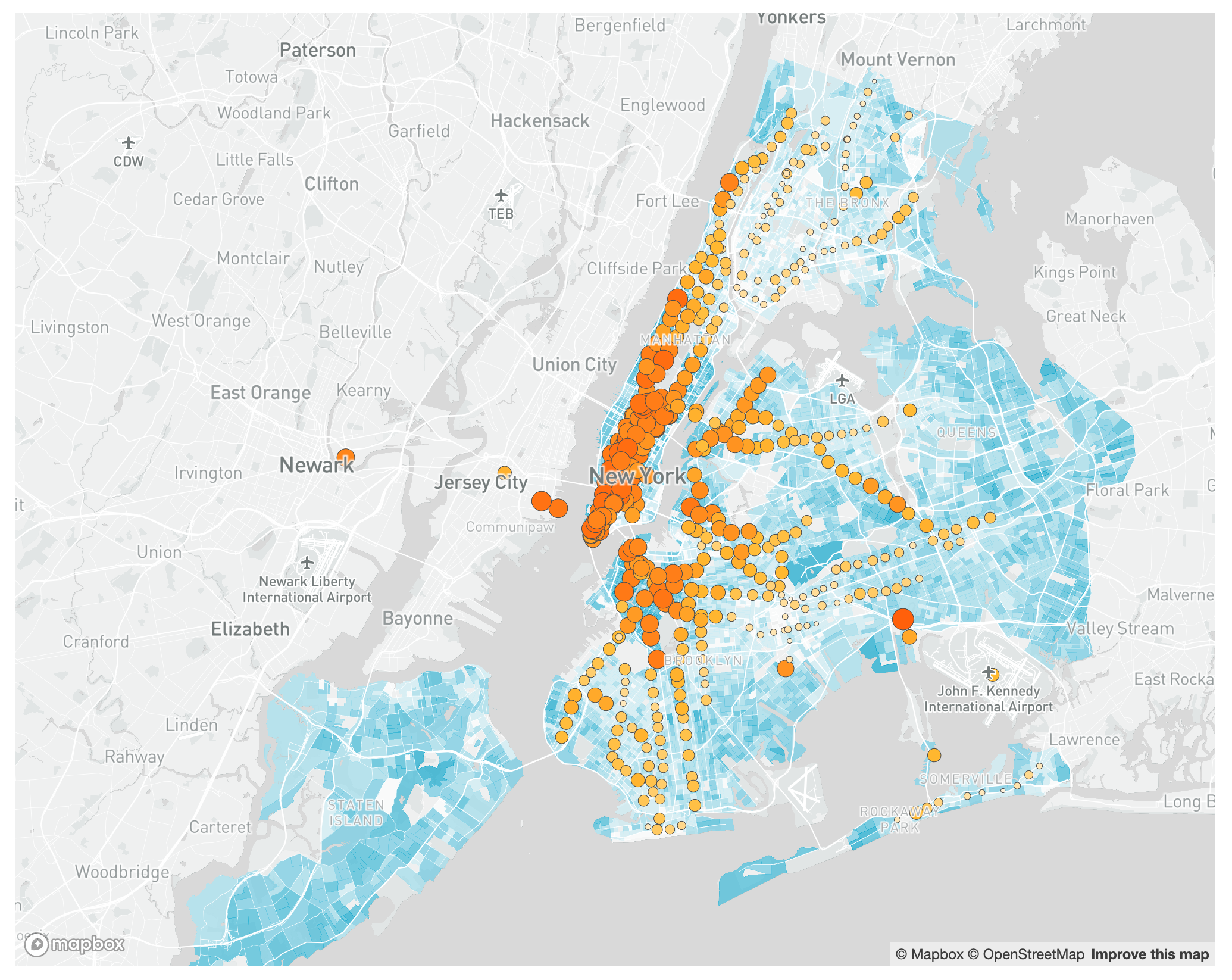
To do this, change the last line of the code where we add the income layer. Instead of 'turnstileData' it should say 'waterway-shadow'. And you can remove the loop we added.
Your map should now look something like the one below. The income should be visible but it should be underneath the subway stations, roads, labels and water. That way we can still see the income data, but it doesn’t obscure other points of reference or the subway stations, which are the main point of the map.
Of course now we need to give the income layer a proper symbology.
If this was a map of just income levels we would probably use a divergent color scheme centered around the median household income for New York City. However, because the main point of the map is to highlight the change in subway usage, using a divergent color scheme will draw attention away from the stations.
Since the income data is there to complement the subway data we will use a simple sequential color ramp. In addition, some of the block groups don’t have any income information so we need to make sure these remain transparent. To properly symbolize the new layer update its code to the following:
map.addLayer({
    'id': 'medianIncome',
    'type': 'fill',
    'source': {
        'type': 'geojson',
        'data': 'data/medianIncome.geojson'
    },
    'paint': {
        'fill-color': ['step', ['get', 'MHHI'],
            '#ffffff',
            20000, '#ccedf5',
            50000, '#99daea',
            75000, '#66c7e0',
            100000, '#33b5d5',
            150000, '#00a2ca'],
        'fill-opacity': ['case', ['==', ['get', 'MHHI'], null], 0, 0.65]
    }
}, 'waterway-shadow');
In these lines we are doing the following:
-
For the
fill-colorwe are using astepfunction, which groups values in buckets. The specific buckets are adapted from aNatural Breaks (Jenks)classification performed in QGIS. Each bucket has its own color. Note the lone color at the beginning without a bucket. In our case that means that any feature with a median household income of less than $20,000 will get that color. -
And for the
fill-opacitywe are using acasefunction, which functions similar to an if/else statement. We are saying ‘if MHHI is equal tonull, then use0for opacity (this means make it transparent); in all other cases use0.65’.
Your map should look something like this:
Current Code
If you’d like to stop at this stage, the final code for this interactive map is as follows:
index.html:
<!DOCTYPE html>
<html>
<head>
    <meta charset='utf-8' />
    <title>Subway Usage During the Covid-19 Outbreak</title>
    <meta name="viewport" content="initial-scale=1,maximum-scale=1,user-scalable=no">
    <link href="https://api.mapbox.com/mapbox-gl-js/v2.7.0/mapbox-gl.css" rel="stylesheet">
    <script src="https://api.mapbox.com/mapbox-gl-js/v2.7.0/mapbox-gl.js"></script>
    <link rel="stylesheet" href="styles.css">
</head>

<body>
    <div id='map'></div>
    <script type='text/javascript' src="map.js"></script>
</body>

</html>
styles.css:
body {
    margin: 0;
    padding: 0;
}

#map {
    width: 60%;
    height: 800px;
    margin: 5em auto;
}

.mapboxgl-popup-content h4 {
    font-weight: 500;
    font-size: 0.9em;
    border-width: 0px 0px 0.5px 0px;
    border-style: solid;
    border-color: rgb(80, 80, 80);
    margin-top: 0.5em;
    margin-bottom: 0.5em;
}

.mapboxgl-popup-content p {
    font-weight: 300;
    margin-top: 0.3em;
    margin-bottom: 0em;
}
map.js:
mapboxgl.accessToken = 'Your access token here';
const map = new mapboxgl.Map({
    container: 'map',
    style: 'Your Mapbox style URL here',
    zoom: 10,
    center: [-74, 40.725],
    maxZoom: 15,
    minZoom: 8,
    maxBounds: [[-74.45, 40.45], [-73.55, 41]]
});

map.on('load', function () {
    // This is the function that finds the first symbol layer
    let layers = map.getStyle().layers;
    let firstSymbolId;
    for (var i = 0; i < layers.length; i++) {
        if (layers[i].type === 'symbol') {
            firstSymbolId = layers[i].id;
            break;
        }
    }

    map.addLayer({
        'id': 'turnstileData',
        'type': 'circle',
        'source': {
            'type': 'geojson',
            'data': 'data/turnstileData.geojson'
        },
        'paint': {
            'circle-color': ['interpolate', ['linear'], ['get', 'ENTRIES_DIFF'],
                -1, '#ff4400',
                -0.7, '#ffba31',
                -0.4, '#ffffff'
            ],
            'circle-stroke-color': '#4d4d4d',
            'circle-stroke-width': 0.5,
            'circle-radius': ['interpolate', ['exponential', 2], ['zoom'],
                10, ['interpolate', ['linear'], ['get', 'ENTRIES_DIFF'],
                    -1, 10,
                    -0.4, 1
                ],
                15, ['interpolate', ['linear'], ['get', 'ENTRIES_DIFF'],
                    -1, 25,
                    -0.4, 12
                ]
            ],
        }
    }, firstSymbolId);
    map.addLayer({
        'id': 'medianIncome',
        'type': 'fill',
        'source': {
            'type': 'geojson',
            'data': 'data/medianIncome.geojson'
        },
        'paint': {
            'fill-color': ['step', ['get', 'MHHI'],
                '#ffffff',
                20000, '#ccedf5',
                50000, '#99daea',
                75000, '#66c7e0',
                100000, '#33b5d5',
                150000, '#00a2ca'],
            'fill-opacity': ['case', ['==', ['get', 'MHHI'], null], 0, 0.65]
        }
    }, 'waterway-shadow');
});

// Create the popup
map.on('click', 'turnstileData', function (e) {
    let entriesDiff = e.features[0].properties.ENTRIES_DIFF;
    let entries_06 = e.features[0].properties.ENTRIES_06;
    let entries_20 = e.features[0].properties.ENTRIES_20;
    let stationName = e.features[0].properties.stationName;
    new mapboxgl.Popup()
        .setLngLat(e.lngLat)
        .setHTML('<h4>' + stationName + '</h4>'
            + '<p><b>Friday, March 6th:</b> ' + entries_06 + ' entries<br>'
            + '<b>Friday, March 20th:</b> ' + entries_20 + ' entries<br>'
            + '<b>Change:</b> ' + Math.round(entriesDiff * 1000) / 10 + '%</p>')
        .addTo(map);
});
// Change the cursor to a pointer when the mouse is over the turnstileData layer.
map.on('mouseenter', 'turnstileData', function () {
    map.getCanvas().style.cursor = 'pointer';
});
// Change it back to a pointer when it leaves.
map.on('mouseleave', 'turnstileData', function () {
    map.getCanvas().style.cursor = '';
});
Adding a Title, Legend, and Layer Buttons
The map is in a great stage, but lacks context and functionality. What follows will allow you to add a title and description to your map, a legend with details about the two visualization languages being used, as well as a button allowing the user to toggle on/off turnstile and income data layers. To begin, we will add the button menu allowing for the user to turn on/off layers. To do so, we need to add a couple lines to the CSS/HTML files, as well as some lines of code to the javascript file.
- To begin, we will add some lines of code in our js file which creates link elements that make visible and invisible the data layers already established in our map (income and turnstile). To begin, I’ll rename our layer ids to:
'id': 'MTA Station Data',and
'id': 'Household Income Data',These id changes should replace all previous references to 0
'id': 'medianIncome',and
'id': 'turnstileData',Note that this is a quick fix and should not be a naming convention used if building a production map or a map with a dynamic menu.
- Next, we need to create a variable that contains each layer id. We will also add click functionality that interacts with the visibility of each layer. This code looks like the following:
var toggleableLayerIds = ['MTA Station Data', 'Household Income Data'];


for (var i = 0; i < toggleableLayerIds.length; i++) {
    var id = toggleableLayerIds[i];

    var link = document.createElement('a');
    link.href = '#';
    link.className = 'active';
    link.textContent = id;

    link.onclick = function(e) {
        var clickedLayer = this.textContent;
        e.preventDefault();
        e.stopPropagation();

        var visibility = map.getLayoutProperty(clickedLayer, 'visibility');

        if (visibility === 'visible') {
            map.setLayoutProperty(clickedLayer, 'visibility', 'none');
            this.className = '';
        } else {
            this.className = 'active';
            map.setLayoutProperty(clickedLayer, 'visibility', 'visible');
        }
    };

    var layers = document.getElementById('menu');
    layers.appendChild(link);
}
That’s it for the additions to the javascript file. In the index.html file, we need to the navigation link to the body. To do so, add the following line of HTML
<nav id="menu"></nav>
And finally, we need to style the menu. Below is some simple styling that places the menu in the bottom right section of the page and offers simple hover and click styling (in black, white, and gray).
#menu {
	background: #fff;
	position: absolute;
	z-index: 1;
	bottom: 30px;
	right: 3em;
	border-radius: 3px;
	width: 120px;
	border: 1px solid rgba(0, 0, 0, 0.4);
	font-family: 'Open Sans', sans-serif;
}
#menu a {
	font-size: 13px;
	color: #404040;
	display: block;
	margin: 0;
	padding: 0;
	padding: 10px;
	text-decoration: none;
	border-bottom: 1px solid rgba(0, 0, 0, 0.25);
	text-align: center;
}
#menu a:last-child {
	border: none;
}
#menu a:hover {
	background-color: #f8f8f8;
	color: #000000;
}
#menu a.active {
	background-color: #404040;
	color: #ffffff;
}
#menu a.active:hover {
	background: #000000;
}
While we’re in the css file, we can also make some quick additions to make the map fullscreen. To do so, replace the body and #map css entries with the following:
body {
	margin: 0;
	padding: 0;
}

#map {
	width: 100%;
	height: 100%;
	margin: 0 0;
}
Finally, we will add our title and legend. To do so, we will start in our index.html file and add in some html so that we can know what we’re styling. In the html file, swap out the existing body with this:
<body>
<nav id="menu"></nav>
<div id='map'></div>
<div id='title' class="title">
<h1>The Geographical Distribution of Subway<br> Usage Decrease Due to COVID-19</h1>
<p>This map documents changes in ridership by subway station between March 6 and March 20th, as measured through turnstile usage. The data is provided by the New York City Metro Transit Authority. To contextualize station locations across the five boroughs, an additional layer (Median Household Income) has been added. This data is block group-level estimates provided by the American Community Survey of the U.S. Census Bureau.</p>
<hr>
<div id="turnstile-legend" class="legend2">
<h4>Drop in Ridership</h4>
<p><em>Click on stations for detailed turnstile usage</em></p>
<div><span style="background-color: #fef0d3"></span>→<span style="background-color: #ff4400; height:20px; width:20px"></span> < 50% decrease to > 90% decrease</div>
</div>
<div id="income-legend" class="legend">
<h4>Median Household Income</h4>
<div><span style="background-color: #00a2ca"></span>$150,000 +</div>
<div><span style="background-color: #33b5d5"></span>$100,000 - $150,000</div>
<div><span style="background-color: #66c7e0"></span>$75,000 - $100,000</div>
<div><span style="background-color: #99daea"></span>$50,000 - $75,000</div>
<div><span style="background-color: #ccedf5"></span>$20,000 - $50,000</div>
<div><span style="background-color: #ffffff"></span>Less than $20,000</div>
</div>
</div>
<script type='text/javascript' src="map.js"></script>
</body>
Here you can see that we’ve added a header (title), some description text, a line break (hr), and two legends: one for the ridership data, and one for the household income data. For this, we will use inline styling which is generally frowned upon. That said, we only have a couple items to style and it would require a lot of CSS to do it in the stylesheet. That said, there is still styling that needs to happen to make the title and text appear (and look nice). In the css file, we will do this by adding styles for our first and second legend, as well as the title area. The additions can be made using the following CSS:
- For the title, we will add the following:
.title {
	background-color: #fff;
	opacity: 70%;
	border-radius: 1em;
	top: 5em;
	box-shadow: 0 1px 2px rgba(0, 0, 0, 0.1);
	font: .8em/.9em 'Open Sans', sans-serif;
	line-height: 2.5em;
	padding: 1em 2em 0em;
	position: absolute;
	max-width: 25%;
	margin: 0em 5em;
	z-index: 100;
}
.title h1{
	opacity: 100%;
}
.title p {
	line-height: 1.5em;
	opacity: 100%;
}
.title div span {
	border-radius: 50%;
	display: inline-block;
	height: 10px;
	margin-left: 5px;
	width: 10px;
}
.title hr {
	border-top: .2em dashed #404040;
	border-bottom: 0em;
	margin-top: .75em;
	margin-bottom: .75em;
}
- For the turnstile legend (.legend), we will add the following styles:
.legend { font: 1em/1.5em 'Open Sans', sans-serif; padding: 1em 1em 2em 1em; position: relative; right: 10px; z-index: 100; opacity: 100%; } .legend h4 { margin: 0 0 10px; opacity: 100% } .legend div span { border-radius: 0%; display: inline-block; height: 10px; margin-top: 0px; margin-right: 20px; width: 10px; } - And for the household income legend (legend2), we will add the following:
.legend2 {
  font: 1em/1.5em 'Open Sans', sans-serif;
  padding: 1em 1em 1em 1em;
  position: relative;
  right: 10px;
  z-index: 100;
  opacity: 100%
}
.legend2 h4 {
  margin: 0 0 0px;
  opacity: 100%
}
.legend2 p {
  padding-top: 0px;
  margin-top: 0px;
}
.legend2 div span {
  border-radius: 50%;
  border-style: solid;
  border-color: black;
  border-width: 1px;
  margin: auto;
  display: inline-block;
  height: 5px;
  margin-top: 0px;
  margin-right: 10px;
  margin-left: 10px;
  width: 5px;
  opacity: 100%
}
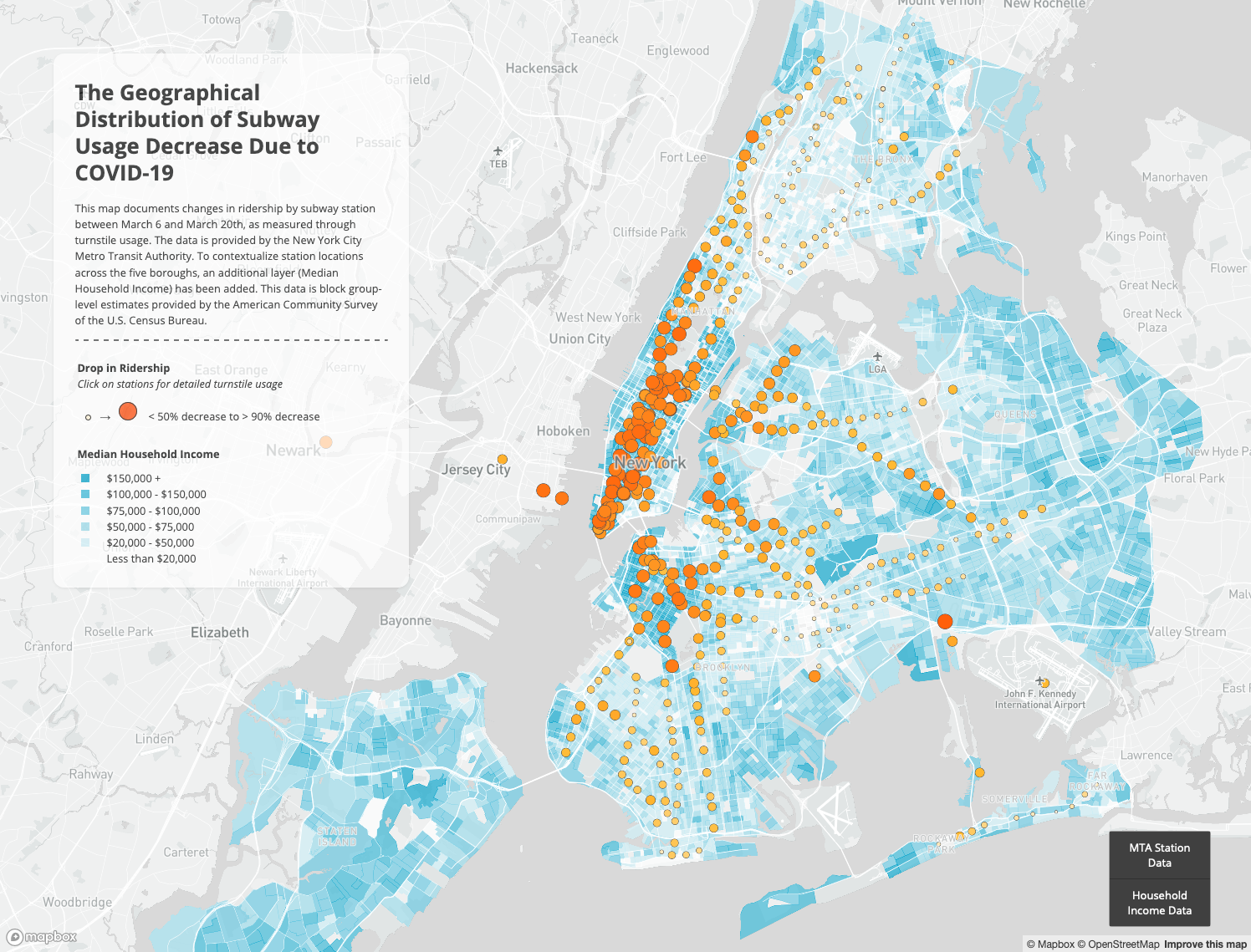
After all of these changes are made, the map should look like this:
Final Code (Styled)
index.html
<html>
<head>
<meta charset='utf-8' />
<title>Subway Usage During the Covid-19 Outbreak</title>
<meta name='viewport' content='initial-scale=1,maximum-scale=1,user-scalable=no' />
<script src='https://api.tiles.mapbox.com/mapbox-gl-js/v1.5.0/mapbox-gl.js'></script>
<link href='https://api.tiles.mapbox.com/mapbox-gl-js/v1.5.0/mapbox-gl.css' rel='stylesheet' />
<link rel="stylesheet" href="styles.css">
</head>
<body>
<nav id="menu"></nav>
<div id='map'></div>
<div id='title' class="title">
<h1>The Geographical Distribution of Subway<br> Usage Decrease Due to COVID-19</h1>
<p>This map documents changes in ridership by subway station between March 6 and March 20th, as measured through turnstile usage. The data is provided by the New York City Metro Transit Authority. To contextualize station locations across the five boroughs, an additional layer (Median Household Income) has been added. This data is block group-level estimates provided by the American Community Survey of the U.S. Census Bureau.</p>
<hr>
<div id="turnstile-legend" class="legend2">
<h4>Drop in Ridership</h4>
<p><em>Click on stations for detailed turnstile usage</em></p>
<div><span style="background-color: #fef0d3"></span>→<span style="background-color: #ff4400; height:20px; width:20px"></span> < 50% decrease to > 90% decrease</div>
</div>
<div id="income-legend" class="legend">
<h4>Median Household Income</h4>
<div><span style="background-color: #00a2ca"></span>$150,000 +</div>
<div><span style="background-color: #33b5d5"></span>$100,000 - $150,000</div>
<div><span style="background-color: #66c7e0"></span>$75,000 - $100,000</div>
<div><span style="background-color: #99daea"></span>$50,000 - $75,000</div>
<div><span style="background-color: #ccedf5"></span>$20,000 - $50,000</div>
<div><span style="background-color: #ffffff"></span>Less than $20,000</div>
</div>
</div>
<script type='text/javascript' src="map.js"></script>
</body>
</html>
styles.css
body {
	margin: 0;
	padding: 0;
}

#map {
	width: 100%;
	height: 100%;
	margin: 0 0;
}
.mapboxgl-popup-content h4 {
	font-weight: 500;
	font-size: 0.9em;
	border-width: 0px 0px 0.5px 0px;
	border-style: solid;
	border-color: rgb(80, 80, 80);
	margin-top: 0.5em;
	margin-bottom: 0.5em;
}
.mapboxgl-popup-content p {
	font-weight: 300;
	margin-top: 0.3em;
	margin-bottom: 0em;
}
#menu {
	background: #fff;
	position: absolute;
	z-index: 1;
	bottom: 30px;
	right: 3em;
	border-radius: 3px;
	width: 120px;
	border: 1px solid rgba(0, 0, 0, 0.4);
	font-family: 'Open Sans', sans-serif;
}
#menu a {
	font-size: 13px;
	color: #404040;
	display: block;
	margin: 0;
	padding: 0;
	padding: 10px;
	text-decoration: none;
	border-bottom: 1px solid rgba(0, 0, 0, 0.25);
	text-align: center;
}
#menu a:last-child {
	border: none;
}
#menu a:hover {
	background-color: #f8f8f8;
	color: #000000;
}
#menu a.active {
	background-color: #404040;
	color: #ffffff;
}
#menu a.active:hover {
	background: #000000;
}
.title {
	background-color: #fff;
	opacity: 70%;
	border-radius: 1em;
	top: 5em;
	box-shadow: 0 1px 2px rgba(0, 0, 0, 0.1);
	font: .8em/.9em 'Open Sans', sans-serif;
	line-height: 2.5em;
	padding: 1em 2em 0em;
	position: absolute;
	max-width: 25%;
	margin: 0em 5em;
	z-index: 100;
}
.title h1{
	opacity: 100%;
}
.title p {
	line-height: 1.5em;
	opacity: 100%;
}
.title div span {
	border-radius: 50%;
	display: inline-block;
	height: 10px;
	margin-left: 5px;
	width: 10px;
}
.title hr {
	border-top: .2em dashed #404040;
	border-bottom: 0em;
	margin-top: .75em;
	margin-bottom: .75em;
}
.legend {
	font: 1em/1.5em 'Open Sans', sans-serif;
	padding: 1em 1em 2em 1em;
	position: relative;
	right: 10px;
	z-index: 100;
	opacity: 100%;
}
.legend h4 {
	margin: 0 0 10px;
	opacity: 100%
}
.legend div span {
	border-radius: 0%;
	display: inline-block;
	height: 10px;
	margin-top: 0px;
	margin-right: 20px;
	width: 10px;
}
.legend2 {
	font: 1em/1.5em 'Open Sans', sans-serif;
	padding: 1em 1em 1em 1em;
	position: relative;
	right: 10px;
	z-index: 100;
	opacity: 100%
}
.legend2 h4 {
	margin: 0 0 0px;
	opacity: 100%
}
.legend2 p {
	padding-top: 0px;
	margin-top: 0px;
}
.legend2 div span {
	border-radius: 50%;
	border-style: solid;
	border-color: black;
	border-width: 1px;
	margin: auto;
	display: inline-block;
	height: 5px;
	margin-top: 0px;
	margin-right: 10px;
	margin-left: 10px;
	width: 5px;
	opacity: 100%
}
map.js
mapboxgl.accessToken = '[ENTER KEY FROM MAPBOX]';
const map = new mapboxgl.Map({
    container: 'map',
    style: '[ENTER STYLE LINK FROM MAPBOX]',
    zoom: 10,
    center: [-74, 40.725],
    maxZoom: 15,
    minZoom: 8,
    maxBounds: [
        [-74.45, 40.45],
        [-73.55, 41]
    ]
});

map.on('load', function() {
    // This is the function that finds the first symbol layer
    let layers = map.getStyle().layers;
    let firstSymbolId;
    for (var i = 0; i < layers.length; i++) {
        if (layers[i].type === 'symbol') {
            firstSymbolId = layers[i].id;
            break;
        }
    }

    map.addLayer({
        'id': 'MTA Station Data',
        'type': 'circle',
        'source': {
            'type': 'geojson',
            'data': 'data/turnstileData.geojson'
        },
        'paint': {
            'circle-color': ['interpolate', ['linear'],
                ['get', 'ENTRIES_DIFF'], -1, '#ff4400', -0.7, '#ffba31', -0.4, '#ffffff'
            ],
            'circle-stroke-color': '#4d4d4d',
            'circle-stroke-width': 0.5,
            'circle-radius': ['interpolate', ['exponential', 2],
                ['zoom'],
                10, ['interpolate', ['linear'],
                    ['get', 'ENTRIES_DIFF'], -1, 10, -0.4, 1
                ],
                15, ['interpolate', ['linear'],
                    ['get', 'ENTRIES_DIFF'], -1, 25, -0.4, 12
                ]
            ],
        }
    }, firstSymbolId); // Here's where we tell Mapbox where to slot this new layer

    map.addLayer({
        'id': 'Household Income Data',
        'type': 'fill',
        'source': {
            'type': 'geojson',
            'data': 'data/medianIncome.geojson'
        },
        'paint': {
            'fill-color': ['step', ['get', 'MHHI'],
                '#ffffff',
                20000, '#ccedf5',
                50000, '#99daea',
                75000, '#66c7e0',
                100000, '#33b5d5',
                150000, '#00a2ca'
            ],
            'fill-opacity': ['case', ['==', ['get', 'MHHI'], null], 0, 0.65]
        }
    }, 'waterway-shadow');
});

// Create the popup
map.on('click', 'MTA Station Data', function(e) {
    let entriesDiff = e.features[0].properties.ENTRIES_DIFF;
    let entries_06 = e.features[0].properties.ENTRIES_06;
    let entries_20 = e.features[0].properties.ENTRIES_20;
    let stationName = e.features[0].properties.stationName;
    new mapboxgl.Popup()
        .setLngLat(e.lngLat)
        .setHTML('<h4>' + stationName + '</h4>' +
            '<p><b>Friday, March 6th:</b> ' + entries_06 + ' entries<br>' +
            '<b>Friday, March 20th:</b> ' + entries_20 + ' entries<br>' +
            '<b>Change:</b> ' + Math.round(entriesDiff * 1000) / 10 + '%</p>')
        .addTo(map);
});
// Change the cursor to a pointer when the mouse is over the turnstileData layer.
map.on('mouseenter', 'MTA Station Data', function() {
    map.getCanvas().style.cursor = 'pointer';
});
// Change it back to a pointer when it leaves.
map.on('mouseleave', 'MTA Station Data', function() {
    map.getCanvas().style.cursor = '';
});

// add menu

var toggleableLayerIds = ['MTA Station Data', 'Household Income Data'];


for (var i = 0; i < toggleableLayerIds.length; i++) {
    var id = toggleableLayerIds[i];

    var link = document.createElement('a');
    link.href = '#';
    link.className = 'active';
    link.textContent = id;

    link.onclick = function(e) {
        var clickedLayer = this.textContent;
        e.preventDefault();
        e.stopPropagation();

        var visibility = map.getLayoutProperty(clickedLayer, 'visibility');

        if (visibility === 'visible') {
            map.setLayoutProperty(clickedLayer, 'visibility', 'none');
            this.className = '';
        } else {
            this.className = 'active';
            map.setLayoutProperty(clickedLayer, 'visibility', 'visible');
        }
    };

    var layers = document.getElementById('menu');
    layers.appendChild(link);
}