Note: If you haven’t downloaded and installed the program, you can find the instructions here. You can also find QGIS’s documentation here.
Datasets
To create these maps we will be using the following three datasets:
-
College Covid Data. Download from NYTimes Github.
-
College Enrollment and College-age Population Data (Table S1401). Download from the American Community Survey
-
Counties (and equivalent) - National File. Download from U.S. Census Bureau - Tiger/Line Shapefiles. Select
2019andCounties (and equivalent), and clickSubmit. Then, selectDownload National File. -
United States Hydrographic Polygons. Download from the Columbia University Libraries Geodata portal. Download the
Original Shapefile. -
US States 1:20,000,000 (clipped to shoreline). Download from US Census Bureau
A packaged file with all files needed for our analysis can be found at brwn.co/02a-census. Please start from this package, as preprocessing has been completed on the college dataset as well as the ACS dataset.
Adding Layers
The first step in creating a basic map is to open QGIS and add the counties and state layers you downloaded:
-
To add shapefiles click on the
Add Vector Layerbutton. Other types of data, including rasters, csv (comma separated values) and postGIS, will be added using the other buttons. -
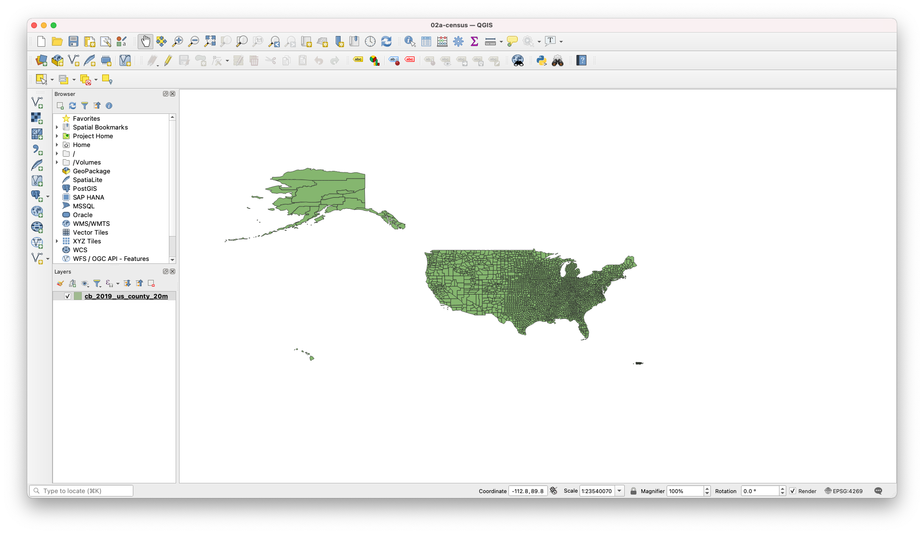
Start by adding the
US Counties (20m)file. -
Under
Soruce, click on the three dots and make sure you select the file with the extension.shp. Remember that a shapefile is actually made up of 5 or 6 individual files with different extensions. Normally, these individual files are the following:-
.shp- The main file that stores the feature geometry (required). -
.shx- The index file that stores the index of the feature geometry (required). -
.dbf- The dBASE table that stores the attribute information of features (required). -
.sbnand.sbx- The files that store the spatial index of features (these might get corrupted, see note at the end of this tutorial). -
.prj- The file that stores the coordinate system information. -
For more information on these extensions and others see this explanation by ESRI.
-
-
Depending on the settings of your QGIS, the program will either load the file automatically and change your project’s
CRS(coordinate reference system) based on theCRSof the file you just added, or ask you toSelect a Transformationfor your file. If you do get the prompt to select the transformation, we suggest you choose the default transformation. Unless you know exactly what transformation you want to use, your best bet is probably to go with the one QGIS is suggesting. In any case, at any point you can change the project’sCRSto fit your needs. -
Once you’ve chosen the transformation (if prompted) close the window where you selected the vector file to add.
-
Next, let’s change the project’s
CRSto the standard US projection:-
Click on the button that says
EPSGat the bottom-right corner of the map. This will bring up theProject Propertiespanel with theCRStab open. -
In the
Filterprompt, typeUSA Albers Equal Area. This will bring up a couple of options in thePredefined Coordinate Reference Systemssection. Choose theUSA_Contiguous_Albers_Equal_Area_Conic_USGS_versionand clickOK. If you’re having difficulty identifying which projection to select, you can also filter by the EPSG/ESRI ID. To do so, type102039. This should bring up the proper projection. Now that you’ve changed your projection, your map will appear different. While this changed the way the map looks, it didn’t alter the data itself or what you can do with it.
-
-
Before:
-
After:
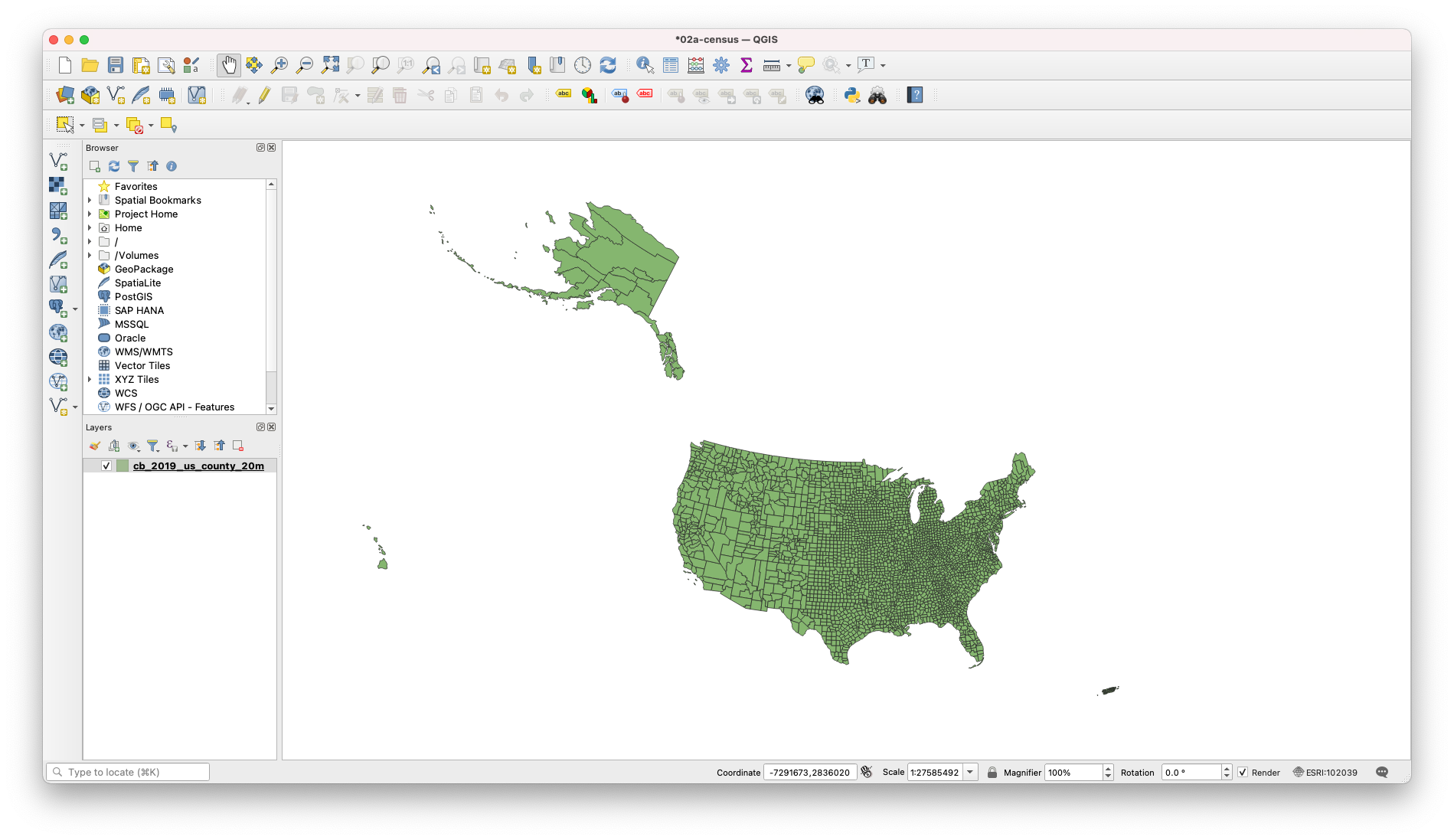
-
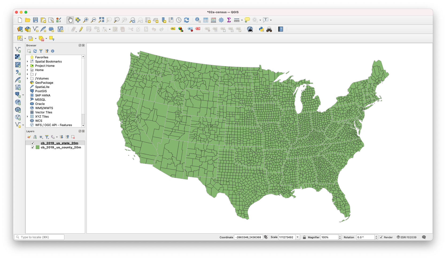
Now add the US states layer.
-
After you’ve added the US states layer you can re-arrange your layers. In the layer panel drag the US states layer above the US counties layer.
-
Finally, so that you can actually see both layers at the same time let’s quickly change the symbology of the US states layer:
-
Double-click on the US states layer and go to the
Symbologytab. -
There, highlight the
Simple Fillsymbol, under theFillsymbol. -
As
Fill stylechooseNo brush. -
For
Stroke colorchoose white (#ffffffin `HTML notation). -
And for
Stroke widthchoose0.5(withpointsas the unit).
-
-
You should now see the states as a white outline and the counties underneath.
Adding our College CSV Files
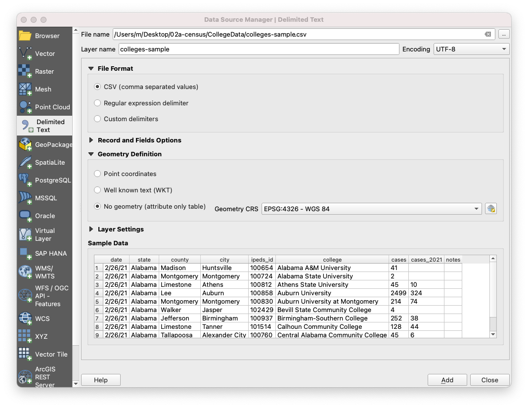
Next, let’s add the College Covid-19 dataset. In the folder, there are six files. The first two files, colleges-raw.csv and colleges-raw.csvt is the original dataset and its accompanying csvt file. The second set of files is colleges-geocoded.csv and colleges-geocoded.csvt. And finally, there is the sample file. THis is what we will import.
*Note: If you don’t know about CSVT files, you can learn why we need them and how to create them in the 1A session here.
-
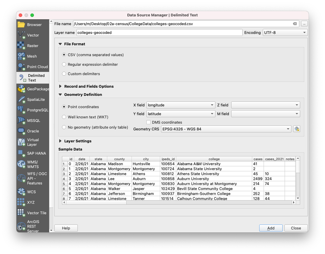
Click on the
Add Delimited Text Layerbutton (the comma with the + sign) and select thecsvfile. Remember, thecsvtfile should be located in the same folder where hecsvfile is and should have the same name (the only difference being the extension). -
Make sure the file format is
CSVand that underGeometry Definitionyou selectNo geometry (attribute only table). If we were importing acsvfile with coordinates or geometry we would select one of the other two options.
-
Hit
Addand thenClose. You should now see thecsvfile in the layers menu. -
To verify that the data was correctly read, right-click on the colleges data table and choose
Properties. Then navigate to theFieldstab. There you should see the different fields with the rightTypeassociated with them:QStringforcollegeandintforcases.
Now unfortunately we can see that in this data, there is no way for us to easily map the data. While we have the college, city, county, and state – none are formatted in a way that QGIS will recognize the actual location. So we need to process our data and specifically, we need to geocode our data. Geocoding is the process of converting addresses into geographic coordinates (latitude, longitude). To do this, we will need to install a plugin. To install plugins, navigate in your upper toolbar to Plugins -> Manage and install plugins. This will open a library of available plugins to extend the functionality of QGIS. Note that these are contributed by QGIS users and are not verified, so be careful as to what you install and how you use it.
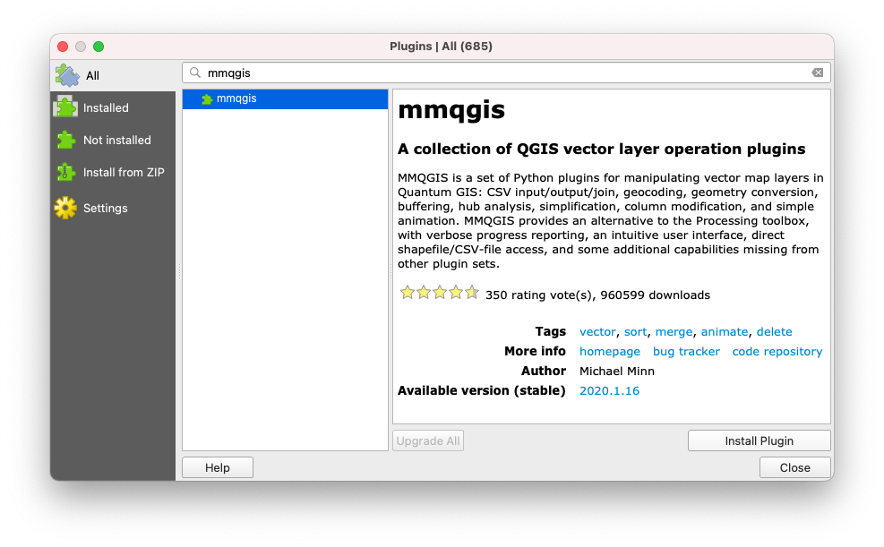
Here, search MMQGIS and that will provide you with the right plugin to install. MMQGIS is a set of plugins that are relied on heavily for spatial analysis.
Before moving onto geocoding, be sure to save your progress.
With MMQGIS installed, you should see a new menu item in the upper toolbar labled MMQGIS. Navigate to this menu, and select Geocode -> Geocode CSV with Web Service. This will open a prompt. Navigate to your colleges.csv file. For city, select city, for state, select state, and for web serviec, select OSM/Nominatim. Finally, let’s create a new folder in our directory called GeocodedColelge and save our output file and our not found file in this directory. Finally, select Apply.
Here we can see it worked – providing a latitude/longitude to the data. Now, this was just a sample dataset to show you the process of using a geocoder. Due to the size of the dataset, I’ve gone ahead and geocoded the colleges for us. Also, I used Google which requries an API key, simply because there place-based matching is more accurate than OSM.
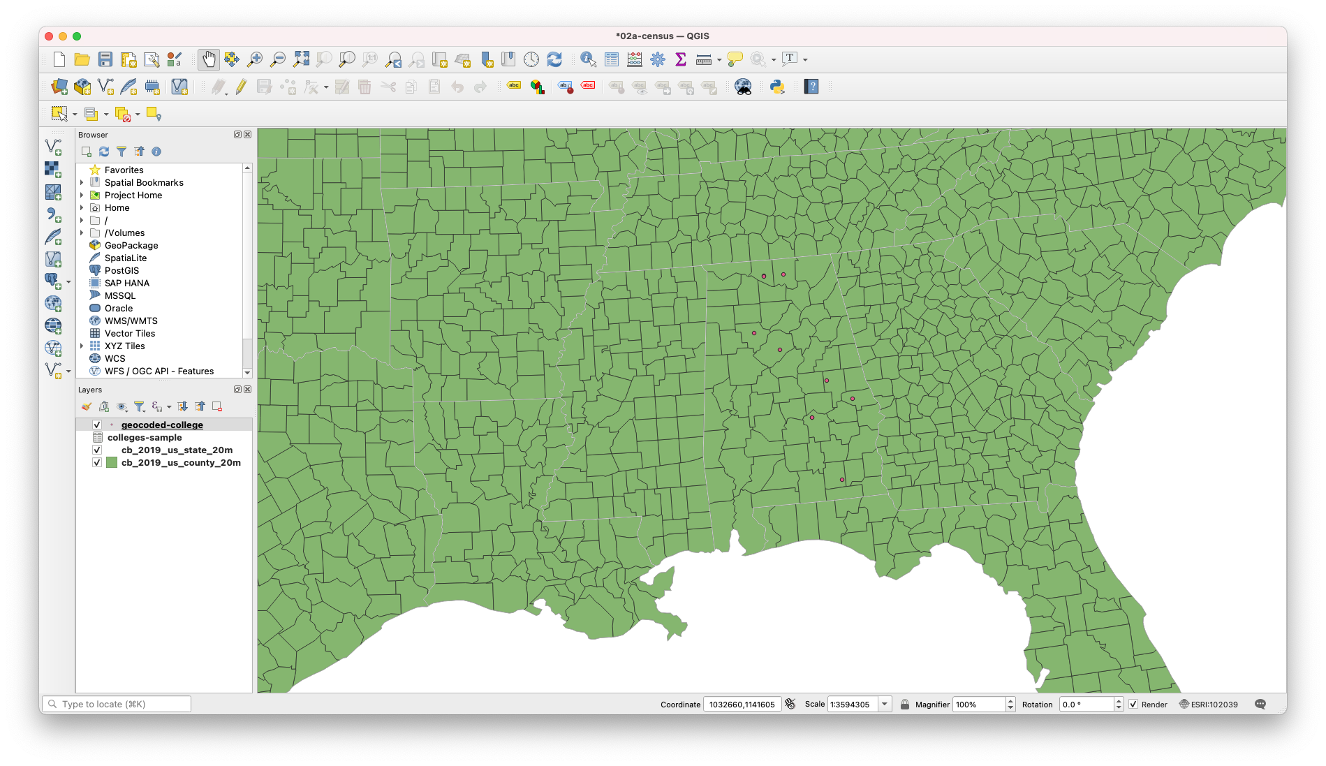
Let’s remove our colleges-sample layer and our geocoded-college layer, and import our colleges-geocoded.csv file.
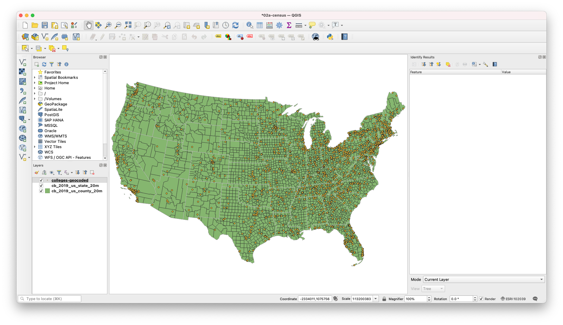
And let’s begin by visualizing our colleges data. Double click on the colleges-geocoded layer and navigate to Symbology in the properties menu.
For the symbol type, we will select Graduated. For the Value, select Cases. For symbol, we will set the fill color to #ffffff, and the opacity to 80%. For method, we will select Size. The defaults of 1 to 8 are fine.
Finally, we need to classify our data. Here will classify using Natural Breaks. And we will clean up our values for the purpose of communication. We will set our range as follows:
- 0 - 300
- 300 - 1000
- 1000 - 2250
- 2250 - 4500
- 4500 +
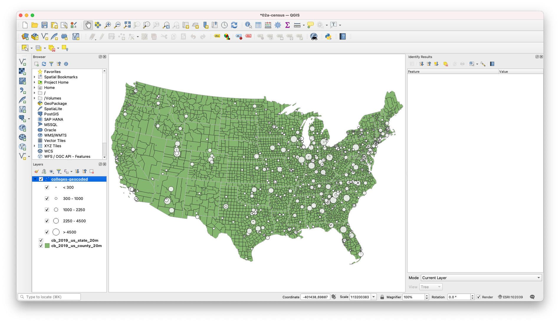
So already, this tells us a lot! Here we can already see trends in which states have a lot of colleges but eemingly few cases (Maine, New York, Oregon, New Mexico). But this isn’t the whole story! These are just case counts. And how do you get a lot of cases? Well, the easiest way is to start with a large population that have the opportunity to become infected. So we need to bring in ACS/Census data to make sense of this visual.
Adding American Community Survey Data.
About the Census
For the U.S., census data is used as a key dataset in understanding the health and progress of our society. It provides metrics about our society and is used to normalize other data for identifying and measuring issues in our economy, environment, and society. This tutorial will explain the proper method for querying and downloading census data; preparing the data for QGIS; and joining, analyzing, and styling the data.
For reference, the U.S. Census has two main surveys, the Decennial Census and the American Community Survey. The Decennial Census is the major census survey, which is carried out every 10 years and attempts to count every person in the country. It has two major disadvantages: one, it only happens every 10 years, so for the years in between the last census might be too outdated and the next one too far away; and two, because it is not using any sampling techniques, it often under-represents minorities.
The second main survey is called the American Community Survey (ACS) and happens continuously. Its questionnaire is sent to 295,000 addresses monthly and it gathers data on topics such as ancestry, educational attainment, income, language proficiency, migration, disability, employment, and housing characteristics. Its results come in 2 forms: 1-year estimates and 5-year estimates. The 1-year estimates are the most current but the least reliable. On the contrary, the 5-year estimates are not as current but are much more reliable. These are what we will use for our session today.
Downloading Census Data
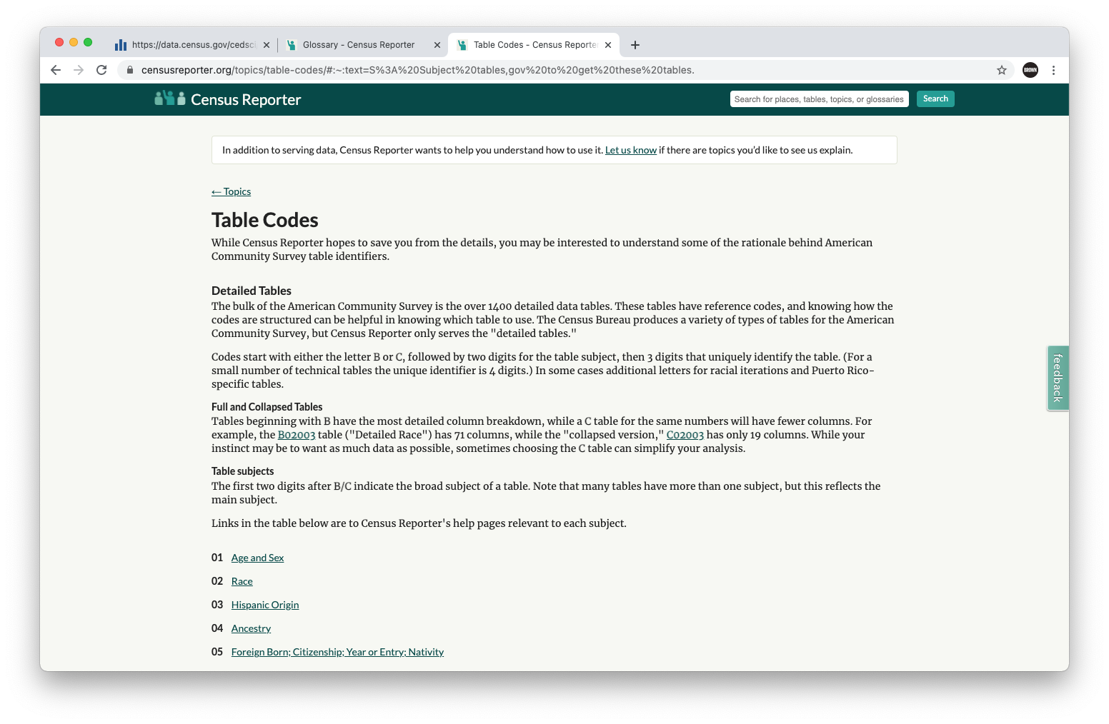
In the folder we had you download, we have already provided the csv files of preprocessed census data. But its important to know where (and how) to access it. The main Census website is data.census.gov. Here, the easiest thing to do is to search for what you’re looking for. But how do you know what you need? I always start by navigating to Census Reporter, a go-to guide for understanding what data exists and what tables you can find the data in. On the Census Reporter Table Codes page, a simple search for School Enrollment tells us we want to look at table S1401. It even provides a link to the Census site.
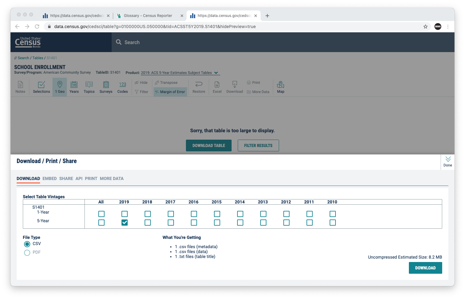
On the Census website, we want to first filter by ACS 5-year. We then want to bring in the proper geography. In our case, we will visualize by counties. So click on Geos, and select All US Counties. Next, we will be prompted to download the table. Select this button and uncheck the 1-year estimate. Then select Download.
And now you have the 2019 5-year estimate at the county level for the table S1401. If you open the table, you’ll quickly be overwhelmed by the sheer count of columns and rows, as well as the codes for each.
If you open the ACSST5Y2019-S1401_edited.csv file provided in your download packet, we can walk through what I did to produce this file.

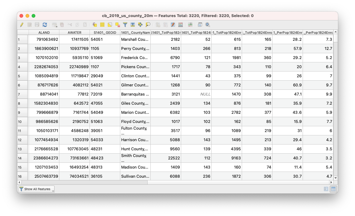
So here you can see the GEOID, the County Name, and then 6 columns of Census Data. Three of these columns are actually data about the college population (Total Population ages 18-24, Total Population Ages 18-25 Enrolled in College or Graduate School, and Percent Population Ages 18-24 Enrolled in College or Graudate School). In addition to each of these columns, the census also tells us the margin of error associated with these estimates. Since we’re working on the county level, MOE is less of an issue than if we were analyzing data at the tract or block group level.
So let’s begin by importing our data.
Select Add Delimited Text Layer and navigate to the CensusData/ACSST5Y2019-S1401_edited.csv. This file does not have geometry, so we need to turn that off. And select Add.
Now, like last time, I can already anticipate an issue with the GEOID due to variations between 4 and 5 characters in that column. So let’s fix that by navigating to the attribute table for S1401 layer.
We will begin by creating a new field (the abacus icon). We will label our field name ‘GEOID_Fixed’. We will set the field type to string. And our expression will be the following: lpad("GEOID", 5, '0')
Now, let’s join our county-level data to our county shapefile. To do so, open the properties of the county layer, and select ‘Joins’ from the options panel. We will be joining on the GEOID and GEOID_Fixed field for the county file and county ACS data file respectively. And we will provide a prefix of ‘S1401_’. Now let’s navigate to the Attribute table to make sure our join was successful.
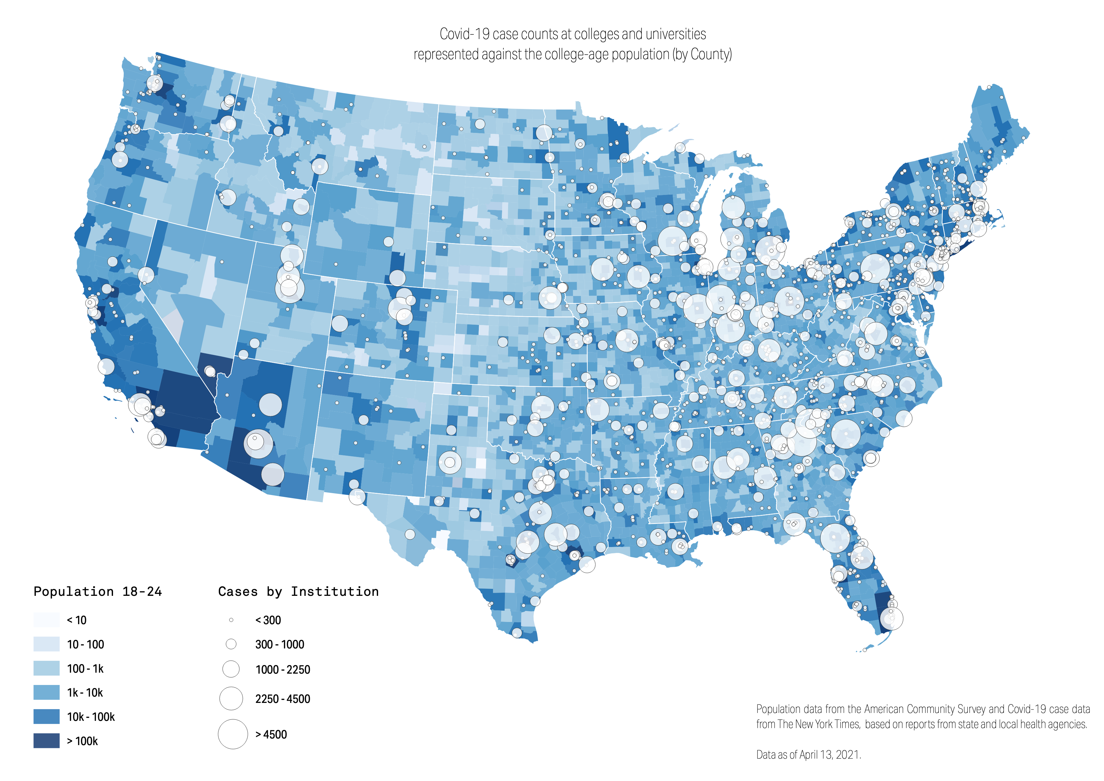
So let’s visualize the data. For this exercise, we are going to make 3 maps – each helping us investigate the data we are looking at. To begin, we will look at the total population. To do this, navigate to Symbology in your Properties panel for the joined county data. Here, select Graduated as the type. For value, select TotPop1824. And for the classification mode, select Logarithmic Scale.
Now let’s bring this into the composer for editing. Begin by importing the map by selecting the Add Map icon and click and drag across the canvas from corner to corner. Lets add legends for our data, sourcing, and a title, and export as a .png. This will be our first map, so we want to save a template for this print manager, and then get back to our main QGIS workspace.
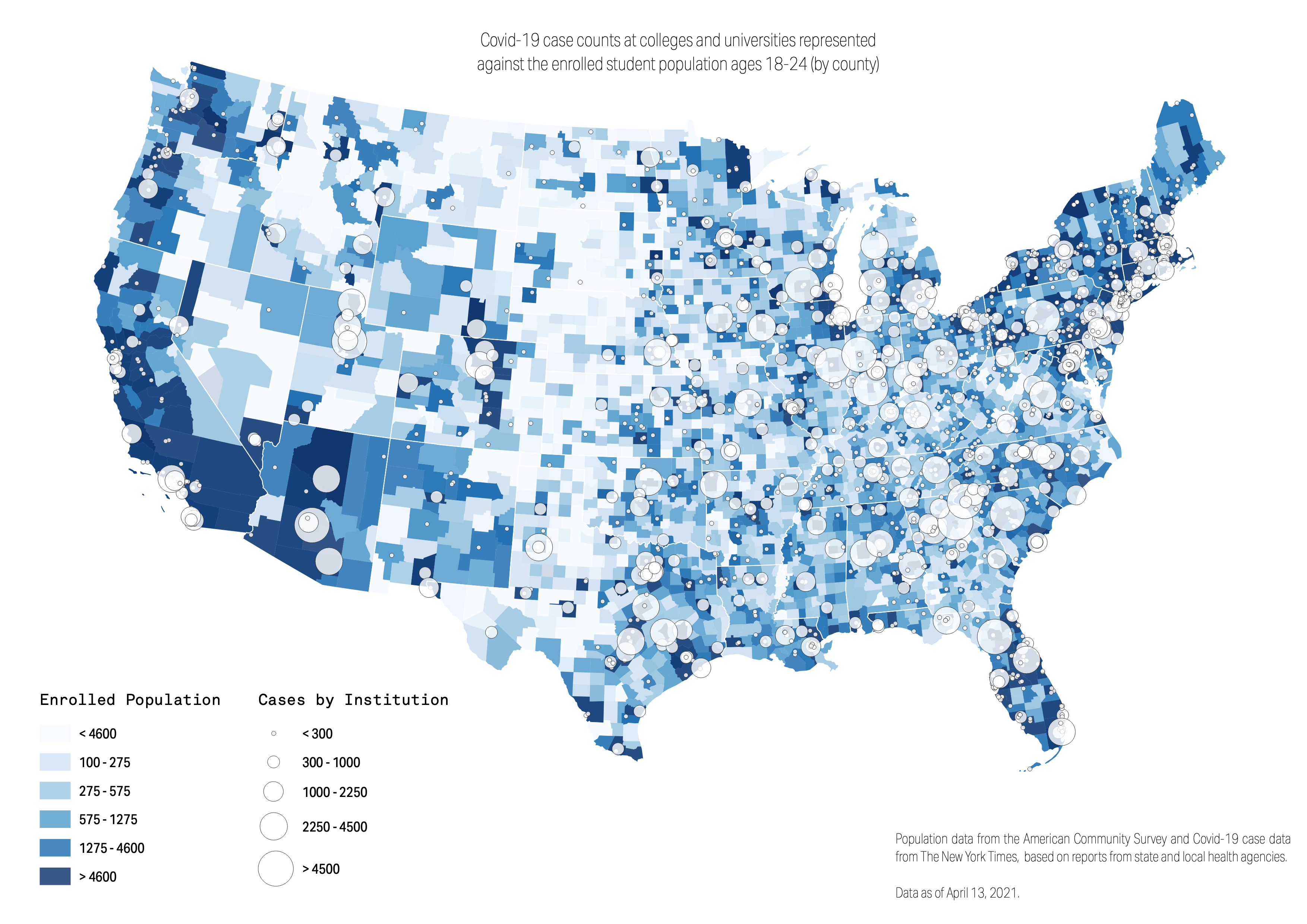
Before doing anything, let’s duplicate our later with county data so that we don’t mess up our link to the print preview, should we want to make any future adjustments. So we will duplicate our county layer, next filtering by total population enrolled. Here, we will classify these using Equal Count (Quantiles).
Let’s bring this into the composer, starting with the previous template so that we only need to make minimal changes!
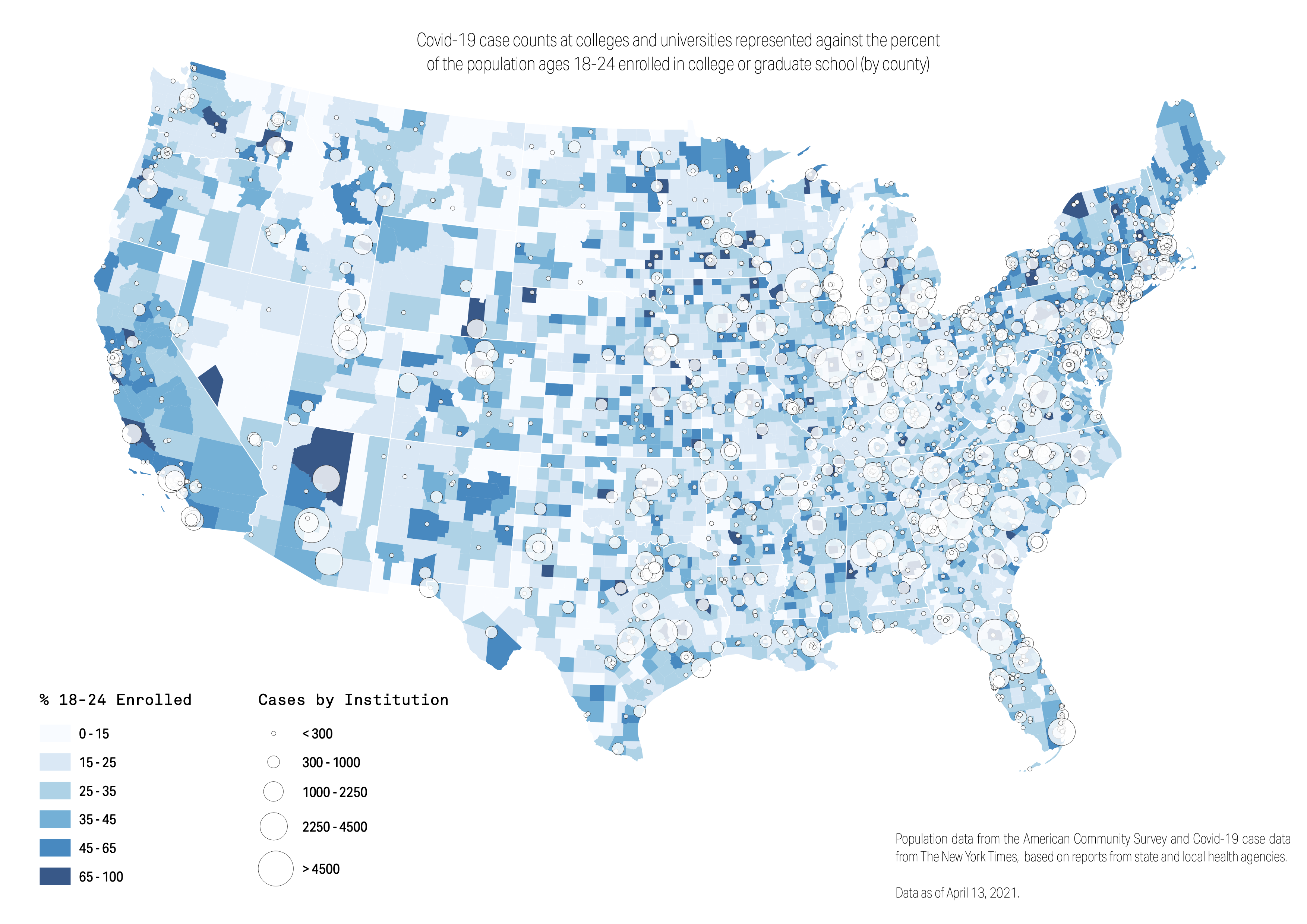
And finally, let’s make one last map, again duplicating our county layer. This time, let’s visualize it using the percent field, and let’s classify it using the mode Natural Breaks. Lastly, bring this into the print composer and produce a final graphic.
Analyzing our Maps
|
|
|
So here we have three maps, all telling us a different story. The symbol map alone has such rich data for exploration, and this map alone might be ready to publish. But the latter half of our exercise was not for communication. None of these maps should go to print, because they are simply too complex for an audience. Instead, they are incredible views into the data, as reporters. Oftentimes, we make maps to understand the data, not to communicate it. And we hope this exercise illustrates the importance and opportunity of this.